Opera 73 developer
-
Opera Comments Bot last edited by
Hi there, We are glad to announce that Opera 73 enters the developer stage today. Based on chromium 87.0.4252.0, this new version comes with lots of fixes to improve your browsing experience. For the whole list of changes, see the full changelog. Installation links: Opera developer for Windows (Using the Opera developer for Windows installer…
Read full blog post: Opera 73 developer
-
ralf-brinkmann last edited by
Hi everybody!
- The program icon in the Windows taskbar still jumps to the last position if a new tab is opened from external (like a link in a newsletter)
- Opera still shows the tab on the far right instead of the last active tab, if I close such a from external opened tab
W10x64, Operax64
-
A Former User last edited by
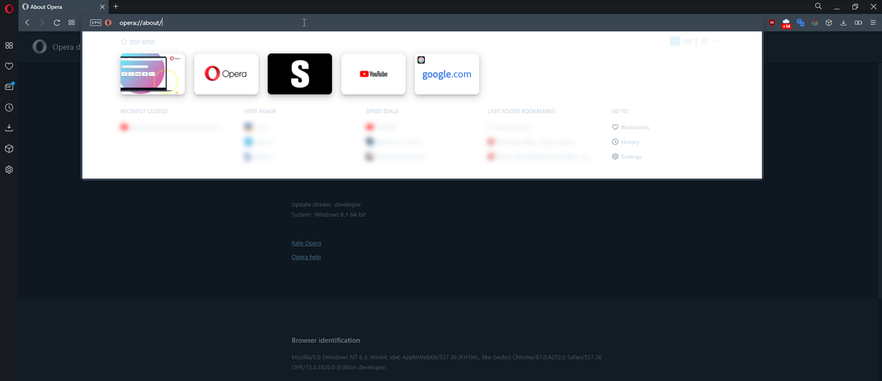
BABE's background color is always white, even when Opera is in dark mode.
-
A Former User last edited by
@kened: In fact, BABE's background color is set as transparent:
body {
background: transparent;
} -
andrew84 last edited by
Great update

Not a single bug was fixed from the list
https://forums.opera.com/post/224980 (except the 1st one, the flash is white again. It's better than colorful, but it means that the fixDNA-88299 White flashes when opening bookmark on startpageis not actual anymore).Additionally some UI's parts are broken in dark mode
- BABE's background is white (text is hardly readable)
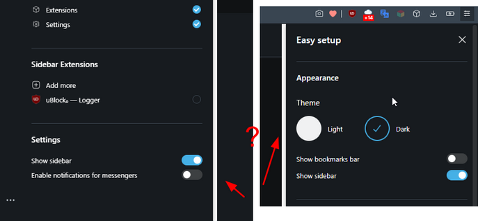
- EasySetup/Sidebar panels have white bold borders
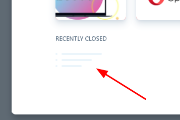
Also, sometimes 'Recently closed' items look too small
-
davidgould last edited by
In spite of using Opera since v4, I am switching to Vivaldi because you haven't fixed the bug that blocks RevertSite from working.
I will keep using Opera at least for the VPN occasionally, but please let me know when you fix this bug. -
andrew84 last edited by andrew84
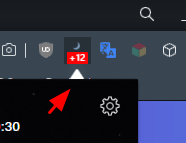
The #unified-popups flag is enabled by default in this build
As I mentioned earlier (https://forums.opera.com/post/220985) some popups look ugly now (white triangle), for example extensions popup that have dark background
-
andrew84 last edited by andrew84
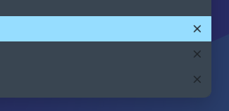
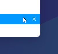
DNA-88670 [Search Tabs] Add close tab button
This is a very welcome implementation
*But in dark mode the closing cross is visible for each row, not only on hover.
-
A Former User last edited by A Former User
@andrew84 said in Opera 73 developer:
The #unified-popups flag is enabled by default in this build
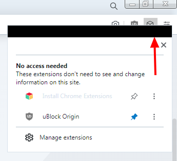
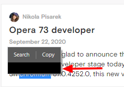
It looks like this for me: black "Artifacts" in each popup, if a theme without "Aero" is selected. Win7x64
-
andrew84 last edited by andrew84
@johnd78 said in Opera 73 developer:
"Artifacts" in each popup, if a theme without "Aero" is selected. Win7x64
In this case it's not acceptable.
If the flag is not from Chromium, it means that it was poorly tested before enabling.*I remember there were similar triangles in the past, but those were tiny and good looking. Current implementation looks ugly to me, too big triangles.
-
andrew84 last edited by
@leocg Reasonable statement.
Unfortunately, quite often (especially lately) known bugs can reach Stable channel. So the sooner the better bugs are fixed (including Dev stage)*All the bugs (known) from the 72 Developer will be in 72 Beta now, I guess (and there's high probability that some of them will reach Stable channel)
-
A Former User last edited by A Former User
@andrew84 said in Opera 73 developer:
If the flag is not from Chromium
This is the flag of the Opera, it is not in the Chromium.
The way to reproduce this bug in Win 7: Turn off DWM in Windows 7 (Choosing the Windows 7 Basic theme will be sufficient)@andrew84 said in Opera 73 developer:
it means that it was poorly tested before enabling.
I partially agree. Now this flag is also in Beta 72, although it is turned off there.
-
A Former User last edited by A Former User
@thededar It looks to be known issue - please read this comment.
-
ralf-brinkmann last edited by
The focus in the pop-up window "Clear browser data" (STRL-SHIFT-DEL) is still not on the blue button to clear the data.
Is this such a big problem to fix this bug?


