Opera unveils Opera One R2 in Developer
-
andrew84 last edited by andrew84
SplitScreen should have such option like opening left page's links in the right pane. For example it's obvious that I'd like to click and quickly see some item's description/parameters/prices in the right pane.
*Personally, I'd prefer a solution (quickly switchable option inside splitscreen mode) that mouse middle click will open links in the right pane while I'm on SplitScreen. Outside the SplitScreen it'll work by default and open links in new tabs.
**Or at least, right click on a link > open in right/left pane option in context menu.
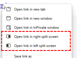
Also, tabs swapping should be added and links/bookmarks drag and drop should work. Bookmarks bar should be visible.
Edit:
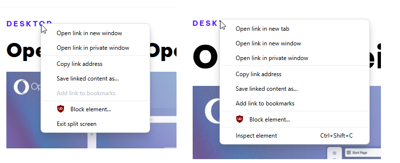
Btw, I noticed that while I'm in SplitScreen mode there's no 'open in new tab' option in context menu when clicking links (mouse middle click works). And add link to bookmarks is grayed out
Looks like a bug.
-
BestCodes last edited by
@ghirahim Can you send a screenshot of your browser sidebar, please?
Hi, I'm BestCodes! I'm a full-stack web dev who moderates on the makeblock forum and works on https://www.agent-one.dev. I have a website, https://bestcodes.dev. I love Opera, so I'm on here occasionally to report bugs and answer some questions.
-
andrew84 last edited by andrew84
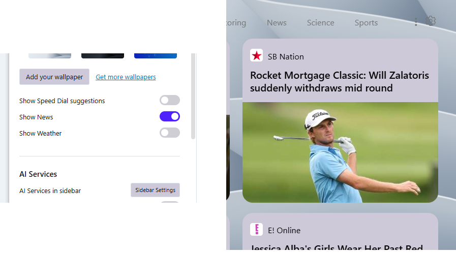
You did smth wrong with buttons background colors in Settings/EasySetup. Instead of previous some light color it's some greyish-rose color now.
As an additional proof News's tiles on SD have the same weird background color.
-
BestCodes last edited by
@andrew84 Hmm... Mine doesn't look like that.

Hi, I'm BestCodes! I'm a full-stack web dev who moderates on the makeblock forum and works on https://www.agent-one.dev. I have a website, https://bestcodes.dev. I love Opera, so I'm on here occasionally to report bugs and answer some questions.
-
A Former User last edited by
@bestcodes mine Opera doesn't look like in the video or screenshots at all

-
andrew84 last edited by andrew84
Regarding the attachable mini player (if it will come in future).

At first sight it takes too much space. And this without even the extensions module.
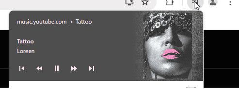
I find it more valuable to use some optional universal button for multimedia on the toolbar, like it works in Chrome for example.
So music or video, on hover the popup will show controls and information about currently playing content. Of course, maybe stylized to look semi transparent. If video, then simply additional control should be add to go to PiP.
-
andrew84 last edited by
@spike666 said in Opera unveils Opera One R2 in Developer:
I can make a new tab before the + sign without a problem.
I'm on W10.
I don't make a new tab, I move existing one. -
Locked by
 leocg
leocg