Opera 103.0.4892.0 developer update
-
ralf-brinkmann last edited by
@andrew84
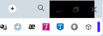
Confirmed. First the minimize and maximize button were black and the rest on the right side red. Then I could "hover it away" with the mouse. Now only the X is red. -
tastodd last edited by
Yes, the X (close) button remains always red after hovering the mouse
But the frames on the sides have become a little thinner
And there was a frame with a full-screen video in the same YouTube

-
ralf-brinkmann last edited by
That's the upper right corner of the browser (maximized) after relaunch and before hovering the black parts away.

-
andrew84 last edited by
@ralf-brinkmann @vegelund
You don't have issues while disabling Workspaces toggle?Just try to create some worksapces, open some tabs inside workspaces and then turn off the workspaces toggle.
-
A Former User last edited by
I’m not in the business of hunting bugs for Opera.
I just want a stable, snappy, and effective web browser – preferably with good design and functionality.
Why dedicate your own time to testing user scenarios that are uncommon or that do not affect your daily use?
There is more to life than subpar browsers.

-
andrew84 last edited by andrew84
@vegelund I just wanted to disable the workspaces feature, it's a pretty common scenario.
Why I enabled them? Because I read on forum regarding some bad animation when switching workspaces and wished to check it.@vegelund said in Opera 103.0.4892.0 developer update:
I’m not in the business of hunting bugs for Opera.
If you registered here and posting some issues, then you are. But apart from testers (who maybe read the blog/forum and are provided with jobs) you doing it for free.
On the other side, the browser is also free and if I use it daily, I'm not against to check some features or issues. -
A Former User last edited by A Former User
@andrew84 said:
If you registered here and posting some issues, then you are.
There’s a difference between posting up issues you notice naturally, that influence your browser use – and testing things just to find faults.
I do the former, not the latter.
-
andrew84 last edited by
@vegelund I noticed it naturally.
Workspaces is almost the only feature among relatively recently implemented features which is worth attention, in my opinion. I still think it's better than tabs islands, so I decided to check what's wrong there with the switching animation. -
A Former User last edited by
@leocg: I don't know. Volume control in pop-out video should control the volume? If the answer is positive, so this is a bug.
-
A Former User last edited by
@leocg: Try to open a pop-out video on youtube and change the volume. After about 50 seconds, the volume goes back to the previous level.
-
A Former User last edited by
@leocg: This bug only happens on Opera. Yandex and Firefox is working properly.
-
andrew84 last edited by
@vladbabinets You have 'News' enabled? Here I see the empty SD after I enabling News in EasySetup.


