Opera 72 developer
-
andrew84 last edited by andrew84
- DNA-87974 Popup unification
I tried turning the flag on, not the best idea I should say.
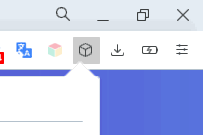
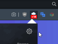
It looks ugly in current view because of the big triangle in the top right corner, especially in light mode when the white triangle overlaps the white toolbar, triangle is not positioned well according to active icon.

Another issue is that extensions supporting dark theme (weather for example) will have the white 'tail' on top.

*Better you'd improve the bookmarks bar dropdowns and menus/context menus borders. Comparing to the popups, menus and dropdowns still have blurry and thicker borders. And I wonder if you still think that the menu's and dropdown's white contrasting selected items in dark mode look great and modern
- DNA-87974 Popup unification
-
A Former User last edited by
I think it's time for address bars that are a little less long and centered. And perhaps with the auto-hiding feature. The current format generates a great waste of space.
-
A Former User last edited by
@kened: Opera Neon is a good example of this. He had a small, centralized address bar.
-
A Former User last edited by
@ralf-brinkmann Yes, I also encountered this error. There is no such error in Chrome when using DoH. There is such a topic.
-
ghirahim last edited by
I'll keep asking because it's one of your main features and you never answered anything. What's happening with your built-in ad blocker? On YouTube, there are ads in every video.
-
A Former User last edited by
@ghirahim: most ad blockers haven't been working on youtube for some reason, probably not updated to their new ad servers.
the only one that does for me is Ublock Origin, I have disabled the opera adblocker and actually like it better since it offers more granular control (and blocks youtube ads)
-
ghirahim last edited by
@nintendork07: AdBlock fixed it weeks ago. But Opera devs just don't care. If only they'd say anything. It's easier to ignore our questions.
-
A Former User last edited by
Still no option for us to return to the old, functional tab cycler? Many users are unhappy with the new cycler and missing closed tabs menu on your forums, Reddit, and elsewhere! Please, developers, listen to our feedback! You're doing such a great job with the other aspects of the browser, and I don't want to be forced to switch!
https://forums.opera.com/topic/39176/bring-back-the-recently-closed-button-on-the-top-bar-on-the-right/
https://forums.opera.com/topic/42846/please-for-the-love-of-god-allow-us-to-revert-to-the-old-tab-cycler-the-new-one-is-practically-unusable -
andrew84 last edited by
@atomicthumbs Instead of 1 tiny but handy feature we've got 2 and both of them are less functional. I don't have many tabs opened at the same time, it means that I rarely use the tabs cycler, but I agree that the horizontal cycler is less helpful (tiles are not informative).
Unfortunately, I think that there are almost no chances they revert something back in near feature.
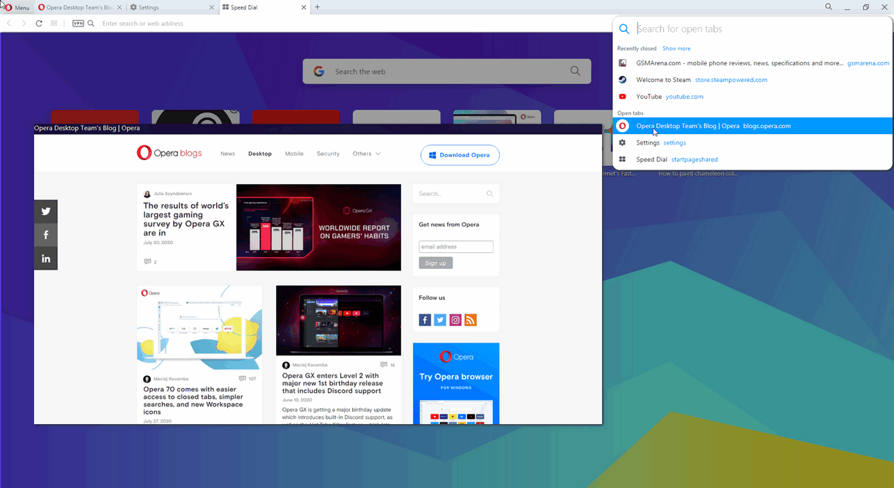
I could suggest to use a narrower version (to fit normal page preview like previously) of the Search in tabs popup for the Ctrl+Tab shortcut only, but they won't remove the horizontal cycler feature I guess.
Something like this (but without 'recently closed' maybe)

-
A Former User last edited by A Former User
@leocg The search-in-tabs feature, horizontal cycler, and missing closed tabs menu are part of the same changes to tab management.


