Opera 68 is here with built-in Instagram in the sidebar
-
A Former User last edited by A Former User
@leocg
If old flags were removed due to old code, which is a totally acceptable for me, why on earth did you keep the flag for the reborn address bar (opera://flags/#enhanced-address-bar) since it no longer works? -
andrew84 last edited by andrew84
@jimunderscorep I think you're wrong here regarding this particular flag.
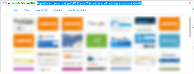
The flag was removed some time ago, but now the flag is back and the feature works (but still in development phase). I hope it will look like in 58 version (with copy/paste and other quick buttons and SD tiles) when finished.
-
adam1709 last edited by
- I don't like the new "Search in tabs" introduced. Previously it was ordered from beginning to end, and now all mixed up ...
- I do not like the gray padlock on both the safe and unsafe side. Firstly, these colors should be different, and secondly, that they are supposedly better standards? I think it would be safe green and red than gray in both cases - what a stupid thing.
- Duplicate tabs highlighter - it's nice that this is an option, but it is hardly useful at all if someone has several hundred cards. The second card is barely visible, and should flash, shine and jump from afar so that I can see it among hundreds of others.
-
A Former User last edited by
@leocg Thanks. That could be useful information for Opera to include in a new release blog post.
Instead of users stumbling upon functionality that has stopped working due to unknown changes in browser settings.
-
A Former User last edited by
@adam1709: you can turn off the search in tabs feature in opera://flags thankfully. it just reverts back to the recent tabs arrows.
-
leocg Moderator Volunteer last edited by
@adam1709 Regarding number 2, a (green) padlock is no longer a guarantee that the site is safe(r), that's why browsers are changing how they display such badges. They don't want users to get the wrong idea that a different color means a safer site.
See:
https://www.cnet.com/news/say-good-bye-to-that-green-secure-lock-on-google-chrome/
https://www.firstpagelife.com/blog/green-padlock-on-google-chrome-is-gone/ -
A Former User last edited by
@andrew84 said in Opera 68 is here with built-in Instagram in the sidebar:
@jimunderscorep I think you're wrong here regarding this particular flag.
The flag was removed some time ago, but now the flag is back and the feature works (but still in development phase). I hope it will look like in 58 version (with copy/paste and other quick buttons and SD tiles) when finished.Which flag? I am 110% sure that the one I mention did exist and worked at v67. I am mainly bugged by the "when the address bar is clicked, apply a fade to gray effect on the rest of the window" behavior. I have never noticed what you show in the screenshot, probably because I had disabled the reborn address bar.
Also, is there some other flag I can disable for it now? -
A Former User last edited by
there's an odd bug on MacOS Catalina 10.15.4, where a gap appears between the address bar and bookmarks bar when opera is full-screen.
-
karen-arzumanyan last edited by
@avl: On the O-menu, this is very inconvenient!
Conveniently through a button on the panel. And not only the last 10, but as of now. -
A Former User last edited by
@nintendork07: also there appear to be some font changes on websites like twitter and facebook, not sure if it's browser or MacOS related
-
firuz-u7 last edited by firuz-u7
@avl: 10 recently closed tabs are not enough sometimes I want to go back to the 15 or 20 closed tab, But history searches by open tab and not closed.
It is desirable that there would be an unlimited number of closed tabs with the help of a scroll, you could watch or as before, up to 33 closed tabs were displayed.
And when it was on the right side of the taskbar it was much more convenient and I could search through the sidebar or Ctrl + Space.
Thank you for your attention, I hope you take this into account. -
andrew84 last edited by
@leocg: but all the other Chromium browsers have 'Not secure' label additionally. In opera there's only changing icon (not very clear), just black triangle.
I could understand it if there was a strikethrough padlock like in FireFox.

It's more informative. Or must be 'Not secure' text like in other browsers. -
adam1709 last edited by
I have a lot of cards - they squeeze so badly. Is there any advice for that? I really miss the view in Firefox - the so-called roll. In Chrome it's a massacre at all - I uninstalled it quickly because it stops showing next cards of 100 or something.
-
andrew84 last edited by andrew84
@jimunderscorep my screenshot is from 58 version.
#enhanced-address-bar flag = 'Quick Access' feature (optional) for the address bar.
Some time later after Reborn3 announcement they removed that feature (and the flag as well).It seems that after the users complaints they decided to return the feature back again (and the flag too).
This is how the feature (Quick Access) looks now in recent Opera versions (still in development I hope).

*Probably you meant another flag called #reborn3-dropdown or similar, I don't remember the exact name. Appears when you begin typing in address bar.
-
A Former User last edited by A Former User
@andrew84 said in Opera 68 is here with built-in Instagram in the sidebar:
There is no #reborn3-dropdown or similar and I am sure that the one I mention above is the key flag for disabling the reborn address bar.
I will look my past comments later on in case I find it.---edit
It seems you are right! Here is the post I got the help from ~6 months ago and it is totally removed now
https://forums.opera.com/topic/36444/opera-65-comes-with-an-improved-tracker-blocker-and-redesigned-address-bar/38