Opera 68.0.3616.0 developer update
-
andrew84 last edited by andrew84
There's some progress with volume indicator synchronization on YouTube and on video pop-out (when adjusting volume on the popup.)
The slider volume indicator works more or less correctly now, thanks. But the speaker icon for the main video may show low volume while it's loud actually and vice versa.

Correct is

- Also, as I mentioned earlier the full screen dimming effect is irritating and it's still hard to use the buttons with the current cursor, I need to be very accurate and precise to move the volume slider or when clicking the closing cross. https://forums.opera.com/post/199383
-
xantares last edited by xantares
You might think searching for tabs may be ”the thing“ – I understand that idea.
But it actually isn't, because the tabs – even hundreds of them – don't change position much and the human ”spatial/location memory“ is quite well developed. So it only happens ever so seldom that you search for an open tab and don't find it hovering in instances.
On the other hand, it happens a lot more often that you accidentally close a tab and want to re-open ist quickly; not using keyboard shortcuts the ”Tab Menu“ comes handy there – much more convenient than unintuitively being redirected via the (sometimes painstakingly slow) history panel.
[
opera://flags/#search-in-open-tabscame handy for me, there, for the time being] -
andrew84 last edited by andrew84
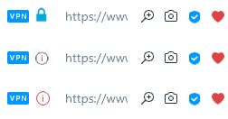
I'm not a fan of seeing how the non-secured icon is transforming into 'lock' icon while page loads, each time I open bookmarks or SD tiles. When I click page refresh I don't see that warning icon.

-
A Former User last edited by
@andrew84: Oh shit I didn't even see that they removed it! Hope they bring it back.
-
andrew84 last edited by andrew84
@andrew84 I'd prefer some outlined 'circle' for non-secured icon, like in Edge for example instead of that solid black triangle (exclamation mark is hardly seen actually).

And some blue colored 'lock' icon would look better because the active vpn an adBlock have blue icons. Black 'lock' icon in this case looks for me like something that is not currently switched on.

*If in short, it's better to indicate by colors than by different black icons.

-
A Former User last edited by A Former User
@andrew84: actually never mind the recently closed tabs appear to have been moved to the sidebar within the history section.
-
rick2 last edited by
@xantares: I disagree, I'm not sure what exactly is this new feature (search by page content instead of only title/url?), but I use Ctrl+Space extensively to locate open tabs and for me it's way better than hovering over more than a hundred open tabs (most of which aren't even loaded because I use "Delay loading of background tabs" option to save memory).
Maybe my ”spatial/location memory“ is under-developed, but I always prefer a keyboard shortcut over a mouse movement.
-
A Former User last edited by
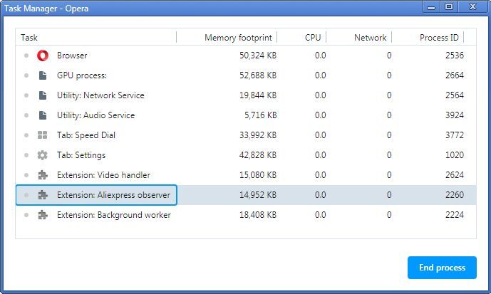
I see that the built-in extension "Aliexpress observer", id: jaocpokicpmlhbchlodlkiochdkmophj has appeared in this build.
Is it so necessary to keep this extension in RAM all the time?

-
xantares last edited by
@leocg: Of course. Neutral is the new green – secure connection the new standard.
But you can un-emphasis using a good design or a bad design from a UI designer's or even typographical perspective.
The new black design doesn't fit into the general distribution of contrast over the UI, for example.
TL;DR: Just because you want to get rid of a green padlock doesn't mean any non-green padlock works.
-
chas4 last edited by
Notification to update (on macOS) happens before the update to this build is ready
Why Open the Web?
Despite the connecting purpose of the Web, it is not entirely open to all of its users.
When used correctly, HTML documents can be displayed across platforms and devices.
However, many devices are excluded access to Web content.


