Opera 67.0.3574.0 developer update
-
zalex108 last edited by zalex108
High CPU - Animated Tab Media icon still happening.
Weeks ago read that it's related to W7.
Is that true?
Any confirmation?Thank you.
"You cannot know the meaning of your life until you are connected to the power that created you". · Shri Mataji Nirmala Devi
-
A Former User last edited by A Former User
Hi @mrx1980, looks to be bad UA string sniffing. You can use one of UA switching extensions, or enable
opera:flags#chromium-ua-compatibilityto avoid this issue.Alternatively, you can run the Opera with the following switch
--user-agent="Mozilla/5.0 (Windows NT 10.0; Win64; x64) AppleWebKit/537.36 (KHTML, like Gecko) Chrome/80.0.3987.7 Safari/537.36". -
zalex108 last edited by
@leocg said in Opera 67.0.3574.0 developer update:
@zalex108 I don't remember a fix for it have beem released.
Yes,
me neither.But if it's W7 related, then I don't expect any fix.
Hopefully I'm wrong.
"You cannot know the meaning of your life until you are connected to the power that created you". · Shri Mataji Nirmala Devi
-
A Former User last edited by
Why Opera don't have support for web panels yet? Such a simple feature that will give us the possibility to remove lots of extensions and have a more stable browser. Vivaldi has this feature for so long and it's perfect.
-
ralf-brinkmann last edited by
@leocg: Oh, I just found out I was logged out. I think this was a mistake in one of the older versions and I did not log in again.
And the position of the opened tabs is really hard to find, because there are no visible "tabs" in my mobile Android phone. I didn't know that. -
andrew84 last edited by
Some issues with bookmarks bar folders dropdowns.
- Expanded dropdown still overlaps the whole toolbar (if there are enough bookmarks in the list)
- In bookmarks bar folders the subfolders do not have the scrolling (if there are enough bookmarks in the list). There are no up/down arrows visible at the bottom/top and the bookmarks list is just trimmed.

-
mrx1980 last edited by
@l33t4opera & @leocg: Thank you for your replies. Enabling opera://flags/#chromium-ua-compatibility is working, so I will contact the website admin in the next days.
-
A Former User last edited by A Former User
Feedback: Great work team opera!
I really liked the duplicate tab highlighting feature. It would be better if some other shade(light pink or blue) was used to highlight, so that duplicate tabs really stands out.Bug report: minimize, maximize & close button/icon missing from top bar.


-
ralf-brinkmann last edited by
www.nikon.de is still not available. Google Chrome with Chromium 81.x can open the page. User agent switcher does not help. I think it's a problem of Chromium 80.x. I hope Opera can update Chromium soon or fix this problem in another way.
W10x64, Operax64 -
A Former User last edited by A Former User
@ralf-brinkmann Hi Ralf, try to run the Opera with the switch "--ssl-version-max=tls1.2"
;-) -
ralf-brinkmann last edited by
@l33t4opera
Oh man! One day the list of all necessary switches will be longer than Trump's tweets per day. It works that way. -
andrew84 last edited by andrew84
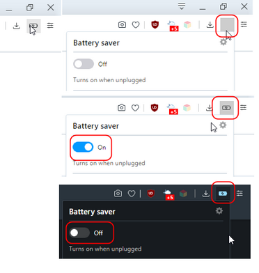
Some mess with the toolbar's battery icon and its state.
- Gray square while icon is clicked (it seems that switching current theme resolves the issue)
- depending on currently enabled theme the clicked icon looks visually disabled while the feature itself is enabled, and vice versa.

-
andrew84 last edited by andrew84
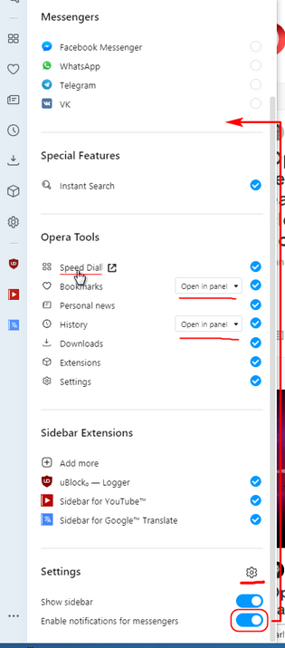
Suggestions regarding the new sliding settings panel for the sidebar.
- 'Show sidebar' toggle must be always visible after opening the panel. Currently it needs scrolling first. *Some quick toolbar button (optiona0)l for showing/hiding the sidebar is still would be very much welcome(like it works in Vivaldi).
- move 'Notifications' toggle into Messengers section.
- add gear icon 'view in Settings' to see the sidebar settings directly.
- duplicate 'Show in panel/Show full page' toggles for History/Bookmarks in internal Settings page too.
- items in 'Opera tools' section could be clickable instead of using the appearing icon (square
with arrow)

In overall, I like that the 3 dots menu doesn't simply clone the right click context menu anymore. Especially I like that you added option whether to view History/Bookmarks in full page or in panel.
One thing I found a bit strange is that panel offers more advanced settings than internal Settings page. I'm used to think the opposite, when quickly accessible settings allow to change only basic features.
-
andrew84 last edited by
The Highlight duplicate tabs on hover feature needs a toggle button in Settings.
-
balcis last edited by
Kornella, for a very long time; first link works, but second link that mentioned as "portable" directs to the stable versions page: https://www.opera.com/computer
