Opera 122.0.5615.0 developer update
-
 Opera Comments Bot last edited by
Hello! We’ve just rolled out a new update (version: 122.0.5615.0) with a redesigned history page – it’s live for all developer users! So, here’s what’s new: For a complete rundown, take a look at the changelog. Happy browsing! Installation links:
Read full blog post: Opera 122.0.5615.0 developer update
-

-
andrew84 last edited by andrew84
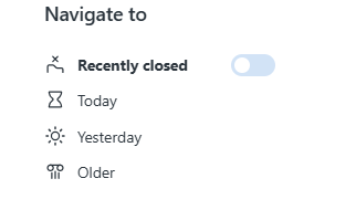
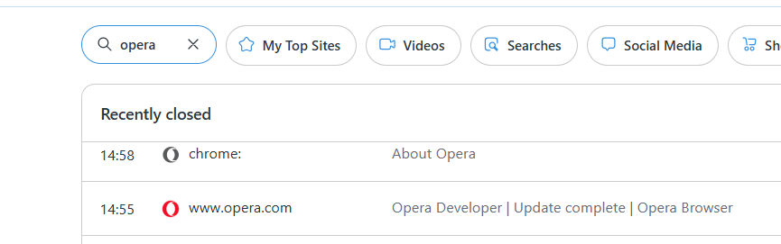
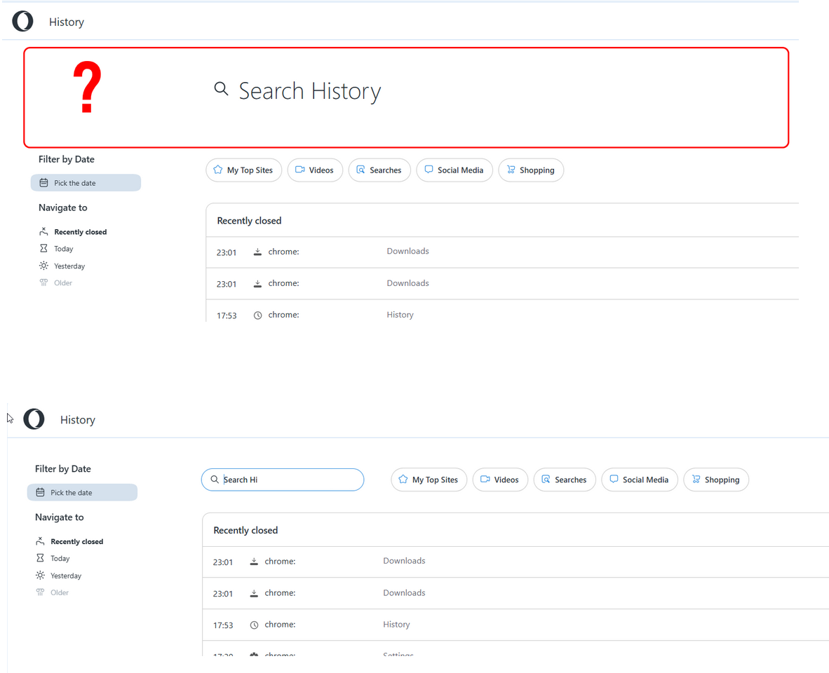
Redesigned history page (still smoothing out a few bugs)
- The recently closed section on top should be optional.
- categories bubbles have not obvious selection indication. The tiny border is not enough.

it'd be better using the filled inverted bubble like on downloads page.

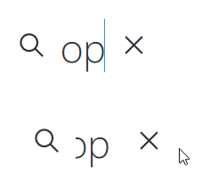
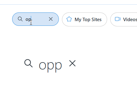
- the search is glitchy
-
the big one search field cuts text after pressing space and then the search field becomes partially responsible
-
after scrolling down and using the small one it allow here to enter three symbols and then jumps to the big one above and prevents typing
-
In other words, after typing the field's width becomes too small.
-
Opera-QA-Team Opera last edited by
@andrew84 Thanks a lot for the feedback and screenshots, it is really helpful!
-
About the "Recently Closed" section at the top: thank you for the suggestion!
-
For the category bubbles: the thin border is the intended design to show selection, but we get that it might not be super clear. The idea of using the filled inverted style like on the downloads page is a good one.
-
As for the search issues: it sounds like after typing three characters, if there are no matches, the history list updates and the input goes back to its default (larger) version. If that’s what’s happening, it’s expected behavior - but we’ll take another look to make sure everything's working smoothly.
Appreciate the suggestions!
-
-
andrew84 last edited by andrew84
@Opera-QA-Team said in Opera 122.0.5615.0 developer update:
As for the search issues: it sounds like after typing three characters, if there are no matches, the history list updates and the input goes back to its default (larger) version. If that’s what’s happening, it’s expected behavior - but we’ll take another look to make sure everything's working smoothly.
just try search on old version and it'll be clear that the search is broken on the redesigned one.
it sounds like after typing three characters, if there are no matches, the history list updates and the input goes back to its default (larger) version. If that’s what’s happening, it’s expected behavior
After some manipulations I can type more character (what's obvious)
*it's quite funny that recently you started trying to present obvious flaws as intended ones (maybe again thanks to AI).
-
andrew84 last edited by andrew84
In overall, I really don't get why there should be so huge search field (appearing/disappearing and causing glitches ) and thus wasted space on top.
Simply make it static (dedicated a bit) next to categories bubbles.
*Also, it'd be nice to have more predefined options to select like 'last week' and 'last month' and 'All'. If I don't mistake, it used to be in the past.
**Also, I think that 'remove entire domain' option should have some confirmation popup. -
andrew84 last edited by andrew84
@andrew84 another one thing I noticed is that when selecting the predefined anchors, the list looks partially hidden and thus actually selected category is wrong.
So I click 'Yesterday' but the list's top is hidden and the bold text is for 'Older' category.
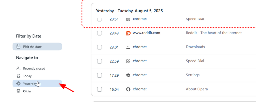
After I move cursor and scroll to the top of the 'yesterday' list, the category is automatically changing (bold text) to the correct one ('yesterday').
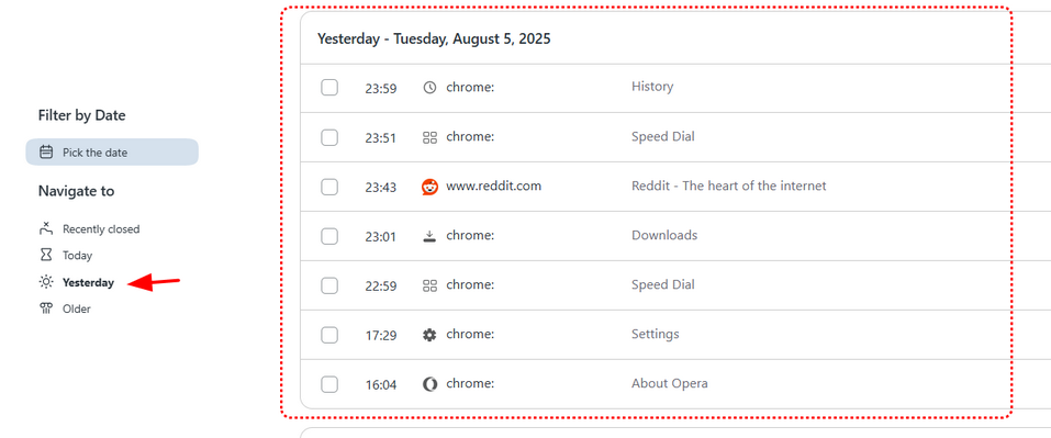
*So I click on one category but visually it shows that another (wrong one) was selected.
-
burnout426 Volunteer last edited by
@andrew84 said in Opera 122.0.5615.0 developer update:
categories bubbles have not obvious selection indication. The tiny border is not enough.
Agreed.
-
-
Opera-QA-Team Opera last edited by
Thanks for the detailed feedback, @andrew84!
-
We appreciate your suggestion regarding the search field layout.
-
Good call on the predefined options.
-
Also noted on the "Remove entire domain" action.
Lastly, thanks for flagging the issue with the ‘Yesterday’ section displaying the wrong category highlight, we've logged it as RNA-379.
Let us know if you spot anything else!
-
-
Opera-QA-Team Opera last edited by
@krishnakrverma: That sounds like a cool idea! Can you share a bit more on how you'd imagine the "circle to search" feature working?
-
 ralf-brinkmann last edited by
CRASH!
I opened a new Tab (CTRL-T) and wanted to open the page www.rmv.de (is in my bookmarks and in the speed dials). I started typing RMV in capital letters by mistake and Opera crashed after the first letter. I could repeat this another time. If I typed the name in lowercase, everything was fine.W11 x64, Opera x64 (standalone installation)
-
Opera-QA-Team Opera last edited by
@ralf-brinkmann: Hi there, thanks for reporting this issue. Could you please check opera://crashes and share the Crash ID(s) with us?
-
krishnakrverma last edited by
@opera-qa-team: Ok so it's a feature famous in Samsung and Pixel phones where you can circle an image & the AI will find you about it. Food images for recipes, extracting text from images... you get it. But it's an expensive feature of course... iykyk

What if we get it right in Opera for mobile & pc? I can simply circle or drag anywhere and Aria will tell me about it, all from my browser, no taking screenshots, no uploading anywhere, just pure consistency. But I hope she won't search with Google Lens...
 ️ I mean, I have been using Aria recently & she unnecessarily highlights terms for Google search in her response, which are out of context from the topic! (I am not talking about the Google Suggestions toggle in the settings.)
Btw I am losing my memorable chats with the AI... I dont know why.. I wish save it in the cloud instead.
-
ralf-brinkmann last edited by
@Opera-QA-Team said in Opera 122.0.5615.0 developer update:
@ralf-brinkmann: Hi there, thanks for reporting this issue. Could you please check opera://crashes and share the Crash ID(s) with us?
First CrashID=bp-d1478fbd-b1a3-428f-bb5b-ebf910250807
Second: CrashID=bp-fcf50240-af43-4ce5-8e0e-0ec490250807 -
-
ralf-brinkmann last edited by
@Opera-QA-Team said in Opera 122.0.5615.0 developer update:
@ralf-brinkmann: Hi there, thanks for reporting this issue. Could you please check opera://crashes and share the Crash ID(s) with us?
Same problem today:
I wanted to search for a product in the REWE shop on Google. When starting to type REWE with capital letters Opera crashed.
CrashID=bp-fe020482-60f1-4c92-b982-45e4a0250808. -
 KenedSF last edited by
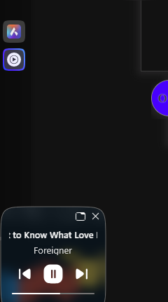
The sidebar mini player is crashing. When the mini player is enabled, if I try to open the player in the sidebar (to adjust the volume, for example), it crashes.
-
Opera-QA-Team Opera last edited by
@kenedsf: Thanks for reporting this issue. Could you please share the crash ID from opera://crashes so we can investigate further?
-
 feature right in our browsy?