Opera 117 developer
-
Opera Comments Bot last edited by
Dear Opera Users! Opera’s new Developer version 117 is here (117.0.5369.0), packed with updates and enhancements. Below is a concise roundup of what’s new in this release: We’d love to hear your thoughts! Drop your comments below and let us know what you think about the update. For more changes find out our full changelog. […]
Read full blog post: Opera 117 developer
-
andrew84 last edited by
- Inactive toggles still don't look nice (the simple black background).

In 115 and in 'old' Opera it looks better.

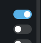
- after disabling a toggle it'll be temporary invisible until clicking somewhere.

- Inactive toggles still don't look nice (the simple black background).
-
tastodd last edited by tastodd
If you are actively involved in the Opera design theme, I would like to draw your attention to the address bar highlighting again.
A lighter color with a light theme looks much more pleasant to perceive than the current dark gray


And if there is an opportunity to choose the color tone of many browser elements, then please implement the ability to choose the color highlighting of the address bar
For example, if the browser is in green tones, then the user would also want to make the address bar highlighting light green, if in red tones, then red highlighting, and so on
I think such an opportunity would make Opera more flexible in terms of design.
-
andrew84 last edited by
-
Themes (not only the Classic one) should have option to select user own wallpapers. It could be possible when 'animated' toggle is switched off.
-
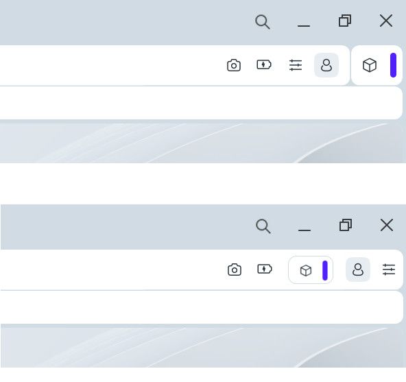
I still think that the EasySetup icon should be the last like it was positioned earlier. So the extensions island must be integrated into the address bar.
-
DNA-119810 [Easy setup][Carousel] When the cursor is moved away from the theme tiles, the view should remain on the current theme instead of resetting to the first one
Maybe this is an intended but here the 'Carousel' doesn't reset its view like previously, after cursor is moved away the tiles stay expanded in full size.
-
-
daria19 Opera last edited by
@andrew84: Thank you for your feedback! Currently, only the Classic Theme allows selecting custom wallpapers, but we appreciate you sharing your thoughts on expanding this feature to other themes. It’s helpful to know how you feel about it, and we’ll keep it in mind moving forward. As for the Extensions section, you can click the handle to make this section smaller if needed. Let us know if there’s anything else we can assist with!
-
daria19 Opera last edited by
@tastodd: Thank you for sharing your thoughts! We appreciate your detailed feedback on the address bar highlighting. Customizing the color tone of browser elements, including the address bar, is a creative suggestion, and we can see how it would add flexibility to Opera’s design. Thanks again for taking the time to share your ideas!
-
daria19 Opera last edited by
@indiqazzz: Thank you for your feedback! While we strive to fix as many issues as possible, please keep in mind that it takes time for all fixes to be implemented. Sometimes we need to prioritize certain areas based on impact and urgency. We appreciate your understanding and patience as we work to improve. Let us know if there’s anything else you’d like to share!
-
andrew84 last edited by
@daria19 said in Opera 117 developer:
you can click the handle to make this section smaller if needed
I know, but I'd prefer the EasySetup's icon would be fixed as the last.
*I'd understand the current implementation if the Extensions island (and other UI parts/buttons/sections) would be moveable and attachable where user want. Otherwise, personally, I don't see any benefits from the hyped modular design. On the contrary, the borders everywhere (especially the content border) push me back from fully switching to One version. -
andrew84 last edited by
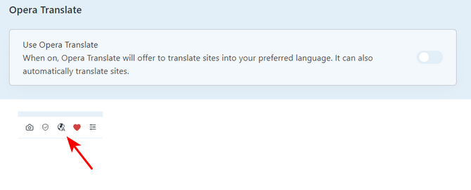
I have the ''translate' option disabled in Settings but still see the icon in the address bar.
-
andrew84 last edited by
@tastodd said in Opera 117 developer:
For example, if the browser is in green tones, then the user would also want to make the address bar highlighting light green, if in red tones, then red highlighting, and so on
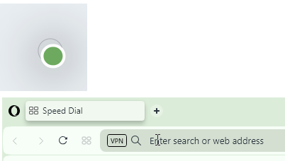
It already works by this way. But the algorithms how the colors are selected to keep the right accents and contrast are bit far from ideal.
So the green color indeed offers some 'greeny' address bar highlighting.
-
tastodd last edited by
@andrew84 said in Opera 117 developer:
It already works by this way. But the algorithms how the colors are selected to keep the right accents and contrast are bit far from ideal.
Yes, but the dark gray address bar cannot be made lighter. In my proposal, this was primary, and changing the color shades is secondary.
-
andrew84 last edited by
@tastodd the best what I managed to achieve is that I selected the light blue close to the one in 'old' Opera.
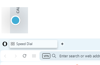 .
.But the tabstrip looks worse in this case (almost no contrast).
@tastodd said in Opera 117 developer:
dark gray address bar cannot be made lighter
That's what I'm talking about. The color tones are generated on the fly. I doubt there'll be a separate option to adjust the address bar highlighting by hand.
If they change the address bar's color in automatic mode like now, then in address bar it will look nice but can look bad in other place and etc. And additionally it should also look nice in both light/dark theme. That's why I don't like the themes feature in current view. -
ralf-brinkmann last edited by ralf-brinkmann
Question:
What is the hidden folder ".opera" in my download folder for and how can I prevent it from being created in the first place?

(W11x64, Operax64) -
daria19 Opera last edited by
@ralf-brinkmann: Hello! The .opera folder might be created by the browser for temporary or configuration purposes, but it's unusual for it to appear in the downloads folder. Could you share any specific settings or your installation steps? This will help us investigate further.