Opera unveils Opera One R2 in Developer
-
andrew84 last edited by andrew84
The 'redesigned' video pop-out looks spoiled!
Why is need to dim all the video area on hover? Why do I need the play/pause and next video buttons in the center?
Why I need to search and be precise among the other buttons (which in most cases are adjusted only once) when simply adjusting a volume?Btw, I first time see the volume's increasing happens from top to bottom

And there's even no timing anymore.
-
andrew84 last edited by andrew84
@indiqazzz I had crashes too. So I needed to run opera with 'no experiments' key and turn the #default-mod flag too to see the themes. But later I disabled the #default-mod flag and it works currently with only the #color-theme flag enabled.
I don't know what was the reason, but I changed wallpaper to some old one after launching the browser, maybe that's the reason. -
andrew84 last edited by
@kened why nice? It become worse and it looks like some default popup in Edge or FF.
-
A Former User last edited by
@kened: Opera One R2 is incredible. The only thing I hope for is the multiple pop-out video feature. When this happens, I can finally uninstall Firefox.
-
A Former User last edited by
@andrew84: The new design is cool. But the edges were a little too rounded.
-
jojo0587 last edited by
Why can I only split 2 pages at a time? The bookmarks bar must hide on split pages? Maybe then it would be between the address bar and the tab bar (instead of between the address bar and the page)? Optionally, add the option to show/hide it in the case of split pages.
What about the toolbar (access to plugins, for example)? Must he disappear?
My proposals for changes in Opera (Google Document).
- There are not enough signs to put all the links here. -
andrew84 last edited by
@kened They just put video control buttons in different places. Volume control is here among other buttons, pause/play is there, video progress is in 3rd place + dimmed video on hover. I really don't understand why is cool.
-
jojo0587 last edited by
How to use Opera's Multithreaded Compositor? I don't see such a possibility in my case. I have Opera 113.0.5208.0.
My proposals for changes in Opera (Google Document).
- There are not enough signs to put all the links here. -
andrew84 last edited by andrew84
@jojo0587 said in Opera unveils Opera One R2 in Developer:
The bookmarks bar must hide on split pages?
Not, of course. The current implementation is strange(very).
There should be a button on the toolbar which simply splits the screen like in Edge.

So I should be able to simply drag a tab/bookmark/opened site onto the splitted area.
hold a key > select tabs > right click> select create split screen is too long.
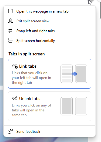
To exit full screen I first need to click 3 dots instead of simply clicking the active 'split screen' icon on the toolbar again.

Edge also has the 3 dots menu, but there are some additional options which can be applied.

-
jojo0587 last edited by
@leocg: Yes, I use the stable Opera on a daily basis. Now I updated Opera Developer to 113.0.5208.0 and I did not see the option to disconnect/move Opera modules.
My proposals for changes in Opera (Google Document).
- There are not enough signs to put all the links here. -
andrew84 last edited by andrew84
@andrew84 I found out that split screen can be created by dragging a tab (option in Setting) but the behavior is quite intrusive because split screen is creating (trying) each time I drag tabs out of the tabstrip (need to be precise and remember to not move a tab too far down).
*So the redesigned popup is bad, color themes are too early to rate because the feature is very raw, split screen feature itself is quite useful but the implementation is not so handy and not so logical like in Edge.
-
burnout426 Volunteer last edited by
@andrew84 said in Opera unveils Opera One R2 in Developer:
I found out that split screen can be created by dragging a tab (option in Setting) but the behavior is quite intrusive because split screen is creating (trying) each time I drag tabs out of the tabstrip (need to be precise and remember to not move a tab too far down).
Yes, indeed. You have to drag and release fast. If you hold too long, it'll trigger split screen. I prefer to have the option off and just select 2 tabs, right-click the selection and choose "create split screen". Maybe the timing can be tweaked so one has to hold longer before it triggers split screen.