Opera 101.0.4843.0 developer update
-
andrew84 last edited by andrew84
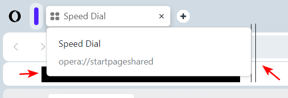
- What's this?
Happens with tooltip when moving cursor from tab island's icon to outer tab.

Or when moving cursor over tabs

- Regarding the tab islands:
In my opinion it should (must) have such options as
-how to leave tab islands when selecting outside tabs.
Whether it should be 'compact mode' (only icon) stay visible

Or it should be normal mode, when the whole tab is visible.

Additional option here could be whether to automatically expand tab island when selecting or not
In overall, the new interface is not comfortable to use comparing to the old UI. In many places is need to be precise to interact with the UI (on forum there are enough feedback regarding this).
Why should I correctly hit the small [+] new tab button each time, for example?

At the same time, close and maximize buttons, which are in use much more rarely, are relatively giant.Also, why is need to click exactly the color 'pill' to expand/collapse island, but not the border around the 'pill' also.

+ scrolling issue because of the content's border, of course.
https://forums.opera.com/post/313493 - What's this?
-
andrew84 last edited by andrew84
And maybe it is enough already posting promotional screenshots strictly only in dark theme.
*I also don't understand, why there's a separate thread on forum for the One version? After it went to Stable there's no other Desktop version anymore.
I'd understand it if the One's development would be in parallel with the ordinary version to collect feedback and make corrections before the final release. -
ralf-brinkmann last edited by
The "close cross" no longer appears on tabs that are not the active tab when I hover over them.
And where can I see the number of open tabs now? If I remember correctly, they used to be displayed when you clicked on the magnifying glass symbol in the top right corner ("Search tab"). Now I have to count. 66 tabs open.
W10x64, Operax64 -
andrew84 last edited by
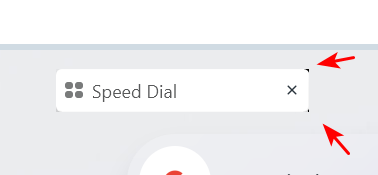
I can't drag tabs normally, like it worked all the time
If I put tabs before the [+] new tab button, then it will be attached. But if put after the new tab button, then it doesn't work.Also, there's some black rectangular background as it seems, for the draggable tabs

-
Beedjees last edited by
There is not space on top of browser window any more...
This space above tabs is very usefull to move the window without move only one single tab.
Please restore this space above tabs. (I even check this option in the browser settings) -
ohmanger last edited by
Great I think this fixes one of the crashes I was getting. Also interesting to see a referenced to python 2, I thought that was long dead!

-
andrew84 last edited by andrew84
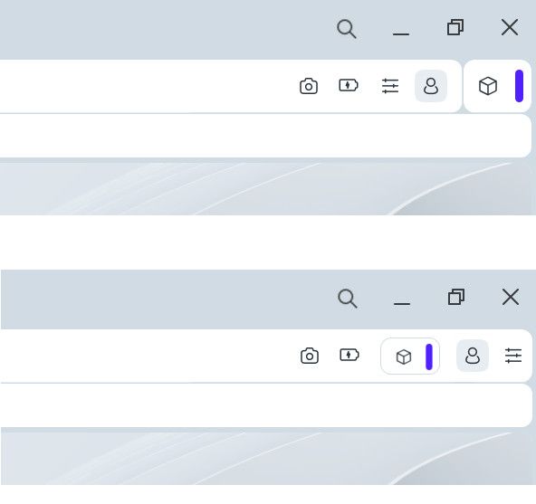
Integrate the Extensions island into the toolbar and place the EasySetup menu button on its usual place.

-
andrew84 last edited by andrew84
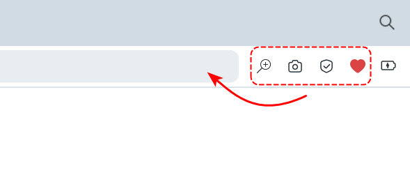
I'd prefer that the address bar icons stay in address bar like previously because the icons refer currently opened web page directly.
It's not clear why they're outside now and all together with the icons which refer the browser.

Edit:
*Maybe (to follow the modular design) this icons set could be also in the form of 'island' to expand/collapse it.
-
andrew84 last edited by
Why there's no option to completely disable the tab islands??
I thought that 'Automatically create tab island' toggle does the job, but after switching it off the islands are still creatable by dragging and hovering tabs. -
Argarth last edited by
There's space between the + icon and the magnifying glass to move the window, no matter how many tabs you have open.
-
Beedjees last edited by
@simcard78 This is a standard in all windows in all other software (on Windows)...
-
parduspars last edited by
Still I can't watch Twitter and Instagram videos. What can I do for this? Any solution? I' m using Linux Mint Xfce.
