Opera unveils Opera One, an entirely redesigned browser
-
firuz-u7 last edited by
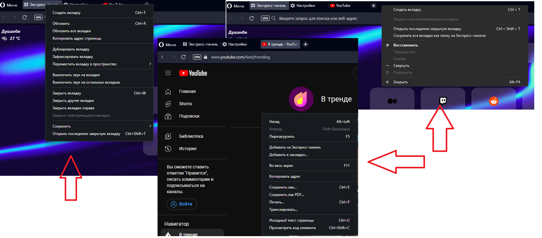
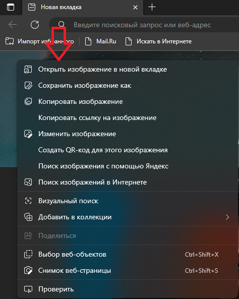
when you right-click in Opera One, the context menu is old and different everywhere, update to the windows 11 context menu!

Here is the context menu in the Edge browser

-
weilan last edited by weilan
I tried it and it's not better, it's worse:

This is a picture that shows the same webpage loaded in Opera one and in Brave. The comparison shows that the UI of Opera One takes much more real estate space than Brave, which results in less content of the page being visible in Opera One.
I think that the UI in Opera One is needlessly oversized for no reason and the tabs that look like floating buttons is ugly. Just because Firefox did it and Edge copied them, doesn't mean it's something that's good looking or better or more functional that you should copy as well.
Even if you are dead set to keep it that way, at least make the UI thinner and more compact so it doesn't waste so much space on useless things like showing the shadows of the tabs.
Also I found out due to the new tabs being "floating buttons", you can no longer click the topmost edge of the screen and select the tab, now you have to put in extra effort to click in the middle of the tab button.
This also applies for the scrollbars that now stand a few pixels away from the right edge of the screen so another muscle memory of clicking the rightmost edge of the screen to grab the scrollbar no longer works.
Honestly, I'm pretty disappointed with how these changes affect Opera. It feels like "change for the sake of change" to me rather than something that enriches the Opera experience.
-
DarthGTB last edited by
Is this new browser Chromium as well? I'd love to see some actual innovation and competition in the market
-
DarthGTB last edited by DarthGTB
If this is just another version in the same Chromium browser, this is pointless. A rebranding and new skin with same features will not win a lot of new customers... I'll still try it out though. I really hope for Opera to succeed. Very cool browser overall
-
idk-what-to-put-here last edited by
From the previews it looks like it's ultra animated win-11 style, and I read that it would be replacing normal opera, will I be able to stay on normal opera? Cause that ultra-animated style genuinely makes me sick. Otherwise I will just switch to Firefox or Yandex.
-
max1c last edited by
This is all great and all but you guys keep releasing concept designs like this and then abandon them. Or never implement the designs in main stream versions. I love Opera Touch navigation. But that browser isn't getting updated with new features and doesn't even have sync. Why would anyone want to use these concept designs when there is no future for them?
-
oP2 last edited by
@leocg: For some years until 2023, when one version of Chromium reached beta phase, opera dev was updated to it. Some times if lucky the dev build got the dev phase Chromium. Although, since this year the dev build gets the stable chromium versions. What happended? Besides, O99 has an earlier version of Chromium than O98, lacking security exploits fixes which are present in O98. How come?
-
edmarcio last edited by edmarcio
This will replace Opera and Opera GX? Or just be another product?
Edit - It seems like it will replace Opera... I will wait for the Stable branch.