With Opera One’s Multithreaded Compositor, your browser UI comes to life like never before
-
oes25 last edited by
The tab islands are much awaited for my part. But I like the implementation on Edge a lot better. Give us a wider handle that can be named. A little vertical line with just a color isn't really that great. I also idslike that the GUI now takes up that much more space. Try to at least make it somewhat close to as space efficient as normal Opera. Then there is the side-bar. It should be more customizable. My custom web-pages (without which I would not use Opera actually) for some reason has to be below the history and settings icons. If they could be besides the messaging and AI apps, that would be more acceptable.
-
rick2 last edited by
I'm on Linux (Slackware64 -current, KDE Plasma 5.27.4, X11) and I installed Opera One.
Copied about 15 URLs from Opera Beta to open in One.I open One, open new tab, paste URL, go, then open clipboard to select another URL, Opera One steals keyboard focus and I can't select the URL (up and down arrows scroll the browser window).
Very annoying behaviour, should I report a bug about it?
-
rick2 last edited by
@ironbone: from https://www.opera.com/download
Direct link: https://www.opera.com/computer/thanks?partner=www&par=id%3D61380%26location%3D424&gaprod=opera
-
ocirnes last edited by
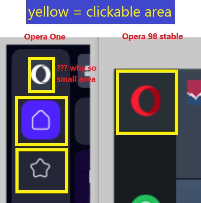
The clickable area of the Opera menu icon ist too small in contrast to other icons of the sidebar:

-
Rogue-River last edited by
Wait now. You had to create an entirely new branch of the browser just to implement tab stacks? GX users are still waiting for tab stacks.
-
weilan last edited by
If you ship the new UI like it currently is, you are doing a massive disservice to every Opera user.
The most basic of functionality is missing and it's unnacceptable:
- you can no longer drag the mouse cursor to the very top edge of the screen and select a tab (or middle click a tab to close it)
- you can no longer drag the mouse cursor to the very top left corner and select the Opera menu button
- you can no longer drag the mouse cursor to the very left edge of the screen and select the scrollbar
This is basic muscle memory that every user has because every other browser has this. What you are doing is borderline criminal.
I am a big Opera user and supporter, but if Opera 100 ships like this in Stable, I will uninstall Opera and tell everyone that I previously told them to use Opera to uninstall it too.
-
thelittlebrowserthatcould last edited by
@parduspars: from opera://about/ make a note of the install path. With elevated privileges, make a folder called lib_extra there and paste in a copy of libffmpeg.so with filesize of about 3 MB. You can obtain the file from several online sources, or from installations of Vivaldi or Chromium Web-browsers.
-
ldupak last edited by
How to add the current page to Speed Dials? No command in right click menu and CTRL+B is not working.
I cannot drag and drop opened tab to another window. It just create a new window. -
eilegz last edited by
Can we put the tabs below the address bar? thats one of the good old features of presto opera that i really miss and i cant deal with, from all chrome and its clones all the UI its the same and theres no way to put it as it should
-
Locked by
leocg


