Opera 94.0.4604.0 developer update
-
andrew84 last edited by
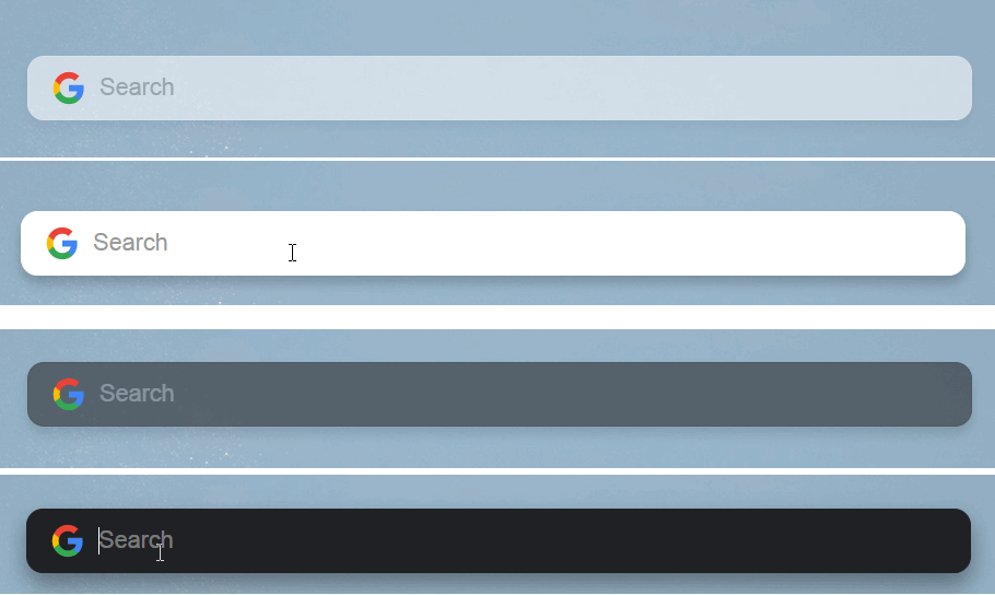
One more visual issue: while on start page and switching from dark to light theme, the search box flickers dark.

*Notice. Quite strange that you try to use semi transparent background for popups on redesigned start page (add site and edit tiles popups), but search box is still simply solid white in both light and dark themes.
Normally it could be semi transparent white/black in light/dark theme when not focused. Solid white/black when the search box is focused.
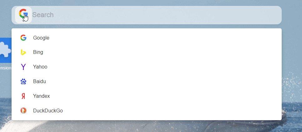
**And it'd nice to have a dropdown to select search engines(at least from the preinstalled list)

-
andrew84 last edited by
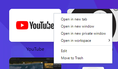
'Move to trash' doesn't work for tiles on start page.
Also, tile's menu suggests to open the tile in workspaces even if the workspaces feature is off.
*Make the flag #start-page-redesign visible to disable the redesign until it will be fixed.
-
pclaudel1 last edited by
@andrew84 My situation is worse. Ever since this update took effect, when I right-click on a tile in Start Page, I get no context menu. When I click on the settings icon in the upper-right-hand corner of a tile, I also get no context menu. When I followed the suggestion to make the flag #start-page-redesign visible, I found that no such flag existed under opera://flags. Now, the only way I can edit an icon or trash it is to open Bookmarks. This is not terribly onerous, but surely it doesn't count as an improvement or upgrade!
What's up?
-
andrew84 last edited by
@pclaudel1 the suggestion(requirement actually) regarding the hidden flag was addressed to Opera team.
-
pclaudel1 last edited by
The more I have to look at the redesigned Start Page, the more I dislike it. It's just so pastel-ridden and so damn "girly-looking" in its fussiness. Things that looked and worked just fine have been screwed around with for no discernible reason other than that someone wanted to change the "decor." Opera is supposed to be a browser for grown-up computer users, not frustrated interior decorators.
I'm going back to Opera Beta until someone with good sense takes charge at headquarters. When that goes pastel, then it's back to Stable. Then goodbye.
-
andrew84 last edited by
@pclaudel1 But I don't see here any changes, excepting the semi-transparent background for add a site and edit tiles popups.
Issues described above are just bugs, which are result of poor testing. -
pclaudel1 last edited by pclaudel1
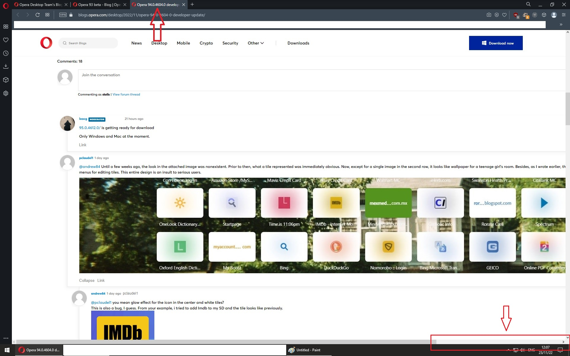
@andrew84 Until a few weeks ago, the look in the attached image was nonexistent. Prior to then, what a tile represented was immediately obvious. Now, except for a single image in the second row, it looks like wallpaper for a teenage girl's room. Besides, as I wrote earlier, there are no longer any functioning context menus for editing tiles. This entire design is an insult to serious users.

-
andrew84 last edited by andrew84
@pclaudel1 you mean glow effect for the icon in the center and white tiles?
This is also a bug, I guess. From your example, i tried to add Imdb to my SD and the tile looks like previously.

I have the same issue with some my tiles, youtube for example. Looks normal in the heart menu popup, but looks broken on SD page.
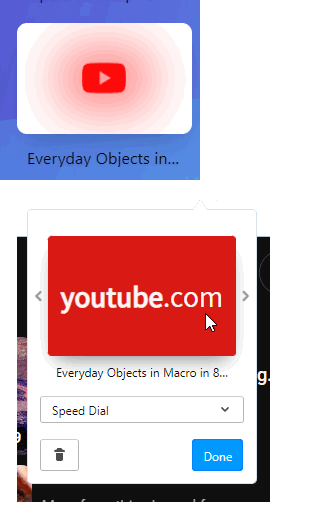
*I think they broke the default solid tiles, which are shown by default. If I select other thumbnails in heart menu popup using arrows, then tiles looks different.
When I select the default tile in heart menu I can see some 'empty' or not found icon on SD page during seconds, then it shows the glowing icons in the center. I think that's the reason.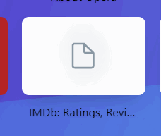
My guess is that it can't find the image and shows favicons instead -
andrew84 last edited by
@andrew84
@pclaudel1 Just check (open) all your tiles-bookmarks. I'm pretty sure images on your tiles will be equal to favicons shown on tabs. -
leocg Moderator Volunteer last edited by leocg
95.0.4612.0/ is getting ready for download
Only Windows and Mac at the moment.
-
Locked by
 leocg
leocg

