Opera 89 Stable
-
Opera Comments Bot last edited by
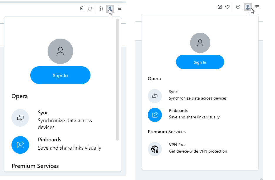
Hello Opera Fans! This summer we are happy to announce Opera Stable 89 which is based on Chromium 103. Improved Opera Accounts pop up With Opera Synchronization, you can synchronize your Bookmarks, History, or Settings between your Opera installations. In this release, we improved the pop-up for signing up and logging into Opera Synchronization. Go…
Read full blog post: Opera 89 Stable
-
andrew84 last edited by andrew84
- reduced [+] (new tab) button issues is not fixed
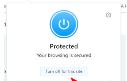
https://forums.opera.com/post/283335 - not correct vpn popup alignment is not fixed (the popup reacts on default page zoom in Settings) https://forums.opera.com/post/284645
- disappearing speed dial tab's closing cross is still not fixed (5 or 6 Stable releases in a row have this bug)

- reduced [+] (new tab) button issues is not fixed
-
A Former User last edited by
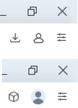
No need to use valuable space for the blue profile sync icon. Sync is a feature that users either have on permanently or don't use. Thus having this option in main menu is sufficient.
-
A Former User last edited by A Former User
Update also logged me out of Sync and reset opera://settings/syncSetup to off.
-
A Former User last edited by
63red.com still will not load here on Linux/Chromebook Desktop installation --> this problem began with Opera 88, actually -- just pointing out this continual problem (other browsers such as Brave, Vivaldi, and Google Chrome load this site fine as a comparison).
-
jojo0587 last edited by
Stable Opera finally has no problem with the large icon of its own search engines. But for me, some of them do not show icons. I'm not sure, but maybe the ones that used to have large icons.
My proposals for changes in Opera (Google Document).
- There are not enough signs to put all the links here. -
jojo0587 last edited by
The "Opera Account" button on the toolbar can replace/add Opera profiles function?
My proposals for changes in Opera (Google Document).
- There are not enough signs to put all the links here. -
andrew84 last edited by andrew84
I support the suggestion to hide the account icon if the sync. is not used.
Simply there should be a toggle (Always show account icon on toolbar) similarly to the one for 'battery saver'.

-
A Former User last edited by A Former User
@avmon said in Opera 89 Stable:
Can the Account button be removed if sync is not used?
Why should the button be there if Sync is used?
Totally unneeded. Sync is available from Menu.
Sync is not a function that people access on a regular basis, necessitating such a prominent and visible placement.
Users either have Sync permanently on or they do not use it.
-
andrew84 last edited by andrew84
By the way, in my opinion, the old icon (outlined style) looks better.
The new one is out of style a bit.


