Opera 74.0.3904.0 developer update
-
Opera Comments Bot last edited by
Hello everyone, We are going live with the new Opera Developer build, which is based on Chromium version 88.0.4324.27. We have enabled the #easy-files-more-files flag in this version and fixed a lot of small issues. Let us know how you like it! All the changes and improvements in this update are listed here. Installation links: Opera…
Read full blog post: Opera 74.0.3904.0 developer update
-
chas4 last edited by
Updating from Version:74.0.3897.0
The progress bar fails to show and gets stuck on Checking for updates… (the notification to restart to update shows tho)Why Open the Web?
Despite the connecting purpose of the Web, it is not entirely open to all of its users.
When used correctly, HTML documents can be displayed across platforms and devices.
However, many devices are excluded access to Web content. -
ralf-brinkmann last edited by
The user-unfriendly behaviour of the previous version in "Clear browser data" is still there.
https://blogs.opera.com/desktop/2020/12/opera-74-0-3897-0-developer-update/#comment-236211 -
andrew84 last edited by
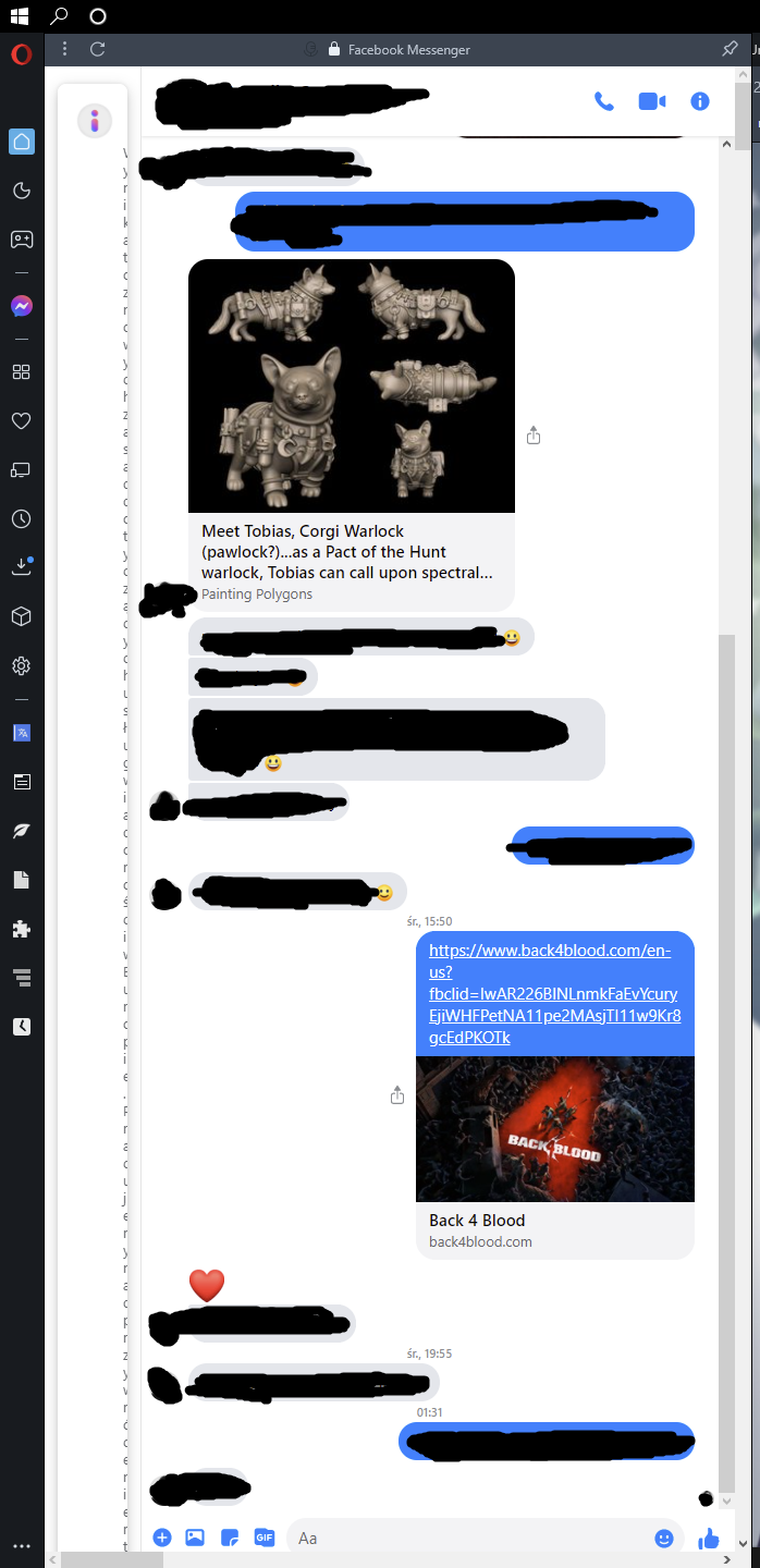
There's a still wasted space on both sides on the BABE https://forums.opera.com/post/235998
-
andrew84 last edited by andrew84
SearchTabs popup still closes after an active tab was removed https://forums.opera.com/post/236197
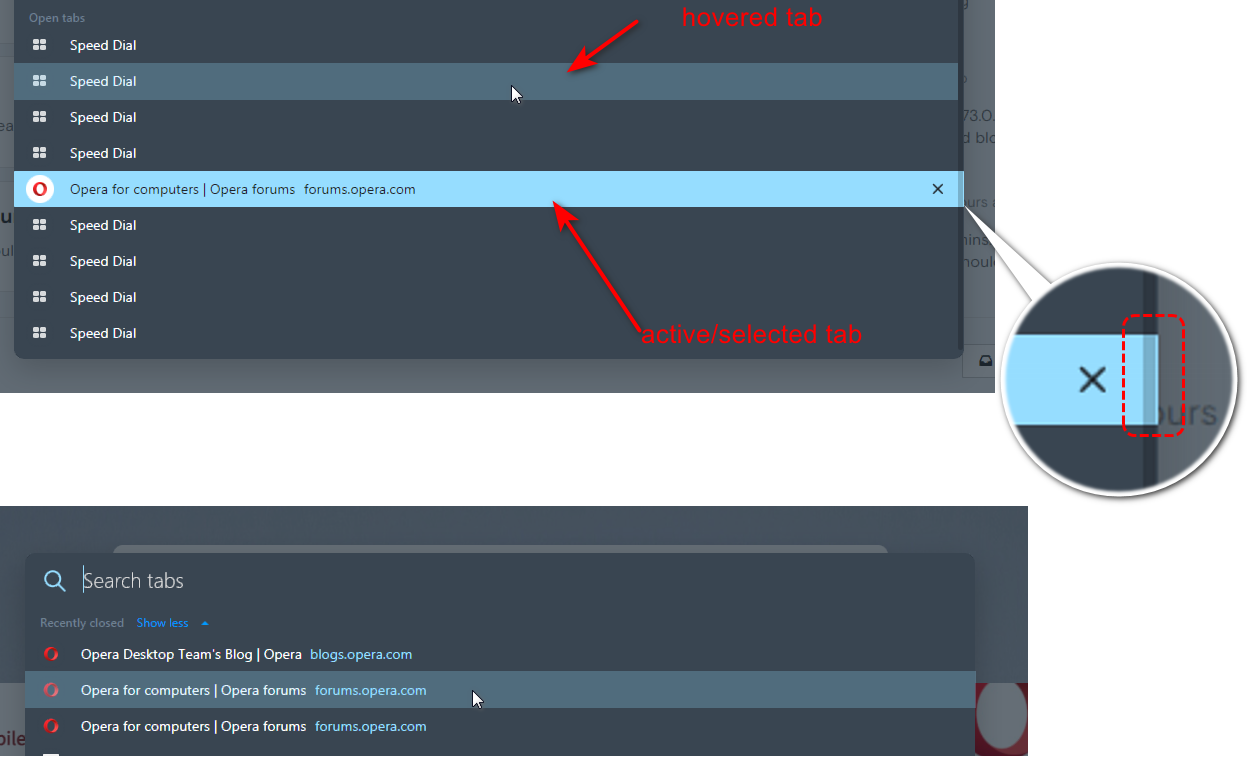
Despite of multiple reports you released it with incorrect behavior. After an active tab was closed the SearchTabs popup closes too. Previous TabMenu stays opened
https://forums.opera.com/post/233425

*The SearchInTabs popup was created to manage a lot of opened tabs. Let's assume that I want to close some tabs (for example Opera related), I search for 'Opera' and then I'm closing the tabs one by one. If the found tabs include an active tab, the popup will be closed too and I will have to open the popup and search again?
And why this happens only with active tabs.. I close background tabs and the popup stays opened.
I also think that active tab should be marked in the SearchTabs (highlighted or using bold text)
-
A Former User last edited by
Nihil novi sub sole, or old habits never die.
Snapshot is worthless as usual.

-
andrew84 last edited by
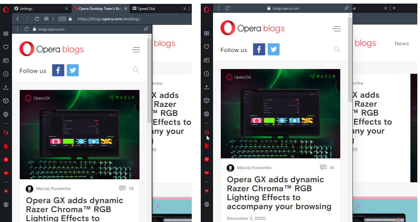
Make the unpinned sidebar panels to appear (like the EasySetup and sidebar setup panels do slide out) below the address bar (bookmarks bar), so tabs and address field is not overlapped. Also move panel's badge icon with address to the left.
-
A Former User last edited by A Former User
Hello,
Opera 74.0.3904.0 developer update is an interesting update it changes the UI which is more attractive than previous I suggest everyone use this update but the problem is mostly theme is dark please update some light theme
Thanks
Puneet -
A Former User last edited by
could you please stop closing (hiding) opera window on macOS when last tab is closed.. I used to browsing mostly in 1 tab.. and to go back to speed dials I just close the tab (I know about speed dials button.. but as I said I'm used to just close the last tab.. to make new speed dial page open.. on windows it goes just well.. on macos it just closed (hides) opera.. so I have to move cursor to my dock and open it again.. then I do forget this and "automatically" close tab.. and opera hides again.. just read some opera forum threads.. where users asking to add such behavior to windows.. but they just don't know what kind of bu.. pain it is.. you want to close last tab, to get new tab opened.. and instead it just closes the browser
-
A Former User last edited by
It is impossible to remove/edit speed dial entry, bookmarks is ok. I have tried with a blank version of this build with the same results, in case it was something else that cause this kind of problem.
-
A Former User last edited by
Some time ago I asked for simple thing -
Some vertical division lines on setting pages are not movableSee how Spotify works with such solution. Opera needs the polishing touches like hell.
[Fig. 1]
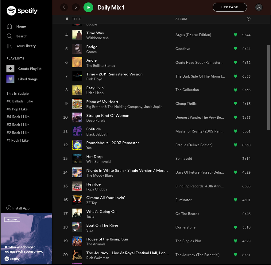
[Fig. 2]
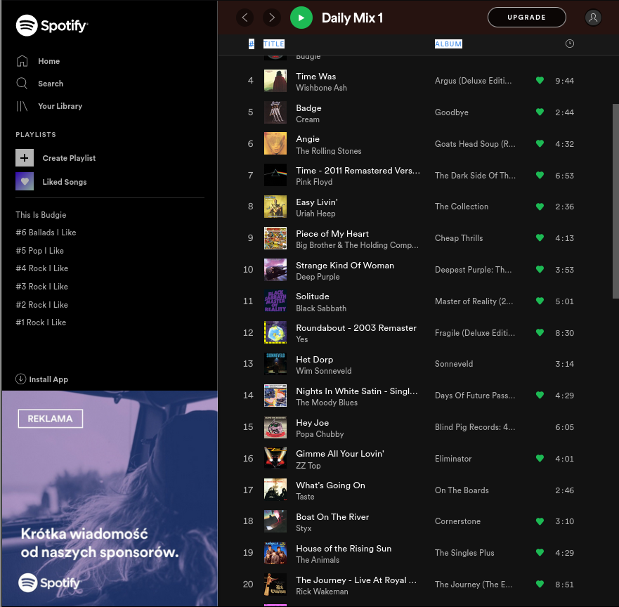
-
andrew84 last edited by andrew84
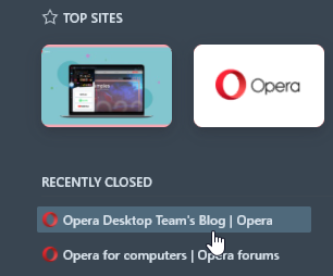
When opening the SerchTabs popup an active tab should be the highlighted light blue. When simply hovering tabs some less brighter blue color should be used (the same is with recently closed items). Maybe the same color which is currently used for items on the BABE (I think it will unify the UI).
In TabMenu an active tab was highlighted.*the highlighted box still overlaps scrollbar.
