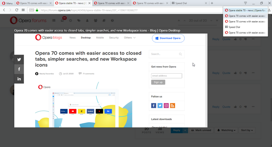
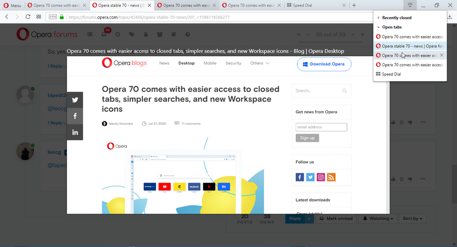
Opera 70 comes with easier access to closed tabs, simpler searches, and new Workspace icons
-
leocg Moderator Volunteer last edited by
@andrew84 Flags are made to be removed at some point, they are experiments as the page clearly says. When they stop testing the new feature, the flags is enabled on stable and removed, sooner or later.
Search in tabs allows you to see your recently closed tabs and, even better, search for them. -
A Former User last edited by
@leocg said:
In Opera developer you can see more. Maybe some flags needs to be enabled.
This tread is not about Opera Developer is it? We give feedback on the latest Stable version.
-
andrew84 last edited by andrew84
@leocg said in Opera 70 comes with easier access to closed tabs, simpler searches, and new Workspace icons:
and removed, sooner or later.
Yes, these are keywords.
Why sooner, but not later (when the feature will restore TabMenu functionality) like the many other flags that are not removed yet from Stable?
I'm pretty sure you're already tired reading and answering on a bunch of the same questions (where's TabMenu button, where's the flag, why only 3 closed tabs, how to revert back, how to block updates ). But if they like when users are stressed after each release and 'boiling' here in the blog/on forum, then probably the decision to remove the flag was correct
-
leocg Moderator Volunteer last edited by
@andrew84 Different people working on different features and, therefore, in their flags. Also, some features/flags may affect others, don't know, so they need to be kept for some time more.
And we should remember that flags are meant more for developers and not for regular users.
-
andrew84 last edited by andrew84
I never used Tab Cycler (Ctrl+Tab) because I dont't have many tabs opened at the same time, but I checked it in older version.
Unfortunately, there's another one downgrade. Previously Ctrl+Tab gave you a pretty big and clear 'Tab preview' in the center of the screen.

Now we have the useless tiles.
- By the way, the old TabMenu also had a 'Tab Preview' feature. No such preview in 'Search in tabs', I can't even close tabs within the 'Search in tabs' popoup
 .
.
I don't use sync. currently, but I just mention that TabMenu also had the tabs view from other devices if I don't mistake, the modern popup doesn't have that feature.
And you want to say that the 'Search in Tabs' is fully ready to use feature and more handy and functional than the old one, it's so stable and ready that it's time to remove the flag?
- By the way, the old TabMenu also had a 'Tab Preview' feature. No such preview in 'Search in tabs', I can't even close tabs within the 'Search in tabs' popoup
-
A Former User last edited by
@andrew84 said in Opera 70 comes with easier access to closed tabs, simpler searches, and new Workspace icons:
Maybe they removed the flag just for fun?
After reading all the negative comments regarding the 'Search in tabs' feature and that many users restored the original TabMenu they laughed (evil laugh) and removed the flag with the words: ' You think you clever enough to disable the flag and restore the TabMenu? Now try doing the same in 70 version, genius! '

Exactly.
-
A Former User last edited by A Former User
Opera Norway AS
You are making terrible changes. You are running the risk of many people (I include myself in this) moving to Firefox or Vivaldi.
-
sgrandin last edited by sgrandin
@sgrandin I submitted this as a bug, DNAWIZ-106411, and added screenshots from a couple of sites, but so far it's been blown off, specifically that I didn't wait long enough for the sites' pages to fully load in print preview. BS! So I've had to spend more time on this with screenshots, to make up for an Opera tech(s) not doing their job, or at least having the sense to ask the right questions first before drawing a conclusion.
But even were it were a matter of waiting for the site to load, it would still be a bug, since in all the time Opera has been using the current print module, pages and thus page numbers have never been slow to load.
With support like this, it's no wonder Opera's print module's UI design is so insensitive to users who need to print from it relatively frequently.
-
A Former User last edited by
In recent days I identified that the other browser (Sorry, I have to say it, edge) has a utility called collections.
It is the possibility of saving specific pages without the need to fill up with bookmarks.
Opera is going to incorporate something similar, for example called a wish list -
A Former User last edited by
@leocg It works more or less like a bookmark, but you don't fill your bookmarks bar with many links, for example, you want to buy some shoes, view several pages and see many options that you like, 20 or 30, with the collections you keep that there and not you modify your bookmarks, you don't leave 20 or 30 shoe link in your bookmarks bar. My friend uses edge and I saw that she used the collections ... and I found it interesting
-
asnobli9 last edited by
The reopening of the closed tabs only is now eliminated. The new version, where the opened and the recently closed tabs simultaneously seen is a nightmare. Before v70 the search-in-opened-tabs flag could be used to disable showing the opened tabs. Now it is not possible. Why was it necessary? It is an idiot "development".
-
A Former User last edited by
@asnobli9 said in Opera 70 comes with easier access to closed tabs, simpler searches, and new Workspace icons:
The reopening of the closed tabs only is now eliminated. The new version, where the opened and the recently closed tabs simultaneously seen is a nightmare. Before v70 the search-in-opened-tabs flag could be used to disable showing the opened tabs. Now it is not possible. Why was it necessary? It is an idiot "development".
You can't understand why Opera did this. Completely removed.
Please Opera, come back with the choice !!!