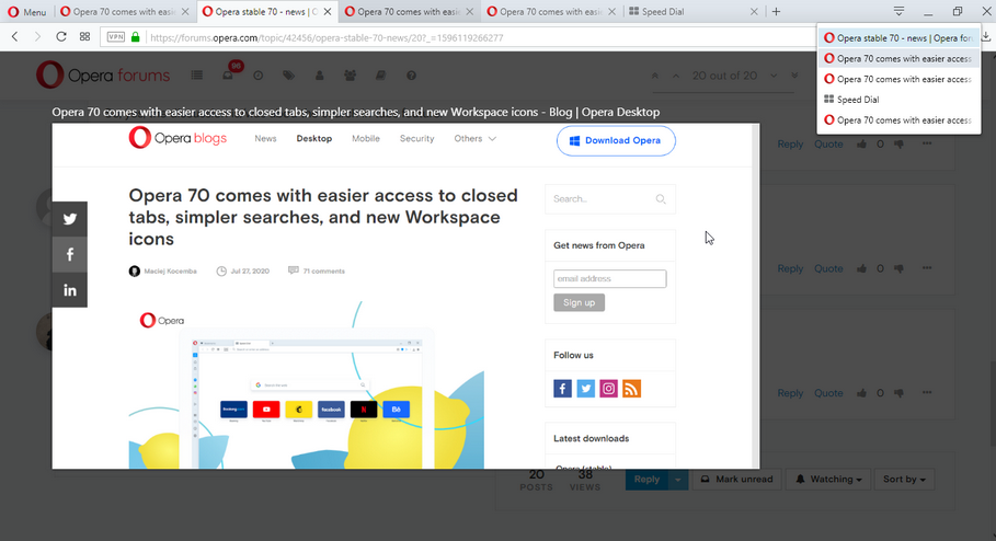
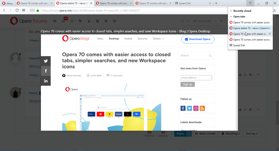
Opera 70 comes with easier access to closed tabs, simpler searches, and new Workspace icons
-
chawoobie last edited by
@chawoobie: I found that if I uncheck Protect me from Malicious Sites, I can access PNC just fine. Is this a bug or a new ""feature?" Never had this problem before this update to Opera 70.
-
leocg Moderator Volunteer last edited by leocg
@chawoobie Nome of them. The feature is kinda old and it's not a bug, the site was just included in one of the thir party databases used by Opera for the malicious sites protection feature.
-
leocg Moderator Volunteer last edited by
@chawoobie You can try contacting APWG to inform them that the site was wrongly added.
-
leocg Moderator Volunteer last edited by
@chawoobie It's up to you. If you feel that you don't need the feature, just leave it disabled.
By the way, you don't get an option to ignore the warning?
-
lillyanne last edited by leocg
@wagnerfilho89: @wagnerfilho89: I decided to restore version 69 and wait for the recent tabs feature, if they do bring it back at all.
Workaround: follow the instructions in this Opera Forums thread, the procedure is the same. https://forums.opera.com/topic/31873/solved-how-to-revert-to-opera-58/4
Make sure you have blocked auto-updater (Opera_AutoUpdate.exe) before you relaunch. Blocking instructions here: https://www.askvg.com/tip-how-to-disable-or-block-auto-update-feature-in-opera-web-browser/
When you relaunch Opera, check the version number. You should see version 69. Auto-update will attempt to connect to the Internet, but since you have blocked it, it won't be able to check for updates. You will instead see "An error occurred while checking for updates." Just ignore it.
Lastly, you want to disable the Search in Open Tabs experimental feature. Doing so will bring back the familiar Recently Closed dropdown list. Here's how:
- Type this in the address bar: opera://flags/#search-in-open-tabs
- Select Disabled
- Restart Opera browser.Hope this helps.
-
andrew84 last edited by andrew84
Maybe they removed the flag just for fun?
After reading all the negative comments regarding the 'Search in tabs' feature and that many users restored the original TabMenu they laughed (evil laugh) and removed the flag with the words: ' You think you clever enough to disable the flag and restore the TabMenu? Now try doing the same in 70 version, genius! '

-
leocg Moderator Volunteer last edited by
@andrew84 Flags are made to be removed at some point, they are experiments as the page clearly says. When they stop testing the new feature, the flags is enabled on stable and removed, sooner or later.
Search in tabs allows you to see your recently closed tabs and, even better, search for them. -
A Former User last edited by
@leocg said:
In Opera developer you can see more. Maybe some flags needs to be enabled.
This tread is not about Opera Developer is it? We give feedback on the latest Stable version.
-
andrew84 last edited by andrew84
@leocg said in Opera 70 comes with easier access to closed tabs, simpler searches, and new Workspace icons:
and removed, sooner or later.
Yes, these are keywords.
Why sooner, but not later (when the feature will restore TabMenu functionality) like the many other flags that are not removed yet from Stable?
I'm pretty sure you're already tired reading and answering on a bunch of the same questions (where's TabMenu button, where's the flag, why only 3 closed tabs, how to revert back, how to block updates ). But if they like when users are stressed after each release and 'boiling' here in the blog/on forum, then probably the decision to remove the flag was correct
-
leocg Moderator Volunteer last edited by
@andrew84 Different people working on different features and, therefore, in their flags. Also, some features/flags may affect others, don't know, so they need to be kept for some time more.
And we should remember that flags are meant more for developers and not for regular users.
-
andrew84 last edited by andrew84
I never used Tab Cycler (Ctrl+Tab) because I dont't have many tabs opened at the same time, but I checked it in older version.
Unfortunately, there's another one downgrade. Previously Ctrl+Tab gave you a pretty big and clear 'Tab preview' in the center of the screen.

Now we have the useless tiles.
- By the way, the old TabMenu also had a 'Tab Preview' feature. No such preview in 'Search in tabs', I can't even close tabs within the 'Search in tabs' popoup
 .
.
I don't use sync. currently, but I just mention that TabMenu also had the tabs view from other devices if I don't mistake, the modern popup doesn't have that feature.
And you want to say that the 'Search in Tabs' is fully ready to use feature and more handy and functional than the old one, it's so stable and ready that it's time to remove the flag?
- By the way, the old TabMenu also had a 'Tab Preview' feature. No such preview in 'Search in tabs', I can't even close tabs within the 'Search in tabs' popoup
-
A Former User last edited by
@andrew84 said in Opera 70 comes with easier access to closed tabs, simpler searches, and new Workspace icons:
Maybe they removed the flag just for fun?
After reading all the negative comments regarding the 'Search in tabs' feature and that many users restored the original TabMenu they laughed (evil laugh) and removed the flag with the words: ' You think you clever enough to disable the flag and restore the TabMenu? Now try doing the same in 70 version, genius! '

Exactly.
-
A Former User last edited by A Former User
Opera Norway AS
You are making terrible changes. You are running the risk of many people (I include myself in this) moving to Firefox or Vivaldi.