Opera 70.0.3701.0 developer update
-
andrew84 last edited by
Collection of bugs (many of them are not fixing during long periods):
- ugly dropdowns in Settings in light mode and flickering dropdowns in darkmode (since the 68 Developer version it's not fixed and as a result we have it in Beta now and soon in Stable, I guess) https://forums.opera.com/post/210304
- annoying and irritating flashbangs in dark mode (on start and while switching internal pages. The bug is also from the 68 Developer and as a result it's in Stable now) https://forums.opera.com/post/210703
- scrollable context menus (appeared in 69 Dev version, now it's in Beta already) https://blogs.opera.com/desktop/2020/05/opera-69-0-3679-0-developer-update/#comment-209470
- tab's indicator is visible through the foreground tab while dragging (on all channels) https://blogs.opera.com/desktop/2020/05/opera-70-developer/#comment-211355
- wrong alignment of bookmarks when expanding last folders on the bookmarks bar https://forums.opera.com/post/211823
- focused (highlighted red) closing cross after clicking 'cancel' on multiple tabs closing dialog (the bug is even on O58)
https://forums.opera.com/post/207319
Also, this dialog flickers white https://forums.opera.com/post/189575 (I don't want to mention how long it stays unfixed) - focused(highlighted) buttons in EasySetup after reopening the menu https://forums.opera.com/post/204635
-
andrew84 last edited by andrew84
@andrew84 By chance, I noticed in this post (https://forums.opera.com/post/189575) the DNA-81836 Light flash while refreshing history in the panel in dark mode
I checked it right now, whether the issue is back or it wasn't fixes, but there's a still white flash when I refresh Bookmarks/History panels.

P.S. Regarding the flashbangs/flickering, the last versions (68-70) are just horrible (at least here on Win8, maybe on Win10 which has the system dark theme it works smoother) -
andrew84 last edited by
DNA-86371 Add custom location to the weather widget
This is a reasonable change.
-
andrew84 last edited by andrew84
@andrew84: additionally, still white tooltips for bookmarks in bookmarks bar folders
https://forums.opera.com/post/201588
https://forums.opera.com/post/208489
Still weird visual style on Personal news page (excepting the expanding arrow which looks fixed).
https://forums.opera.com/post/201597 -
andrew84 last edited by andrew84
@andrew84 but '3 dots' are not visible in light mode.
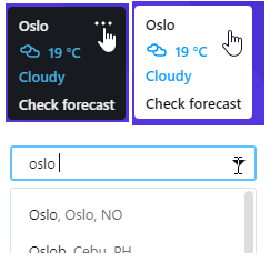
Also, the dropdown's reaction is weird when clicking arrow. No arrow or hand cursor for the dropdown's arrow icon. If I edit the location, it doesn't show suggestions (for example by typing 'Oslo' ->' , ' > 'space' it shows nothing, I must first delete the whole text and begin typing from scratch to see the suggestions list), also I can't close the dropdown by clicking arrow icon. -
ralf-brinkmann last edited by
@indiqazzz There is no "Show more". I'm back on disabling this tab feature.
W10x64, Operax64, bright background -
ralf-brinkmann last edited by
Auto-Completion of URLs in my speed dials or bookmarks does not work. When I type parts of any speed dial or bookmark into the address bar nothing happens. Opera does not search or find the associated page or URL.
W10x64, Operax64 -
indiqazzz last edited by
@ralf-brinkmann: There will be, so there's no necessary in your 'Only 3 recently closed tabs is not enough.'.
-
andrew84 last edited by andrew84
- DNA-86409 Optimize shared Start Page
It needs more optimizing to exclude the previously activated UI elements or fragments (opened folders/scrolled down page/expanded lists) visible for a moment when creating new tabs.

-
ghirahim last edited by leocg
In this Opera developer update we have added Recently Closed Tabs to the Search in Tabs feature.
Thank you, Thank You ! You finally listened to our feedback. Do it more often!
Edit: I noticed that I can only see 3 recently closed tabs. Why so little? Can we have a dropdown menu of more closed tabs? Please, change this.
-
ghirahim last edited by
@ralf-brinkmann said:
Only 3 recently closed tabs is not enough.
I agree completely.
-
andrew84 last edited by andrew84
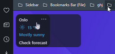
@andrew84 Also I'd prefer some semitransparent background (the same in both dark and light modes, similar to the '+ Add a site' tile) instead of solid white/black.
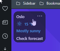
And more info can be shown, for example 'real feel', 'wind', 'uv-index'. The tile itself can be rectangular, not square (to fit more info).
-
andrew84 last edited by
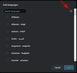
Scrollbar on 'Add languages' popup doesn't look great in dark mode. It seems that the magnifying glass icon is misplaced too (on all channels).
-
A Former User last edited by
@andrew84 said in Opera 70.0.3701.0 developer update:
DNA-86409 Optimize shared Start Page
After this change, there is a problem with the
opera://flags/#shared-start-pageflag being disabled. If you open any site, then the folders on the Speed Dial page will no longer open. -
andrew84 last edited by andrew84
@johnd78: I don't know if it's possible, but if bookmark (or search result) opens in current
speed dial tab, then the start page's visual state should reset (when flag is enabled).
