Opera 69.0.3645.0 developer update
-
andrew84 last edited by andrew84
-
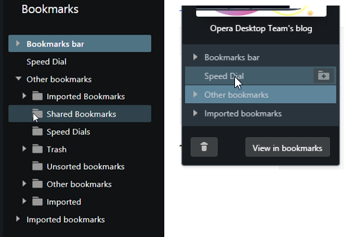
Comparing to Bookmarks internal page the 'heart menu' dropdown has a less clear text in dark mode (all channels). Ii's a bit hard to read the light gray text on light blue background (I was reporting it few times already).

-
Personal news page still has the visual issues https://forums.opera.com/post/201597
-
-
andrew84 last edited by
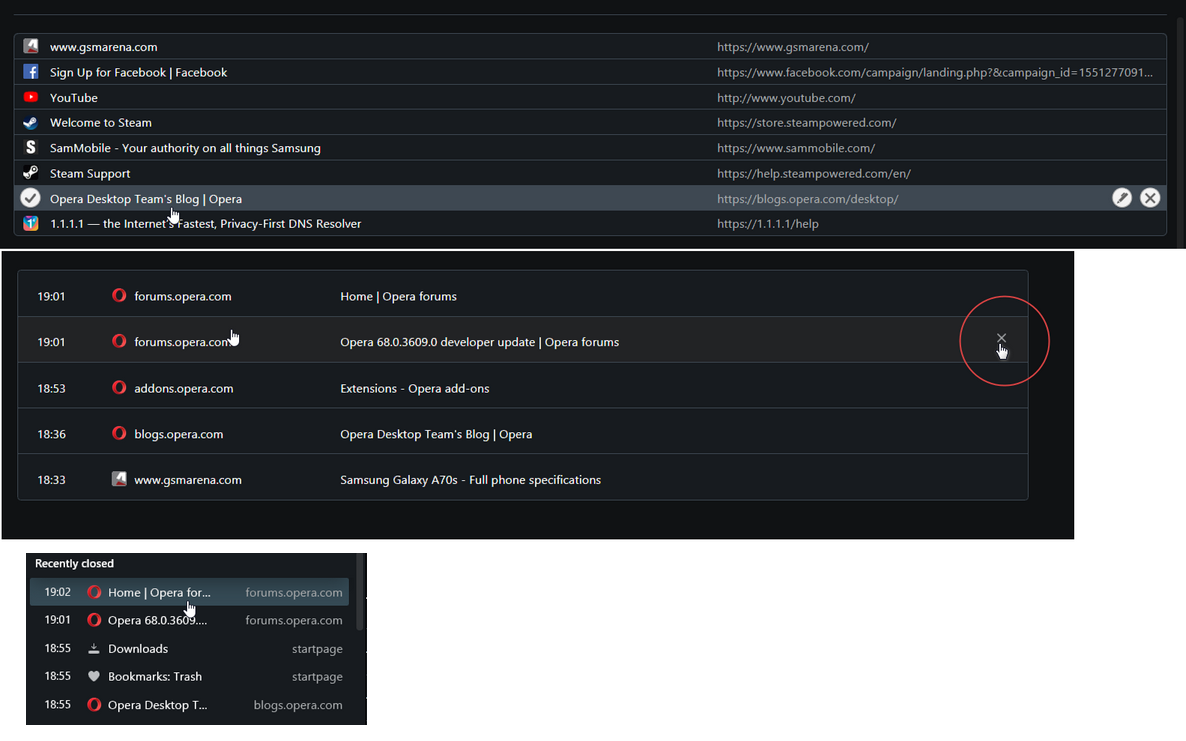
- Comparing to Bookmarks page on the internal History page there are dark gray selected items on dark background (at the same time highlighted items look correctly in the history sidebar panel). Also there's still no highlighting effect for the 'remove' cross. And History items need to be more compact (in height)

- Comparing to Bookmarks page on the internal History page there are dark gray selected items on dark background (at the same time highlighted items look correctly in the history sidebar panel). Also there's still no highlighting effect for the 'remove' cross. And History items need to be more compact (in height)
-
SilentHugOfDoom last edited by
where is instant search? why did you dropped it? are you going to replace it with a better feature?
Stable macOS • Online Portfolio
-
leocg Moderator Volunteer last edited by
@SilentHugOfDoom It has been replaced by search in open tabs since the beginning of Opera 69 cycle.
-
SilentHugOfDoom last edited by
@leocg what is search in open tabs exactly? how it works? I searched it in youtube but it shows instant search feature video. is there a source?
Stable macOS • Online Portfolio
-
leocg Moderator Volunteer last edited by
@SilentHugOfDoom better discuss it in the latest Opera developer topic. you can click on the icon at the top right or use Ctrl Enter to enable Search in Open Tabs, what was a feature of Instant Search already but is now being enhaced.
-
A Former User last edited by
@artexjay Indeed. This is annoying! I don't want Facebook, Google, or any other company that compromises my privacy, on the list of exceptions.