Opera 68.0.3609.0 developer update
-
emniss last edited by
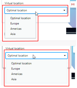
What happend to the Asian VPN location in 68.0.3609.0? Is it no longer available?
-
andrew84 last edited by andrew84
Make VPN's location dropdown to be wide as previously.

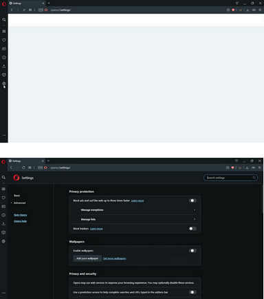
The white flashbang for Settings/Extensions page in dark mode is still not fixed. I can see it every time I open Settings or Extensions pages.

-
emniss last edited by
@andrew84 said in Opera 68.0.3609.0 developer update:
Make VPN's location dropdown to be wide as previously.
Thanks, meanwhile it's back again. The moment I postet, there were only three locations available in the drop-down menu (optimal, Europe, Americas).
-
ralf-brinkmann last edited by
Are there any new tricks how Opera can keep the connection to Cloudflare as standard DNS server (with Opera only)?
I can do what I want, after a while it switches back to my old standard DNS server without DNS-over-HTTPS encoding.
W10x64, Operax64 -
andrew84 last edited by andrew84
Suggestion.
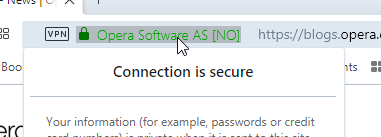
Please remove or make the highlighting for the address bar 'lighter' blue. Currently that solid light blue background looks almost the same as sidebar or toolbar, it should be 2 times lighter blue (or 2 times more opacity) and should differ from sidebar/toolbar backround.

Also, the whole browser uses light blue color accents, but address bar items are still highlighted gray, it looks weird. Some light blue/opacity combinations should be used in my opinion, instead of gray.


-
paradox96 last edited by paradox96
@paradox96 said in Opera 68.0.3609.0 developer update:
This is my 5th report of this bug throughout the year, but still not fixed

-
A Former User last edited by
@andrew84: yes, I can confirm this
It takes around 4-5 seconds to render search results, plus couple of seconds until panel gets responsive
same for closing search (click on X in search form)
also, opening folders with larger number of bookmarks is delayed about 1 sec -
andrew84 last edited by andrew84
Workspaces suggestion.
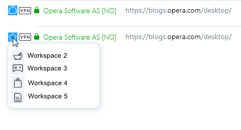
Indicator in address bar when sidebar is hidden (will be useful for users who don't use the sidebar and will use shortcuts to switch workspaces)

Update:
there could be a popup with workspaces choice also when clicking on that indicator.

-
yamierite last edited by
DNA-84410 [Win/Lin] Replace Tab Menu functionality with Search in Open Tabs
So you removed the only feature I used Opera for? nice
-
A Former User last edited by
@yamierite said in Opera 68.0.3609.0 developer update:
DNA-84410 [Win/Lin] Replace Tab Menu functionality with Search in Open Tabs
So you removed the only feature I used Opera for? nice
Please don't rid Opera of it's brilliant Tab Menu ... oh, it is so special in FullScreen Mode!
-
A Former User last edited by
How to revert DNA-84410?
Some questions to the developer - you know that millions of people are using opera. And - there I'm absulutely sure - there are a lot of Users wich loves and uses the functions.
Also I do understand that you want to devop your product further - but why do you have to remove such/any functionality/buttons?
Why dont you make it configurable?Its great you have new Ideas - offer them and the user may use them. But dont force them removing good practice!
-
woyjuq last edited by
Why close Recently opened pages feature ? its helpful, and we need Screenshot function please
-
ralf-brinkmann last edited by
@andrew84 That works, but I would like to know: What is this "Search in open tabs"? I don't find anything about it in the help file.
-
leocg Moderator Volunteer last edited by
@ralf-brinkmann It's kinda the replacement of Instant Search. It allows you to find an specific opened tab . Or should, at least.
-
andrew84 last edited by andrew84
@ralf-brinkmann I don't know. Maybe to search tabs among all currently opened tabs in all workspaces.
But for me it will be easier to manually reopen website that I need instead of searching it in opened tabs.*As I mentioned earlier (https://forums.opera.com/post/200118), they could just redesign the TabMenu for better view of currently opened tabs, leave 'recently closed' section in place and add search for both 'opened' and 'recently closed' tabs.
But they added cycling tab menu (Ctrl+Tab) instead that I will never use. It's difficult to imagine how I will press Ctrl + Tab Tab Tab ... to activate some tab if I have 30 tabs opened for example, I want using my mouse.
And now they added one more popup for opened tabs that is similar to cycling popup actually.
Two useless features in my my opinion, both are less functional than TabMenu. I just want quickly view my opened/recently tab by doing one click, without any dimming effects and searches/pressing keyboard keys many times. -
ralf-brinkmann last edited by
@leocg What again was this "instant search", that I never used and never needed? And how should this and the new tab search work?
-
A Former User last edited by
@ralf-brinkmann Press the Instant Search icon in the sidebar -OR- press Alt-Spacebar to find out!
 It's very nice!