Opera 67.0.3575.28 beta update
-
A Former User last edited by
@leocg:
I believe that Opera Neon would be a new option to the regular Opera. Like Opera GX. -
andrew84 last edited by andrew84
Apply the fix for the bookmarks bar dropdowns (address bar overlapping and no scrolling in subfolders) before the moment Beta hits Stable.
https://forums.opera.com/post/196071It looks fixed in Developer version a piece time ago.
Most probably these:
DNA-84061 Expanded bookmark menu overlaps the whole toolbar
DNA-84056 Submenus are not scrollable -
A Former User last edited by
@treego said in Opera 67.0.3575.28 beta update:
@thegeneral Oh, no! I love the Instant Search!
It's beautifully elegant!
Very visually appealing.
I would really miss it.
I love how it shows search results in a new tab, also, when clicked upon.
-
johnston5129 last edited by
still no video pop out for twitter /netflix/prime the list goes on why cant you make the pop out on every video like vivaldi just did???????????????????????
-
andrew84 last edited by andrew84
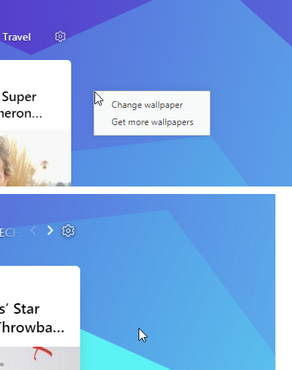
- There's no right click menu on start page when clicking on the background in News section. On all channels. In O58 version context menu exists.

- News still do not work in Private mode.
- There's no right click menu on start page when clicking on the background in News section. On all channels. In O58 version context menu exists.
-
alexs last edited by alexs
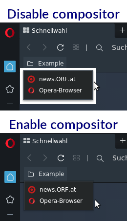
Bug when disable compositor on Linux. Viewed in the folder in the bookmarks bar.
A long time ago under Opera Presto the same bug was fixed later (Ruari?).
Siduction (Debian/sid) with Xfce/64bit

-
A Former User last edited by A Former User
Hi @alexs, it's known (returning) issue - you can find more info here.
-
johnston5129 last edited by
@johnston5129 still no video popup for TWITTER is anyone at opera even listening???
-
mikerobinson last edited by
How do I get back to the old tab switching behavior? This mini thumbnail thing is utter garbage compared to how it was before.
-
mikerobinson last edited by
Ok, I found it. Go to opera://flags/ and find "Use horizontal tab cycler" and disable it. You're welcome.
Opera devs: This has to be the worst change you guys have made in a very long time.
I used to get a full screen view of the web page instead of a tiny little thumbnail that I have to try to squint to figure out what it is. Switching tabs shouldn't require much brain power.
I used to have a nice vertical list of all of the tabs with their icons and name, whereas with the new switcher, since they're all spread horizontally across the screen, it is not as quick to look at just the icons as when they're tightly stacked on top of each other. For example, if I want to switch to Youtube, I'll look for the red icon first, and then the text second if I have several Youtube tabs open. As it is now, I have to look across the whole screen just to look for the icons from only a few websites, and the tab that I'm after might not even be displayed.
With the old switcher, I could have 20+ tabs displayed in a nice vertical stack, and quickly mouse over them if the tab is far down, whereas with the new switcher you get, what, five?
And with the new tab switcher, if I want to cycle forwards a few tabs and then back to the original one, it's also a lot harder to do because it's almost impossible to tell what the first tab is, whereas before, the top tab is the current tab. End of story.
I'm sorry to complain. I know you guys have put a lot of work into this, but it just has terrible functionality.
-
albert71292 last edited by
After this update, the "Smart" and "Funny" icons above the comments on Fark.com are no longer clickable. They worked fine prior to this update, and they still work fine in other browsers.
-
burnout426 Volunteer last edited by burnout426
@albert71292 Where are the icons at exactly? And, do you have to have an account and be logged in to see them?
