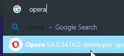
Opera 66.0.3475.0 developer update
-
andrew84 last edited by
'Heart' popup is affected by PageZoom in Settings, but it shouldn't(for example I set 125% in Settings and the popup is also large).
*The same with History/Bookmarks sidebar's panels. I think they shouldn't be scaled by PageZoom option in browser Settings and must look as EasySetup panel. I'd prefer some dedicated zoom option for the panels.
-
angrypenguin last edited by angrypenguin
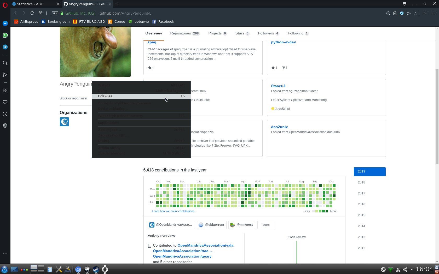
@intek13x Same here in Linux version with dark mode.
@kmielczarczyk can you look at this?
See here:

-
andrew84 last edited by
Dark mode is still broken in private windows (now it looks even worse than in previous build most of the UI text/buttons are just unreadable). Also, it seems that EasySetup's 'show sidebar' and 'show News' toggles don't work in Private window.

-
A Former User last edited by A Former User
-
When you click on "Clear Browsing data" located in "History" in "Sidebar," we go to opera://settings/clearBrowserData
but the side panel does not close automatically.
https://drive.google.com/file/d/1Us8RfHzWYqik3IZyNjMWr7hiJVm1wQhk/view?usp=sharing -
Ctrl + scroll the mouse wheel still does not change the scale on Speed Dial
(This works well on Opera Stable 64.0.3417.61) -
When you add a bookmark to any section except "bookmarks Bar", opens "bookmarks Bar" for a second"
-
-
andrew84 last edited by
bug with invisible area of the silm 'Add a site' tile is still there on all channels.

-
andrew84 last edited by andrew84
Bug.
The search phrase in first row is unreadable in address bar dropdown(in both light and dark theme) if the cursor is away.

Edit:
Also, selected item shouldn't have white text on light blue background, I guess. In 64 it looked in in the other way.

-
ralf-brinkmann last edited by
"DNA-80584 Closing active tab – the last active tab should be shown" still does not work if the active tab was opened by clicking a link in an external program (e-mail client, usenet client, external pdf-reader ...). Instead the focus goes to the last tab on the far right.
W10x64, Operax64 -
firuz-u7 last edited by
When you want to add a bookmark and click to select the folder appears two scrolls and you have to scroll to find the button is ready:
Please fix it.
Note:
You need to have more than ten sub folders to appear two scrolls.
https://imgur.com/WbCdASo
https://imgur.com/8a2sQfGAnd Will 2 sidebars be combined in Opera like Opera GX?
https://imgur.com/undefined -
burnout426 Volunteer last edited by
@firuz-u7 said in Opera 66.0.3475.0 developer update:
When you want to add a bookmark and click to select the folder appears two scrolls and you have to scroll to find the button is ready:
Mentioned the poor design to Opera. Hopefully they will make it better.
However, do note that you don't have to click the done/ready button. The bookmark is saved automatically when you click the heart icon. Clicking a different folder just moves it (automatically). All the done/ready button does is close the dialog, which you can do the same by just clicking outside the dialog. As in, the done/ready button is just a "close dialog" button that you don't really need to see.
-
firuz-u7 last edited by
@burnout426 said:
@firuz-u7 said in Opera 66.0.3475.0 developer update:
When you want to add a bookmark and click to select the folder appears two scrolls and you have to scroll to find the button is ready:
Mentioned the poor design to Opera. Hopefully they will make it better.
However, do note that you don't have to click the done/ready button. The bookmark is saved automatically when you click the heart icon. Clicking a different folder just moves it (automatically). All the done/ready button does is close the dialog, which you can do the same by just clicking outside the dialog. As in, the done/ready button is just a "close dialog" button that you don't really need to see.
Это понятно но дела привычки и еще когда хочу папку выбрать прокручивать очень не удобна потому что есть две полосы прокрутки и иногда один прокручиваю иногда другой.
https://imgur.com/WbCdASoИ у Opera GX обе боковые панели объединены а в обычной Opera надо открывать вторую боковую панель чтобы использовать расширения для боковой панели .
https://imgur.com/undefined -
firuz-u7 last edited by
@burnout426 said:
@firuz-u7 said in Opera 66.0.3475.0 developer update:
When you want to add a bookmark and click to select the folder appears two scrolls and you have to scroll to find the button is ready:
Mentioned the poor design to Opera. Hopefully they will make it better.
However, do note that you don't have to click the done/ready button. The bookmark is saved automatically when you click the heart icon. Clicking a different folder just moves it (automatically). All the done/ready button does is close the dialog, which you can do the same by just clicking outside the dialog. As in, the done/ready button is just a "close dialog" button that you don't really need to see.
This is understandable, but it’s a matter of habit, and even when I want to select the scroll folder, it’s not very convenient because there are two scroll bars and sometimes one scrolls sometimes the other.
Https://imgur.com/WbCdASoAnd Opera GX has both side panels combined, but in regular Opera you need to open the second side panel to use extensions for the side panel.
Https://imgur.com/undefinedSorry, I wrote in Russian
-
andrew84 last edited by
@burnout426 said in Opera 66.0.3475.0 developer update:
done/ready button is just a "close dialog"
I thought this is a chromium's limitation and can't be changed, but in Vivaldi it works logical/correctly: if I don't press 'done' button, bookmarks won't be added.
-
firuz-u7 last edited by
@leocg said:
@firuz-u7 English here please
This is understandable, but it’s a matter of habit, and even when I want to select the scroll folder, it’s not very convenient because there are two scroll bars and sometimes one scrolls sometimes the other.
Https://imgur.com/WbCdASoAnd Opera GX has both side panels combined, but in regular Opera you need to open the second side panel to use extensions for the side panel.
Https://imgur.com/undefinedSorry, I wrote in Russian
-
spiryts last edited by
Finally, we have one side bar, thank you, so can I have hope for option to move it on the right side ?, and, can something be done with "wyślij do mojego flow" to make it shorter.