Opera 132.0.5898.0 developer update
-
 Opera Comments Bot last edited by
Hello! Opera developer new update is now available – version 132.0.5898.0. What’s new and fixed? For a full list of changes check out our changelog. Happy browsing! Installation links:
Read full blog post: Opera 132.0.5898.0 developer update
-
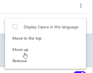
andrew84 last edited by andrew84
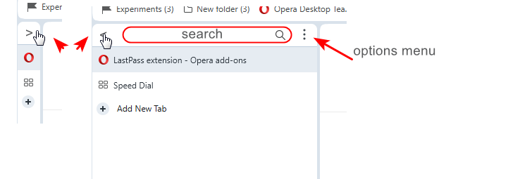
I'm not sure that removing the tabstrip while in vertical tabs mode and putting OMenu and window control buttons on the same level was an good idea.
*I'd better put the full page name in the center of the tabstrip and integrated the search field (with show /hide quick toggle ) directly into the vertical tabs panel and left the SearchTabs button on its current place.
So now if the vertical tabs pane is narrow the search tabs button is not visible at all.
The built in search field would filter tabs in real time while typing.**And still the vertical tabs panel should have the auto hide mode (like the sidebar) so when hovering over the narrow pane (favicons only) the pane should expand. Also there should quick action button to quickly collapse to narrow mode and to quickly expand to previously defined width panel (instead of manually moving each time).
The new tab button could be placed below the tabs and the quickly show/hide button can placed instead of the current new tab button.
-
andrew84 last edited by andrew84
There were again some changes to the tabs visuals?
The 'three levels' highlighting effects (inactive tab, hovered inactive tab, active tabs) was a lot better.
Now hovered inactive tab looks the same as active tab with round corners.
But the vertical dividing lines make its right and left edges look cut
It's better not to duplicate the shape for the hovered inactive tab but simply use a bit darker highlighting effect without shape.
-
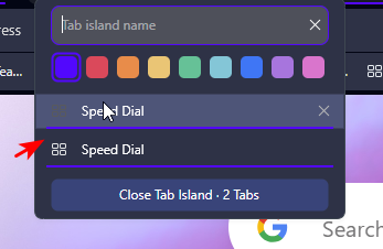
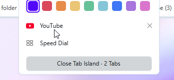
In dark mode island is hardly visible, it's almost as dark as inactive tabs.

-
in island's dropdown the duplicate underline intersects with the highlighting box an thus looking blurry.
-
in light mode there's still no items highlighting in this dropdown.
-
Also in Setting there's still no items highlighting.
In overall, I don't understand why is need to use so small tabs.

Tabs could go narrow if islands are created but if there's no island almost the full height of the tabstrip should be in use. Currently the part used for the shadow effect at the bottom is too big.
-
-
LALuseeen last edited by
All many users have wanted for about 10 years is the ability to turn off download notifications. Can you get that done for us, Please?
-
-
beboss last edited by beboss
I'm running into a frequent issue when switching between Workspaces. The mouse cursor position doesn't match the actual clickable area of the page. I often have to move the mouse slightly (usually downward) to click the correct element, even when the cursor visually appears to be over it. This is especially noticeable on buttons and text fields with hover effects.
Example:- I'm in Workspace 1 and copy some text.
- I switch to Workspace 2 (or 3, 5, etc.).
- I try to click into a text box to paste — but the click registers somewhere else.
This happens very often when I switch Workspaces. It feels like the page hasn't fully resized/rendered to the window yet, so elements are temporarily (or sometimes persistently) offset from where they should be. Sometimes I can even see the page snapping into place after switching.
Environment:
- Mac Mini M2
- macOS 15.7.7 (24G718)
- External monitor: HP Z27k G3, 27" @ 3840x2160
Opera version: always updated and this issues has been for a while
I use 5–6 Workspaces and switch between them constantly, so this is quite annoying. Would be great if this could be fixed.
-
LALuseeen last edited by
@SiMcarD78 it causes an issue that causes macOs to continuously switch from any other app to Opera every time a download completes, which means you're constantly interrupted in the middle of whatever you're doing.
-

-
LALuseeen last edited by
@leocg Imagine if apple had to add in custom controls and functions for every app that had annoying quirks... It just isn't very practical. It makes more sense for devs to implement changes to their own software based on user feedback - And users have been asking for this one from Opera for 10+ years
-
leocg Moderator Volunteer last edited by
@LALuseeen There could be only one control, to allow or not allow a app on the background to be sent to foreground and a list of exceptions.
-
leocg Moderator Volunteer last edited by
@LALuseeen Maybe there never have been enough demand for it.
How many downloads people do daily for it to happen often enough to be a problem? How many of those downloads take that long to even allow you to start something on a different app? -
Locked by
 Opera-QA-Team