Opera launches Opera One R2 – the best Opera Browser to date
-
max1c last edited by
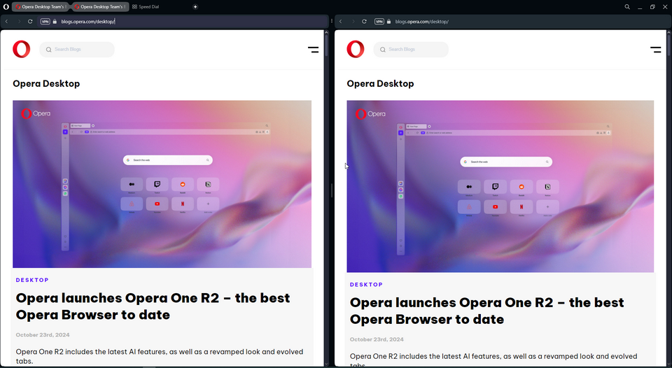
@daria19: I understand that this is intended. But it breaks immersion when using the browser and even in full screen the border is larger than other browsers. It's also taking up a significant amount of space when you have multiple windows opened side by side. I believe this was introduced with Opera 100. Before 100 it was significantly smaller.
-
HealingCross last edited by
@daria19 As I'm getting used to the new version, I really appreciate it. It's the best looking browser with the most handy features for me. Thank you very much.
-
andrew84 last edited by
@max1c said in Opera launches Opera One R2 – the best Opera Browser to date:
turn it off in Edge?
by turning off 'Try the new look and feel of Microsoft Edge' toggle in Settings.
-
andrew84 last edited by andrew84
The thick border (central) also looks bad in split screen mode.

Also, when trying the split screen feature I discovered that there's almost no progress regarding the usability and still far behind the Edge's split screen mode.
- why there's no bookmarks bar visible?
- creating split screen by dragging is still bad and is need to be very precise to not create the screen accidentally (so need to keep the setting off)
- why the 3 dots menu has no indication on hover?

- why the auto-hide sidebar is not of the same height like in regular mode and overlaps the toolbar?

- why the auto-hide appears each time I touch the separating vertical border?
- why I can't simply click somewhere 'x' to exit split screen mode.
- why the highlighting box shape is different while in split mode and looks stretched vertically?

-
ddvddv last edited by
Bring back the 'Force dark theme on pages' button in 'Easy setup' ... as it was .
-
andrew84 last edited by
@andrew84 can add more
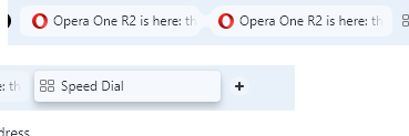
8. how active 'split group' looks vs active tab. Split tabs have no shadow effect.

- For example I'm on 1st split screen. After right clicking inside the address field on the second screen and selecting 'paste and go' the web site will open in the 1st screen. So split screen doesn't get focus when clicking on the address field.
-
andrew84 last edited by andrew84
@ddvddv Indeed.
The 'EasySetup' is not so easy anymore.My suggestion would stay the same.
There should be a switch in Settings 'Enable themes'. So when switched off the EasySetup (and the rest UI) should look and function exactly like previously. Only those who like playing with themes should suffer. -
andrew84 last edited by andrew84
As for the mini player, I see two flickering cursors (hand + arrow) simultaneously while moving inside the player.
And the player still can't be attached anywhere like it was shown on your demo (https://forums.opera.com/post/354720).*And on the video pop-out the volume level is still adjusted vice versa. Increases from top to bottom (nonsense).
-
raphaelbm last edited by leocg
Is this a stable update?. It has not been labeled stable when it should be. Please fix this asap.
thx Raphael -
andrew84 last edited by
the floating modules for your music & video content feel smooth and responsive. You can move these modules around your screen, or even across multiple screens, and resize them to your liking. This takes Opera One R2’s modular design concept to a whole new level
I believe I was able using the floating video pop-out ~10 years ago, moving and resizing it. The only difference I see now is the pop-out's interface is spoiled with this full screen dimming, overloaded with all these buttons and not so informative as previously.
-
raphaelbm last edited by
@raphaelbm: There having been no reply yet...
My search for STABLE releases is https://blogs.opera.com/desktop/category/stable-2/
This page does NOT SHOW this release.
Please fix this page to include the STABLE tag so that it is visible.
This page to be fixed is at:
https://blogs.opera.com/desktop/2024/10/opera-one-r2-the-best-opera-browser-to-date/Again, thanks for looking. Fix this asap// Raphael
-
ddvddv last edited by
Setting the theme is making once (or twice) then no need to make changes no more. "Forcing dark theme" could be use at any time (if you want and if it's in comfortable place) for every different page you visit... so bring back as it was.
-
andrew84 last edited by andrew84
@ddvddv it's strange. Today I was complaining in Dev thread https://forums.opera.com/post/362948that there's no toggle in Settings (see screenshot). But now I see the switch.

-
andrew84 last edited by andrew84
@leocg for some reason I see it now in Settings without smth. editing.
Edit: I was able to reproduce the glitch. Enable Classic theme and select light mode in EasySetup, then open Settings page and select dark in 'Apereance' section so no 'force dark theme' toggle visible. After refreshing the Settings page the toggle appears.