Opera One R2 introduces dynamic Themes
-
lu-fi last edited by
Everything looks great.All I miss is the ability to add my own wallpaper to fill the screen like in aurora mode.
-
spootch last edited by
hello support, i noticed a bug in the browser settings rlated to AI aria services, exactly the text prompt, even when its disabled, it keeps showing in text for example when i chat in messenger it keeps covering the text im writing i tried disabling it but, it wont
-
burnout426 Volunteer last edited by
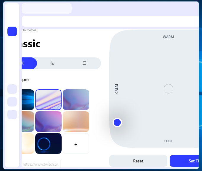
I see the Edit theme page doesn't support scrolling. For example, if you shrink Opera's window and try to edit a theme, you get this:

-
daria19 Opera last edited by
@burnout426: Hello! Yes, resizing the content on the mixer page is not supported for now.
-
burnout426 Volunteer last edited by burnout426
@Danio9900 If possible, it would be best if the classic theme's default colors could match Opera Stable's colors exactly. In Opera Stable (light mode) the color is grayish. In developer with color themes, it's too pastel and light-purplish. The tooltips when hovering over buttons on the address bar and extension bar are purplish too.
Also in developer click in the address field doesn't darken the fields background like in stable.
-
tastodd last edited by leocg
@burnout426 Yes, I would like the color scheme in the classic theme to fully correspond to the one that is now the default. And those who want to change the colors to suit their preferences will already use the fine-tuning of colors
-
max1c last edited by
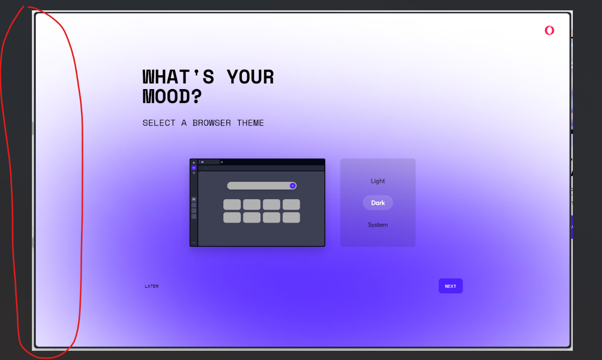
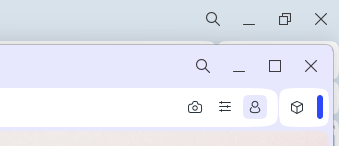
Is there a way to get rid of the border frame around the content? There is no practical use for this. It obstructs the content, looks ugly, and un immersive. In addition, it has an issue with multiple monitors where you can accidentally drag/resize the window on another monitor while interacting with the side bar or content on the page close to the edge of the browser.

-
balbert last edited by
@Danio9900
It would be great to introduce a "System" mode preset that switches to "Polar Wind" in system app light mode and "Aurora" in system app dark mode. Perhaps we could rearrange the order to have "Light/Dark/System" at the primary level, with Dynamic and Classic options underneath? And it appears that the dynamic theme isn’t animated in any tabs apart from "Speed Dial."
-
AmazeingGames last edited by
Very nice shaders! Though I wish the tab bar at the top could keep animating while you're browsing
-
Locked by
 leocg
leocg
