Opera 107.0.5035.0 developer update
-
BestCodes last edited by
@andrew84 I tried to in Chrome, Firefox, and Edge, and it doesn't work. To me, it seems like there would be no reason to drag your tab past the new tab button…
See what I mean by strange here:
https://ibb.co/B35GDrbHi, I'm BestCodes! I'm a full-stack web dev who moderates on the makeblock forum and works on https://www.agent-one.dev. I have a website, https://bestcodes.dev. I love Opera, so I'm on here occasionally to report bugs and answer some questions.
-
andrew84 last edited by andrew84
@bestcodes You read the forum's topic regarding the issue? I guess not.
If you drag and drop a tab after the new tab button [+], the tab should be attached as last tab on the tabstrip, it should not be located after the [+] button like on your picture.
*But in Opera new window will be created instead of attaching the tab. -
BestCodes last edited by
@andrew84 In Opera I can't drag the tab that far anyway, and no new window is created...
Hi, I'm BestCodes! I'm a full-stack web dev who moderates on the makeblock forum and works on https://www.agent-one.dev. I have a website, https://bestcodes.dev. I love Opera, so I'm on here occasionally to report bugs and answer some questions.
-
andrew84 last edited by
@bestcodes Sorry, but I really don't understand why is so difficult to reproduce the issues.

-
BestCodes last edited by
@andrew84 I can't drop it there, I've tried that. If I just grab a tab and drop it, then it just opens in a new window like normal. I can't drag it and put it past the
+. Anyways, in Chrome trying to do this is horrible. It gets flashy and opens in a new window automatically. I like how it is in Opera.Hi, I'm BestCodes! I'm a full-stack web dev who moderates on the makeblock forum and works on https://www.agent-one.dev. I have a website, https://bestcodes.dev. I love Opera, so I'm on here occasionally to report bugs and answer some questions.
-
andrew84 last edited by andrew84
@bestcodes
In Chrome;-
I drag a tab

-
I put it on the tab strip after the + (but the tab automatically is placed/clued before the + button, with extra free space before the +)

-
I release mouse button.

No flashy or flickering things at all.
and it works in all other browsers (Edge, Vivaldi, FireFox, pre One Opera)this way
@bestcodes said in Opera 107.0.5035.0 developer update:
If I just grab a tab and drop it, then it just opens in a new window like normal
it's not normal. and they don't fix it during a year soon.
-
-
andrew84 last edited by
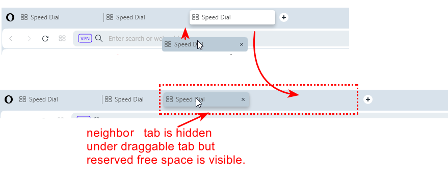
While creating all these screenshots, I noticed one more issue when dragging tabs. If inserting a tab, neighbor tab doesn't move (but free space still allocates) and thus the neighbor tab will be hidden under draggable tab until dropping the tab.

Of course, in pre One version it works correctly. Neighbor tab smoothly slides to the right visually and free spaces becomes available.

-
BestCodes last edited by
@andrew84 Maybe it's an issue. I have no problems. If it is, hopefully they will fix it. In the meantime, we can be patient as they work.
Hi, I'm BestCodes! I'm a full-stack web dev who moderates on the makeblock forum and works on https://www.agent-one.dev. I have a website, https://bestcodes.dev. I love Opera, so I'm on here occasionally to report bugs and answer some questions.
-
andrew84 last edited by
@bestcodes yes, they work hard. During almost a year the default tabs management functionality is not restored. Maybe such things like rounded corners everywhere (especially content border looks amazing and really necessary, I feel how the border improves my browsing everyday) and animations here and there are very important.
But after all I'd like to have the habitual functionality not worse than previous version had.
Personally, I don't see benefits from the 'modular design', things work smoother in old version here and that's why I continue using it as daily browser and checking Developer version from time to time, -
BestCodes last edited by
@andrew84 The benefits of a modular UI (if you understand what that is) are endless. It being modular means that it is more flexible and can have things added to it. As Aria told me:
It's great to hear that you appreciate Opera's hard work and the design elements like rounded corners and animations. However, you mentioned that you would like to have the habitual functionality not worse than the previous version. Here are some points to consider regarding Opera's modular design and functionality:
Opera One's modular design allows for the addition of new features and integrated AI tools as they become available.
The UI has been reimagined with a modular design that adapts as features are added or tabs are opened.
The sidebar elements dynamically adjust to make space for more cutting-edge AI integrations.
Extensions are grouped in a collapsible module in the address bar, simplifying the space while retaining quick access.
Opera One has been reengineered with a new technology stack to ensure smooth animations without interruption.
The separate compositor thread in Opera One allows animations to continue running even if UI processes are interrupted.While the modular design and new technology stack aim to provide a more forward-thinking browsing experience, it's understandable that you prefer the smoother performance of the old version. It's great that you continue to use Opera as your daily browser and check the Developer version from time to time.
Hi, I'm BestCodes! I'm a full-stack web dev who moderates on the makeblock forum and works on https://www.agent-one.dev. I have a website, https://bestcodes.dev. I love Opera, so I'm on here occasionally to report bugs and answer some questions.
-
andrew84 last edited by andrew84
@bestcodes Aria wasn't able to recognize sarcasm. And I'm still don't understand how long more I should wait to get equal smoothness like in old version. One year more?
Even theme switching doesn't look smooth while on speed dial page, background flickers few times.
And tabs dragging theme again. While inserting tab on first place, the free space and [+] button twitches, tab itself flickers. sometimes address bar flickers too.

Waiting comments from Aria
-
andrew84 last edited by andrew84
Another one bug, which relates the tab islands and tabs.
After expanding tab island tabs do not resize and thus sliding away of the tabstrip and overlap the window's buttons block while cursor stays on the tabstrip. After moving the cursor away tabs resize and the tabstrip restores and looks normal. Then the bug repeats when expanding tab island.
Happens also in Stable. The bugs relating tabs management are simply endless.
-
andrew84 last edited by andrew84
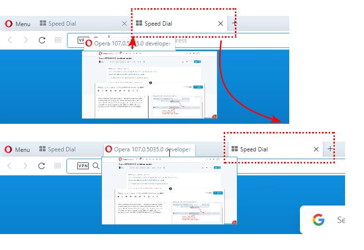
@edmarcio sure it does, but it should not. The dropped tab should be attached to the tabstrip as last tab.
I recorded how it works in pre One version.

The same logic is in Edge and in Chrome, but there the draggable tab is presented as window. In Opera (pre One) the draggable tab looks as a compact thumbnail and this is an ideal variant. In One version the draggable tab looks like a simple tab (too small).
-
Locked by
 leocg
leocg