Opera 106.0.4985.0 developer update
-
andrew84 last edited by andrew84
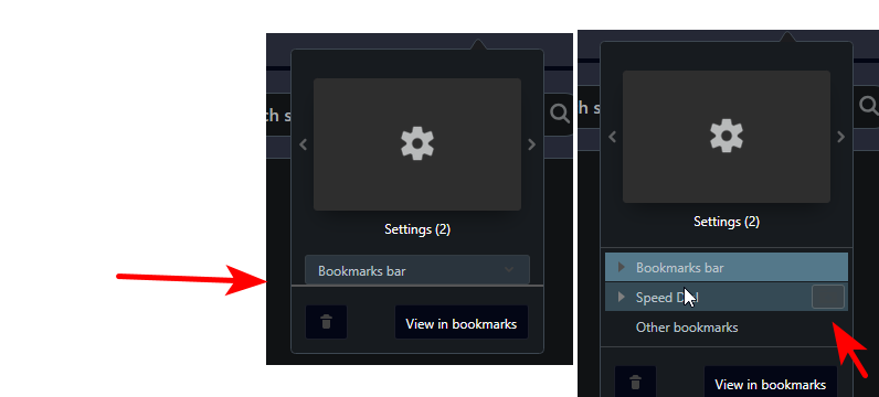
In dark mode the heart menu looks incorrectly.
Some horizontal line at the bottom and thus the dropdown is a bit cut.
Folder icon is not visible and looks like some solid button.
The same is in Stable as it seems.

Window buttons block still has the old dark greeny-navy highlighting boxes.

Also, the 'search tabs' background has the old color.*In overall, I don't like the color selected for dark mode. It's like dark grey but too 'purplish' or 'grayish blue' and suits more for GX version. I'd prefer more simple dark grey (or the shade like in pre One version but a bit darker).
-
burnout426 Volunteer last edited by burnout426
@vladbabinets What specific version of Windows 11 Pro? I'm using Windows 11 Pro Version 22H2 (Build 22621.2715).
-
multiwebinc last edited by
On Linux, it still drags the window when you grab the right edge of the scrollbar instead of scrolling the page.
-
ralf-brinkmann last edited by
@burnout426: I'm not sure if this is the same problem I have with being logged out from all pages where I was logged in before (and now could not log in again). My System is Windows 11x64 Pro 23H2. Currently I can't use this new version at all and am back to Opera 106.0.4977.0 developer. If this isn't fixed in the next version, I'll have no choice but to switch to another browser. For example Brave. It is also very safe.
-
burnout426 Volunteer last edited by
@ralf-brinkmann Could be something with Opera specifically on 23H2.
-
A Former User last edited by
@kened

This blue line would be a good indicator of an active tab. It would be much faster to find the active tab when we have many tabs open. -
A Former User last edited by
@leocg Try opening multiple tabs on multiple islands and you'll see how counterintuitive it is to find the active tab. With a line, a dot, or a color, as our colleague @andrew84 suggested, it would be much easier to find the active tab.
-
A Former User last edited by
@leocg See the difference between many open tabs in Opera and Vivaldi, which uses a color scheme across tabs:


-
A Former User last edited by
@leocg: In fact, this does not always happen. I try to maintain a certain organization. But sometimes the work requires dozens of tabs open at the same time and it becomes chaotic to find the active tab.
-
vladbabinets last edited by
I see that the developers do not respect users at all. There is a serious problem in the browser, but no one is solving it