Opera 90.0.4457.0 developer update
-
vladbabinets last edited by
@ralf-brinkmann Win 11 Pro x64, 6 tabs open in two spaces. Nothing special - YouTube and Google docs
-
basementality last edited by
@xantares: I have same problem with sync encryption passphrase. Last beta 89.0.4447.20.
-
vladbabinets last edited by
@ralf-brinkmann: Computed. The processor loads synchronization. When I log out of the account, the load immediately drops
-
ralf-brinkmann last edited by
@vladbabinets
Oh, I forgot that there is a synchronization. I think once it was broken and disabled (in any older version) and I did not activate it again. Now I restored it and am going to watch what happens. At this moment there is no change in the CPU consumption so far. -
SiMcarD78 last edited by
@simcard78: Today the problem returned. Disabling synchronization makes the problem go away.
-
ralf-brinkmann last edited by
@simcard78
I was about to check what's going on on my computer when I noticed the sync icon is gone. This "little man" with the green or red dot. According to the information in the settings menu, I am still logged in. So synchronization should also take place. You just don't see it. Otherwise, the CPU load on my computer is still around 0.5 - 0.8%.
W10x64, Operax64 -
ralf-brinkmann last edited by
Today the same like yesterday:
I had restarted Opera and controlled the synchronization settings in the Opera settings. Everything was alright and the sync icon on top right was there with a green light and stayed there until I went to bed. Today in the morning this icon was gone.
Is that a bug or a feature? Did I miss something?
W10x64, Operax64 -
ralf-brinkmann last edited by
@simcard78, really? But then I can't tell at a glance whether the synchronization is still working and I'm logged in.
-
SiMcarD78 last edited by
@ralf-brinkmann: When there's a problem the sync icon appears with an error red symbol.
-
andrew84 last edited by andrew84
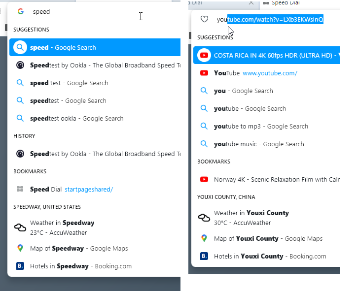
suggestion: Along with the calculator in the address bar dropdown, make the cities suggestions also optional.
I insert 'you' for example and see the weather, map and hotels in Youxi county in China, I unsert 'speed' and see the same for Speedway in the united states, and so on.
Why do I need such unnecessary info?

Also, I'd like to see the choice of search engines at the bottom (like it already used to be in Opera, before the reborn3 dropdown restyle) + separately bookmarks, history, tabs like it currently works in FireFox

-
Locked by
 leocg
leocg