Opera 75.0.3946.0 developer update
-
Opera Comments Bot last edited by
Hello again, Among the tweaks in this Opera Developer update you’ll find crash fixes and a WhatsApp issue fix – after clicking a notification, the sidebar was not opening. We’ve also removed an invalid section in Settings (thank you @andrew84). All the changes and improvements in this update are listed here. Installation links: Opera developer…
Read full blog post: Opera 75.0.3946.0 developer update
-
andrew84 last edited by andrew84
- Still no fix for the updating process on About page

https://forums.opera.com/post/239503
We’ve also removed an invalid section in Settings
I'm not sure what do you mean but 'Manage exceptions' option still exists in 'On startup' section in Settings. Now it opens but there's no 'Add' buttons.
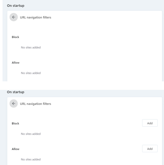
- Still no fix for the updating process on About page
-
chas4 last edited by
opera://about/ update progress bar is broken (has been for a few build) as it never shows
Why Open the Web?
Despite the connecting purpose of the Web, it is not entirely open to all of its users.
When used correctly, HTML documents can be displayed across platforms and devices.
However, many devices are excluded access to Web content. -
andrew84 last edited by andrew84
SearchTabs popup still needs improvements (All the issues listed below work properly in previous TabMenu) .
- Single speeddial tab on the popup has the closing cross whereas the speeddial tab on the tabs bar doesn't have this.
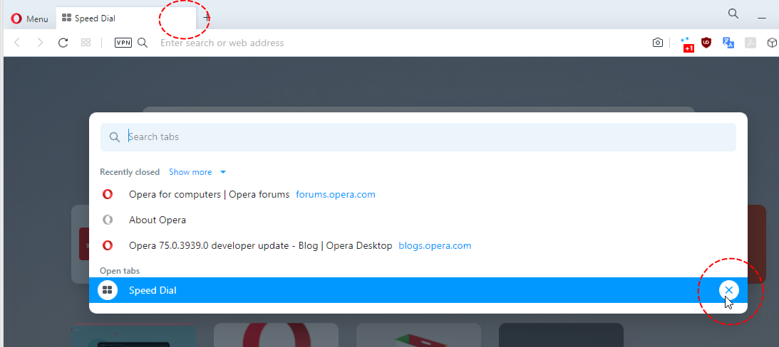
- when closing currently active tab using SearchTabs popup the popup itself closes too (it should stay opened).
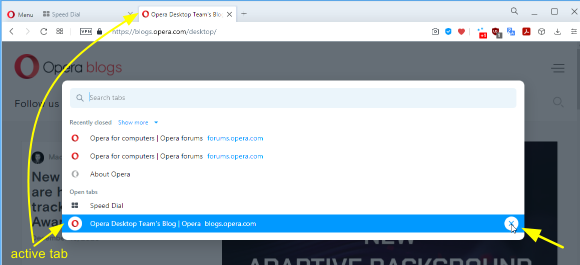
- Currently active tab is still not marked (highlighted or by using bold font) https://forums.opera.com/post/237720
- Open tabs section is still not so 'interactive'. When I hover opened tabs on the popup the hovered tab should be also highlighted/focused on the main tabs bar.
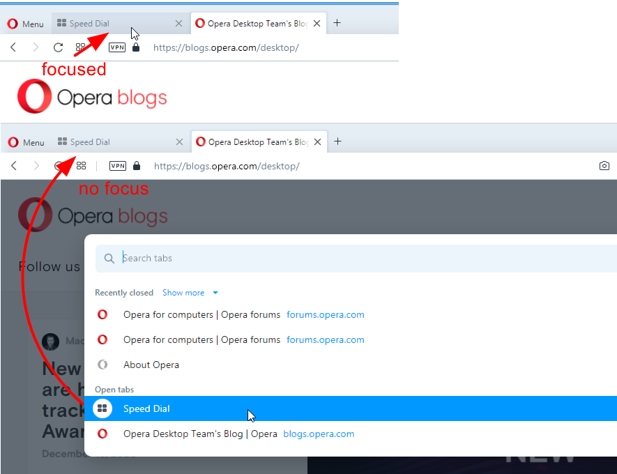
- Single speeddial tab on the popup has the closing cross whereas the speeddial tab on the tabs bar doesn't have this.
-
andrew84 last edited by
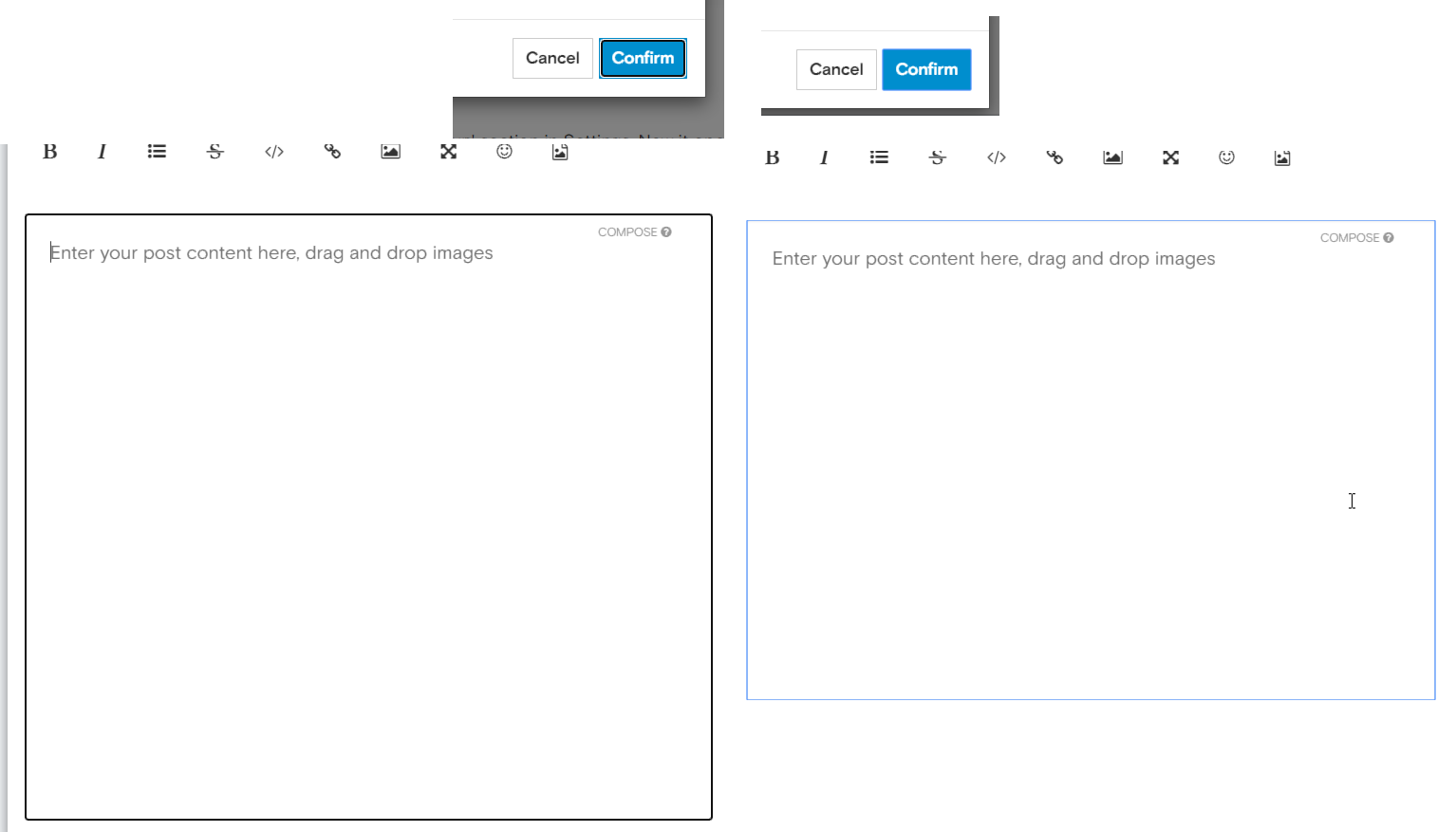
on forum there's still some ugly black (instead of the tiny blue) border for focused objects (text fields/buttons). *probably related to Chromium.
O75 vs O69
-
A Former User last edited by
@andrew84: It looks like part of chromium changes, they made focus borders thicker some releases ago. They also had light blue borders, now have thick black. You can disable it with chrome://flags/#form-controls-refresh
-
andrew84 last edited by andrew84
Discovered by chance that Chrome has a scrollable TabStrip feature

I think Opera also should have such feature (optional is Settings)

