Opera 69.0.3638.0 developer update
-
andrew84 last edited by andrew84
@leocg said in Opera 69.0.3638.0 developer update:
can't please everyone all the time.
It's more than possible in this particular case.
Just add switches on the new popup as I suggested above https://forums.opera.com/post/203796Or restyle the TabMenu to look more modern but with the kept functionality and layout.
Both developers (because there will be another one new feature implemented that can be hyped) and users (because it will be the same feature, loved by most users, but even more improved) will be happy in this case. And the complaints will stop instantly.

-
leocg Moderator Volunteer last edited by
@ghirahim I don't think we can say if the decision was good or not good at the moment, it's something that only (long) time will tell.
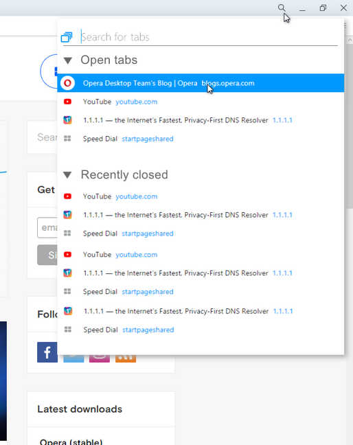
Search in tabs still shows your opened tabs, so for those who want to see a list of tabs, it does the same. And for those who want to reopen recently close tabs, that isn't something that people do very often, there are other ways to do it.For me, the button, nay of them, could be removed.
-
A Former User last edited by
@boti99: I like it especially if i accidentally opened the same link twice.
-
A Former User last edited by A Former User
@leocg: You can make smarter decisions though, this decision is quite devoid of any thinking what so ever.
There are many ways to search through tabs as well. Many more ways then reopening a closed tab or viewing what tabs you closed. Your argument doesn't hold.
-
A Former User last edited by A Former User
@leocg actually you can keep adding switches. Notice the empty spaces on the sidebar? Even make it optional! My what a word. But Opera hates optional things and would much rather choose what you want for you.
-
A Former User last edited by
@leocg this shows me that they are only able to add or get rid of feature never fully flesh them out. Such a disappointment.
-
A Former User last edited by
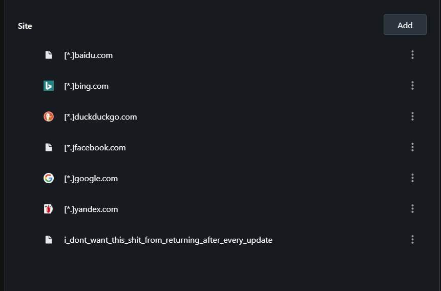
I don't want the premade exception to return after every update especially when I have deleted them all before the update.

-
A Former User last edited by A Former User
@leocg here's one that is used by pretty much every single chrome power-user.
"ctrl + tab " or "ctrl + shift + tab " plus if im not mistaken theres another way to do it as well which is a bit more like going through it.Here's a reason why someone, might want them. Maybe they do not want to pin the tab but instead would like to close it in order to save memory and then check back on it at a later time that day or if for example you accidentally closed the tab, its nice to quickly click the button to check and filter. Plus if I'm not mistaken the old way also had a list of all opened tabs. So in a sense this feature change is a step backwards.
-
A Former User last edited by A Former User
@leocg then maybe Opera should wise-up a bit and stop injecting the browser with "features" or bloat for the most part that doesn't make much sense. Unless they give more power/options (less restrictions[have a whole list
 ]) to their users. But we both know that's not going to happen.
 -
A Former User last edited by A Former User
@leocg it shows you the entire list of tabs that are open, plus their names and thumbnail. Not hard to look through. And here's another suggestion if Opera is so hellbent on putting in a tab searcher then why doesn't it replace the defunct search box with it? It's a smarter way of adding it at the very least than what is currently in place. Especially if it's made optional too.
Or even adding the search feature the preexisting ctrl+tab feature. Now that would be actually incredibly smart.