Opera 67.0.3574.0 developer update
-
andrew84 last edited by andrew84
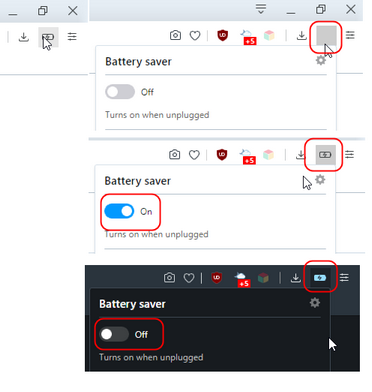
Some mess with the toolbar's battery icon and its state.
- Gray square while icon is clicked (it seems that switching current theme resolves the issue)
- depending on currently enabled theme the clicked icon looks visually disabled while the feature itself is enabled, and vice versa.

-
andrew84 last edited by andrew84
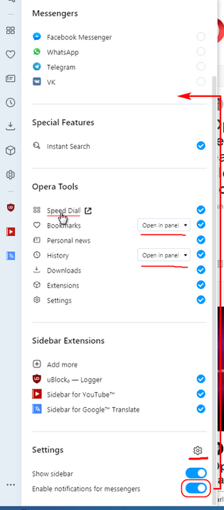
Suggestions regarding the new sliding settings panel for the sidebar.
- 'Show sidebar' toggle must be always visible after opening the panel. Currently it needs scrolling first. *Some quick toolbar button (optiona0)l for showing/hiding the sidebar is still would be very much welcome(like it works in Vivaldi).
- move 'Notifications' toggle into Messengers section.
- add gear icon 'view in Settings' to see the sidebar settings directly.
- duplicate 'Show in panel/Show full page' toggles for History/Bookmarks in internal Settings page too.
- items in 'Opera tools' section could be clickable instead of using the appearing icon (square
with arrow)

In overall, I like that the 3 dots menu doesn't simply clone the right click context menu anymore. Especially I like that you added option whether to view History/Bookmarks in full page or in panel.
One thing I found a bit strange is that panel offers more advanced settings than internal Settings page. I'm used to think the opposite, when quickly accessible settings allow to change only basic features.
-
andrew84 last edited by
The Highlight duplicate tabs on hover feature needs a toggle button in Settings.
-
balcis last edited by
Kornella, for a very long time; first link works, but second link that mentioned as "portable" directs to the stable versions page: https://www.opera.com/computer
-
A Former User last edited by
@ralf-brinkmann: Just checked and it is enabled here by default as well.
-
A Former User last edited by
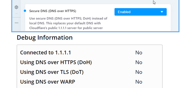
It seems that in this build DNS over HTTPS function (DoH) is not working. The
opera:flags/#opera-dohflag is enabled. In previous builds, everything is fine. Win7 x64 -
kmielczarczyk Opera last edited by
@boti99: Thank you for your feedback. Why would you like this feature optional?
-
boti99 last edited by
@kmielczarczyk: Because for me it seems a bit distracting. Maybe a slightly delay would solve my problem.
-
jojo0587 last edited by
Maybe the settings from the button "..." can be copied to Settings >> Manage sidebar (opera://settings/manageSidebar)?
My proposals for changes in Opera (Google Document).
- There are not enough signs to put all the links here. -
andrew84 last edited by andrew84
@boti99 said in Opera 67.0.3574.0 developer update:
a bit distracting
Yes, especially in dark mode.
-
andrew84 last edited by
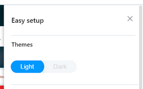
I saw and I liked the themes switching toggle(slider) button in browser overview on your home page. I think I'd like to see the same button instead of circles in EasySetup (+scheduled theme switching option in settings).

-
A Former User last edited by
A simple toggle to switch between the two workspaces would be nice, maybe have each workspace have a different theme/color and if you have more than two workspaces, maybe have a dropdown or slideout menu for selecting them, for privacy sake, I don't need my boss/coworkers seeing just how many workspaces I have
p.s. maybe a password lock and/or a hidden workspace would be helpful.
-
leocg Moderator Volunteer last edited by
@johnd78 https://cloudflare-dns.com/help says that I'm using DOH.
-
zalex108 last edited by
@leocg said in Opera 67.0.3574.0 developer update:
@johnd78 https://cloudflare-dns.com/help says that I'm using DOH.
Check it with out the VPN.
"You cannot know the meaning of your life until you are connected to the power that created you". · Shri Mataji Nirmala Devi

