Opera 66 initial release makes it easier to reopen closed tabs and to access extensions
-
A Former User last edited by
On previous release 65.0.3467.78 I posted the following comment:
"""I tried today to open this URL:
https://www.costacrociere.it/login.html
and I was answered with a blank page (after a very momentary shadow of login page).
It works well on Chrome 79.0.3945.88 and any other browser I have on my notebook under Win 7 Pro. (MS Internet Explorer, Firefox, Maxthon), and it worked well also with previous Opera releases."""I see that the problem remains still unfixed in the present release.
Couldn't you gently pay your attention to this issue? -
A Former User last edited by
I updated yesterday and sorry, Opera has lost its most important comfort features with the switch to chromiums code base for the sidebar and video pop-out. I do not understand why google consistently makes features less comfortable AND removes the possibility to configure it - why does the user cannot decide how he want to use the software
The new sidebar removed the most important comfort features:
-
Is sits in TOP of the tabs and hides the content from tabs, unable to read it. It is a popup window and no sidebar anymore.
-
I don't know when exactly this happens but it happens frequently, that the sidebar content (bookmarks) don't remember its scrolling position and is all the way up to the top. Very annoying when you go through your bookmarks, checking for news and instead of the old real sidebar, you now each time have to
- click to open (it overlays the tab, so you cannot read your page)
- click to close
- click to open again to select the next one, again unable to read the content of the website and so on.
- frequently, the bookmarks scrolled to the top, so you have to scroll down again and find your next entry
With the old real sidebar, you had it open to the side and it stayed this way, beSIDE the content of the website and you simply
- click open a bookmark (and being able to read it)
- click the next one
and the bookmarks stayed at the position where you left them, no matter what you did.
-
Video pop-out does not remember its size and position, each time it opens at the bottom right corner in a too small default size. So each time I have to reposition and resize it
-
Volume control is gone in video pop-out., again making Opera less comfortable to use.
These are my most used features, the video-popout not remembering its position and size prevented me to switch to Vivaldi but now with the most TWO comfort features gone I can switch to Vivaldi - it has the same annoying video popout but it has a real sidebar.
-
-
gigimon last edited by
Why new video pop out disable a video in tab and show it only in pop out small window?! It's not comfortable in multi display/workspaces mode, please return back this possibility!
-
A Former User last edited by
@elspivo Just say nothing at all if you have nothing worth saying. OK? Chat and junk has it's place but not on this forum. Tray Facebook, Instagram or whatever instead please.
-
stolis last edited by
Unfortunately, the most annoying “feature” of all is that you "don’t seem to care" about user preferences. Keep adding things without any option for disabling them.
- The bookmarks side panel is useless to me since I prefer using the bookmarks bar.
- As for history, having to scroll so many times it’s much more worse. The history page (thank god) has the option to choose directly (Today-Yesterday-Older) avoiding all that scrolling. Can you at least put something similar in the side panel? Otherwise it’s useless too.
I’ve also noticed that the page up-down buttons don’t work on history side panel like on bookmarks. Can anyone confirm?
-
stolis last edited by
One last thing. History side panel has the option to open history page by clicking on the clock icon, while on bookmarks panel does nothing.
-
A Former User last edited by
Today Twitter suddenly has been broken in incognito mode even if I add it into both Opera adblocker whitelists (for ads and trackers). Page is loading, but then I get white page without anything. Please investigate it. Last Opera 66 x64, Win 8.1.
-
A Former User last edited by
@twilightssuperb, but when I just closed all private windows, opened it again, cookies were deleted, so Twitter loaded OK... I don't know why.
-
elspivo last edited by elspivo
@hugh-allen: F**k off guy, ok? I asked a question that bothered me, and got the answer from moderator, and helpful user, Everything was fine and you show up, and have problem with me. Maybe your problem with "middle wheel" function is so important?
"I asked a serious question and I get stupid and unhelpful remark" - what question? What remark? From me?!
You go away, and stop posting me! You are a only person that making junk.
-
burnout426 Volunteer last edited by
@caraboy2001 Can you try the directions in https://forums.opera.com/post/194771?
-
kikonen last edited by leocg
This bug is still there....
- Have 10+ tabs open
- Move mouse below "equal-sign-caret-down" right top corner "recent tabs" menu
- try to change between two most recent tabs with CTRL + TAB
=> won't happen, since when hitting CTRL + TAB, first this "recent tabs" menu opens quickly, and notices now that mouse pointer is over some entry....
=> Thus instead of switching between tabs, CTRL + TAB switches between random tabs, depending of mouse pointer location.
Well, I'm not holding my breath that this bug would ever get fixed, since "touchpad scroll + CTRL + TAB" bug triggering random zooming, is even older bug and still not fixed.
-
andrew84 last edited by
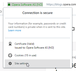
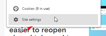
Again, the Stable version is released with a known visual bug that was fixed in Dev long ago.
Trimmed the page info popup.

I think that the issue described on forum also refers here
https://forums.opera.com/topic/37654/opera-page-information -
A Former User last edited by A Former User
@andrew84 Looks fine here.

WIN10-64. Opera 66.0.3515.27 Norwegian.
-
andrew84 last edited by andrew84
@vegelund hover the 'site settings' by cursor, there should be a little free space at the bottom. Check it in Dev

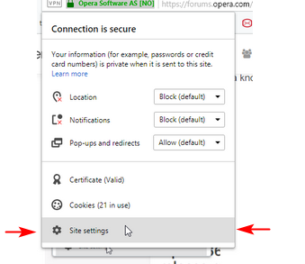
I guess that screenshot on forum has a worse look because probably the user uses the other scaling in Windows (the hint's text on his screenshot consumes 5 rows instead of 3) and the issue looks uglier.- Also I'm not sure that these free spaces on both left and right sides are correct.
That popup looked like this all the time(screenshot is from O58):

- Also I'm not sure that these free spaces on both left and right sides are correct.
-
A Former User last edited by
@andrew84
 That level of nitpicking would be frustrating to move through life with.
I just want basic functionality and design to work. Hakuna matata. -
andrew84 last edited by andrew84
@vegelund: I pointed to that tiny free space just to demonstrate that something is wrong with the popup, and not for nitpicking. And on each individual system the visual issue can be different (taking into account that the issue is fixed already but was not applied to Stable).
As you can see the user on forum has much worse result on his own PC (Site settings is invisible and gear icon is out of border). -
A Former User last edited by A Former User
@andrew84 No worries, bugs do vary depending on system/screen settings.
I’m still missing the line divider under address bar (probably related to Windows 10 scaling).

-
max1c last edited by
@vegelund: Yea, really. This release has serious regressions and people are complaining about miss-aligned things by .01 inch.
-
vomax007 last edited by vomax007
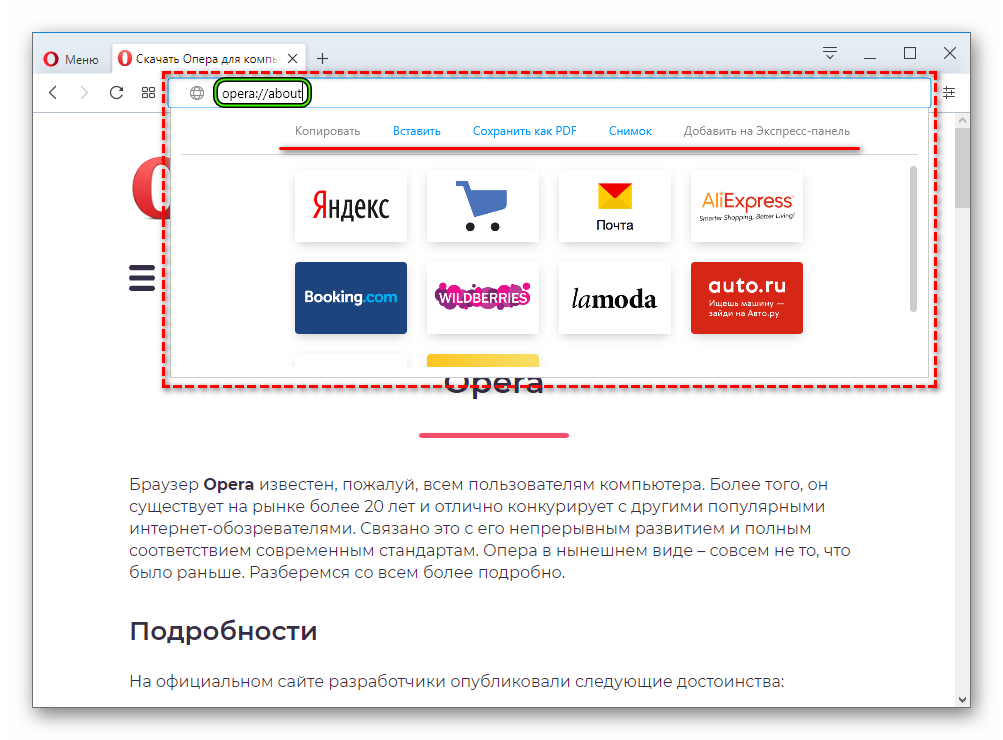
I was hoping that you would RETURN the drop-down menu from the address bar with the buttons: 'Copy', 'Paste', 'Save as PDF', 'Snapshot', 'Add to the Express Panel', but alas, you did not return it ...
Why did you remove it altogether ??? It was very convenient, especially I need the 'Copy' button. Why do you always only break and worsen? First, we redrawed all the icons after version 44, then Opera began to close for 2 minutes, then it began to heavily load the processor and RAM as an average game, then they removed the drop-down menu from the address bar after version 64. What do you remove next, what is really needed? Return this drop-down menu already, without it as without hands !!!
