Opera 116.0.5341.0 developer update
-
Opera Comments Bot last edited by
Dear Opera Users! The latest Opera developer update – 116.0.5341.0, introduces useful improvements for stability and customization: This update fine-tunes Opera’s performance and appearance for a better user experience! You can find the full list of fixes in the changelog. Installation links:
Read full blog post: Opera 116.0.5341.0 developer update
-
andrew84 last edited by andrew84
DNA-119466 Unable to open easy setup page when color-theme flag is disabled
I don't see the flag here.
DNA-119457 Create ‘Themes’ section in opera://settings
I was so optimistic to see the setting to enable/disable color themes but actually 'Wallpapers' section was renamed to 'Themes' and the 'theme' toggle was moved from 'Appearance' section.
-
Olifant last edited by
DNA-119467 [Extensions] ‘Allow access to search page results’ option not saved after restart
I am glad to see this fixed. Thanks Opera Team. -
Dudikoff last edited by Dudikoff
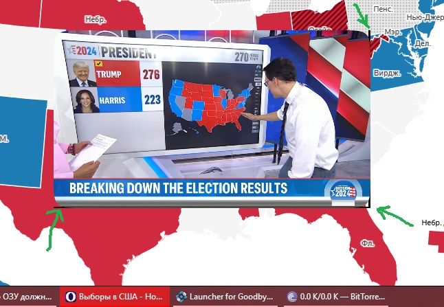
Visible black bars on corners of Youtube window. Not fixed, I already reported when there was still a build 116.0.5335.0.
My configuration -
Chip - AMD FX-8300
Videocard - Sapphire Radeon R9 270X
Video drivers - radeon-software-adrenalin-2020-22.6.1-win10-win11-64bit-legacyasics-june23-2022-legacy.exe
OS - Microsoft Windows 10 Enterprise LTSC (x64) Build 17763.6414 (1809/RS5)
-
dnzrzx34 last edited by dnzrzx34
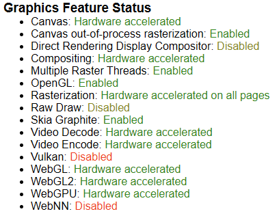
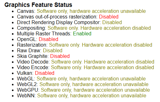
When watching videos Opera flashes a black screen few times and finally turns off Hardware-Acceleration.
Active GPU:
Inactive GPU:
-
andrew84 last edited by andrew84
Return the 'Categories' options for the address bar suggestions dropdown.
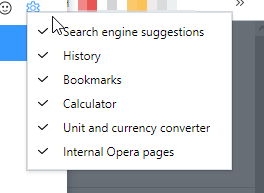
-
andrew84 last edited by andrew84
I don't know if it was an intended change but I'd prefer that icons in menu/context menu and text alignment were the same like in 'old' versions.
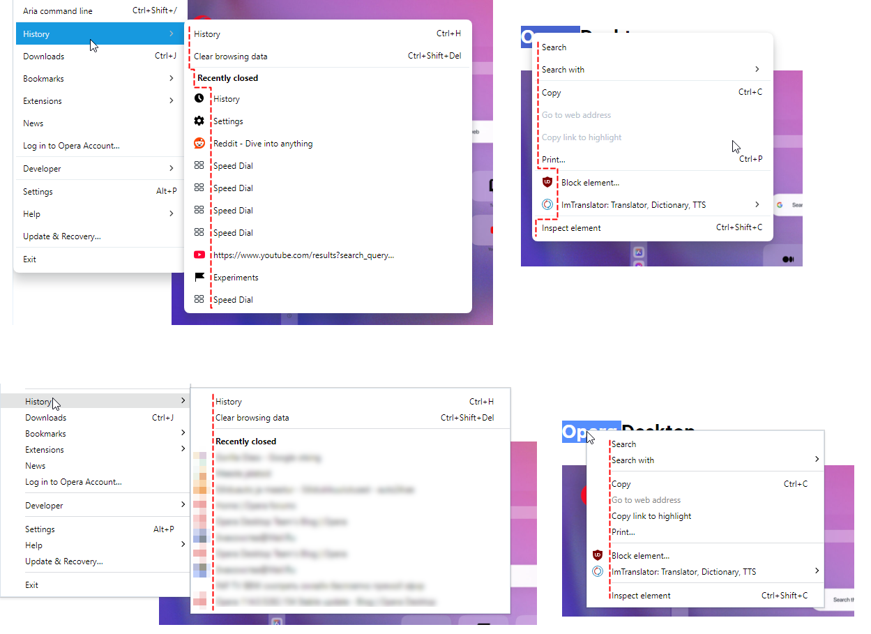
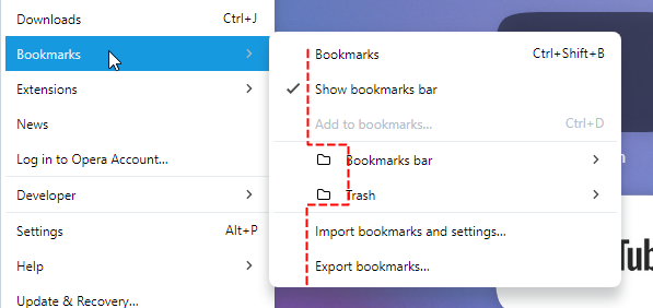
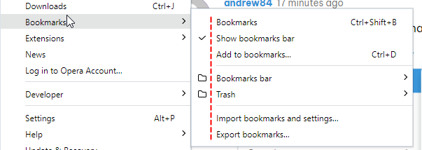
*And also the spaces between menu items should reduced. Especially affects small screens and also increases scrolling for bookmarks bar expanded bookmarks dropdowns.
-
daria19 Opera last edited by
@andrew84: Thank you for your feedback! The current layout, including the icons, text alignment, and spacing, has been implemented in accordance with the design specifications established by our design team. The spacing, in particular, was carefully considered to ensure a balance between readability and usability across various screen sizes. We appreciate your suggestion and will continue to monitor how these design choices perform across different devices. Thank you for taking the time to share your thoughts with us!
-
daria19 Opera last edited by
@dnzrzx34: Thank you for bringing this up! We’re sorry to hear that you're experiencing graphic glitches in Opera. This could be related to several factors, such as graphics drivers or specific settings. If the problem persists, feel free to share more details about the glitches, and we’ll do our best to assist further.
-
andrew84 last edited by
@daria19 The flag #address-bar-categories-customization was introduced after complaints and suggestions.
For example https://forums.opera.com/topic/58200/search-bar-calculator-on-off-switch how it looks on practice.My post was about the same https://forums.opera.com/post/282544
But later the flag was removed for some reason and option was not implemented.

-
indiqazzz last edited by
You can switch to to tab or select by clicking LMB on top of the tabbar, bur you can't close it by clicking MMB on top of it. You have to click inside tabs area.
