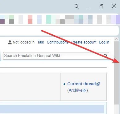
[Compilation]Discussions on Scrolling doesn't work if the mouse is on the edge of the screen
-
andrew84 last edited by
@vegelund said in Scrolling does not work when cursor is on the left/right edge of a webpage:
What module is to the right of the scrollbar?
That's simple. Following their 'genius' design the whole web page content window is a module, so it's separated like other modules using the rounded corner border.
-
A Former User last edited by A Former User
@leocg The main content module to the left of the scrollbar does not create any problems for the issue we are talking about.
-
andrew84 last edited by
@akasudesu the problem here is that the border is by design.
So solution here is to remove the border completely.
But if they'll remove the border, it'll break the idea of the modular design with its rounded corners. Maybe I'm wrong, but I have doubts that they'll qualify the existing problem as an issue or bug. -
A Former User last edited by A Former User
@luciflash said
Anyone who uses the scroll bar is a maniac
How do you move quickly down long pages?
-
andrew84 last edited by
Sometimes I use mouse's middle click to quickly scroll, but this doesn't excuse the ill-conceived design.

-
A Former User last edited by A Former User
@luciflash and @andrew84
I'm on a ThinkPad X1 and use the TrackPoint for mouse movement.
For scrolling I can use:
• The middle mouse button. That will scroll at a linear and constant pace, taking forever to get from 2/20 to 18/20 of a page.
• The up/down arrows on the keyboard or top/bottom arrows of scrollbar with same result; linear scroll speed and takes forever.
• Page up/down buttons or click above/below the scrollbar. Same thing here, will take 30 clicks to move from top to bottom of a long page.
• Catch the scrollbar and pull it up/down. Based on the pressure I place on the TrackPoint I can increase/decrease the speed of scrolling, to elegantly move throughout a large page and easily stop wherever I want.
So for moving on long webpages the scrollbar is invaluable to me.
-
andrew84 last edited by
I'd like to hear from Opera team about some benefits of the web content's border. Why the border is cool, what extra usability it offers and etc.
-
A Former User last edited by A Former User
No worries. It will be fixed.
It’s an obvious mistake for Chromium behavior.@leocg said
And for me it's the normal behavior.
My beef with you is that while you are the most prolific poster on this forum by magnitudes,
you are never remotely critical of anything produced by Opera.It usually goes like this:
A new release, feature or bug comes along.
A huge number of users comment negatively on this and want change.
@leocg loves it and sees nothing wrong...After some time, Opera realizes it was a mistake and fixes it.
Now, who was correct?
and who was blatantly gullible and out of touch with common users? -
leocg Moderator Volunteer last edited by
@vegelund Just because something has changed doesn't necessarily mean that it was wrong or bad before, but that people may prefer things in a different way.
It's known that (human) brain doesn't like changes and (people) may have difficulties adapting to those changes.Also, just because someone can't see or reproduce a problem doesn't mean that it doesn't exist. And just because someone is having a problem doesn't mean that it affects everyone.
-
A Former User last edited by
Had to reinstall windows, and this new opera is giving me scrolling issues since i often put my cursor on very left side of the screen. Also speed dials have worse visuals, really prefer it old way.
I thought my opera was up to date prior to windows reinstall. But this one is clearly completely different version. Is there other version i can download without rounded corners and all that jazz?
-
xzabuzax last edited by leocg
If you have the window maximized and you move the cursor of the mouse to the scroll bar on the right but the cursor hits the corner then the scroll bar won't work since you can't select it, you need to move the mouse a little bit to the left to select the scroll bar, this is SO annoying, this is the only browser that does this shit! this never happened with the previous version.
The culprit for this annoying issue or bug is the new stupid border that was added on the right in Opera One, for the love of god, please fix this shit! in the beginning I kind of liked the new GUI but I'm starting to hate it now, this is so annoying!

-
kingfish84 last edited by
With the new Opera the vertical scroll bar is no longer flush with the edge of the window when maximised. This is extremely annoying as it means that if you move the mouse to the rightmost part of the screen you cannot click on the scroll bar to drag it. This seems to be inspired by the the bubble design of the browser? Anyway, very frustrating - please change Opera!
-
SaeedP last edited by
@xzabuzax Thank you for mentioning that! I was trying to find a setting for it but no luck. Also the empty spaces and borders (even though very small) for different elements are adding some redundancies which made me to remove my bookmark bar to see more content of the webpage. Looking forward to see the fix for it.
