The future of browsing: Opera One, the first AI-powered browser is ready for download
-
multiwebinc last edited by
@rolandm: What pages crash for you? I'm on linux and haven't had any crashes yet.
-
burnout426 Volunteer last edited by
@illusiveart said in The future of browsing: Opera One, the first AI-powered browser is ready for download:
AI Aria does not work in the CIS region for political reasons?
Don't know the answer, but it's likely that it is indeed for legal and or political reasons.
-
weilan last edited by weilan
Ever since the first beta for Opera 100, I installed it excited to see the changes and here are the problems:

You can see in the image Brave on the left and Opera 100 on the right. What is the difference you might ask?
The difference is the new UI introduced in Opera 100 makes it really oversized and not really beautiful or useful. Now tabs don't look like the folder tabs where the idea for tabs originally came from.
Now they look like some ugly "tab islands". First Firefox came up with this stupid idea, then Edge copied it and now Opera copied it...
Now they take so much more space - you can see where the Brave UI ends and where the webpage begins and compare it to where Opera 100's UI ends and where the webpage begins.
It's mostly because those stupid, useless and ugly "tab islands" obviously need to have shadows, because without those massive shadows, Opera 100 will not be useful enough.
I think this UI redesign is ugly and pointless and it's making the browser worse.
I ask to add at least an option to revert the tabs' appearance to their old version that look like actual folder tabs and take up less space.
Just think about it - everything that makes the Opera 100's UI bigger than that of Brave is because of useless eye candy that doesn't make anything better.
P.S.:
Also, you still can't move the mouse to the rightmost end of the screen and grab the sidebar in Opera 100, nothing happens, on every other program, browser or Opera 99 and older, you could do it.
I'm sorry, but I'm not sorry, this new UI revamp for no reason and for the sake of making useless changes is a disaster. Whoever came up with this idea should be reprimanded and demoted and either the old UI reinstated or some new UI that is functional, compact and not a buggy mess be developed.
Opera is popular because it's fast, but when updates just add more bloat and horrible changes, it makes me want to uninstall it and never look back.
-
ocirnes last edited by
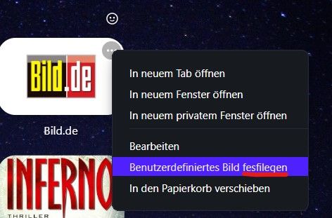
typo in German language: "Set custom image" in SD.
"fesfilegen" (wrong)--> "festlegen" (correct)

-
herrpietrus last edited by herrpietrus
OK, bye bye Opera... at least Opera One. Reinstalling version 99.
Why these tabs are so thin an incoherent with the rest of the UI?
Why buttons on the sidebar are moved to bottom?! -
herrpietrus last edited by herrpietrus
BTW - why the tabs cannot be higher and why main tollbar cannot be thinner? It's so huge now even though icons gets smaller and smaller. Please, start to think.
I quite like separated modules and even that frame around the page content, but not these too much rounded shapes and even more wasted space!
And please, make SD tile less rounded. Websites are not designed for old TV's.... -
A Former User last edited by A Former User
One thing I like about the new tabs is that it’s much easier to see the active tab. On 99 it was almost impossible.
Opera Sync is buggy and constantly logs user out.
Once logged in again opera://settings/syncSetup is set to off.@max1c said
There seems to be a bug with speed dial tiles not update the selected image/logo.
Give it some time. After a few hours and restarts, all of mine updated correctly.
Note that you can now upload custom thumbnail for speed dials. -
rolandm last edited by
@multiwebinc: https://calendar.google.com , https://www.spiegel.de , exotic things like these...
-
leocg Moderator Volunteer last edited by
@multiwebinc Here, Alt Tab is to changing between opened apps. To change among opened tabs, there is Ctrl Tab.
In none of them the mouse position makes any difference on what tab or app will be selected.
-
staticx last edited by leocg
vpn access via button in address bar is really missing !!!!!!!!!!!!!!!!!!!!!! you need always to go in settings to enable vpn!
-
multiwebinc last edited by
@rolandm: Neither of those crash the browser for me on Ubuntu 22.04. Does it happen in a private window? Have you tried disabling extensions to see if one of them is causing the bug?
-
multiwebinc last edited by
@leocg: Whoops, you're right. I meant Ctrl-Tab. The mouse position for me does affect which tab is selected.
-
multiwebinc last edited by
@leocg: Here's a screencast of what I mean. At the beginning of the video, my mouse is not over the thumbnails when Ctrl-Tabbing. Then I move it to the 3rd position and Ctrl-Tab then starts to act all wonky. And when I move the mouse just one pixel, it selects that tab. https://www.youtube.com/watch?v=rEOOQBAv3mI
-
JoannaCzajka Opera last edited by
@max1c Thanks for the feedback. What exactly you see when the image/logo is not updated? Are you able to share the screenshot? Thanks.