Opera 100.0.4801.0 developer update
-
leocg Moderator Volunteer last edited by
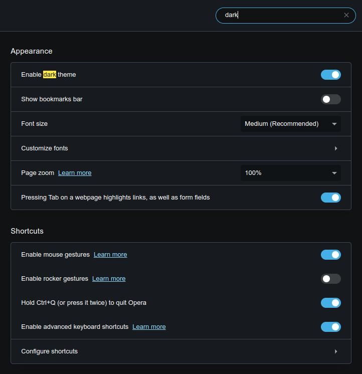
@thelittlebrowserthatcould Force Dark Pages is in main settings.
-
thelittlebrowserthatcould last edited by
@leocg not for me (and Snapshot is still crashing Opera One).

-
ocirnes last edited by
dragging a tab from tab bar results in size changing tab, Win 10:
https://youtu.be/uScSHteP79Q -
leocg Moderator Volunteer last edited by
@thelittlebrowserthatcould It looks a little different here. There is a drop-down menu to choose the theme, among light, dark and system and there's an option to enable Force Dark Pages just below it
-
burnout426 Volunteer last edited by
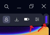
Animated collapsing/expanding of extension component
The team is is continuing to work on improving both animations and UI components.Yeah, expanding/collapsing the extension component is not very smooth at the moment. Or, more specifically when the address bar component resizes the way the account icon changes position is a little funky.
-
thelittlebrowserthatcould last edited by
@leocg it's only in Easy Setup in the Debian builds for the current Stable and Beta, also. I didn't use Easy Setup much, but it's right that it should be there, in case there's a problem reading a page. Before I noticed it was there, I was using an extension and/or user script with TamperMonkey.
-
thelittlebrowserthatcould last edited by
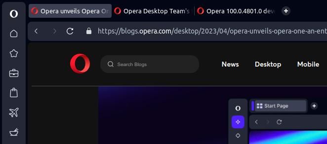
@thelittlebrowserthatcould here are tabs with no Tab Island controls in Linux (and what I take to be the control shown in the page).

The screenshot also shows that the active tab has not been moved to the rightmost position in this workspace (but works OK in the first workspace), as desired by my use of the Most Recent Used Tab Stack extension (for Chromium). There have been problems in the recent past with the functionality of this and the Tab Slider extension being affected in Opera Beta (which was the only version I had installed at the time).
The last version would not start maximized, and I've just now caught this version doing it for the first time.
-
andrew84 last edited by
Still don't get the idea of how the modules are visually presented..
Why do I need these bold borders and spaces around and between elements?
The current representation could be as an option in the form of theme or like interface tuning similar to Vivaldi's 'corner rounding' themes editing option. But not forced as the main design. -
andrew84 last edited by
@leocg It seems they don't learn from their mistakes. The option was implemented after multiple complaints after reborn3 release where the SD tiles size was decreased.
Unless they are planning smth. valuable regarding the start page customization, there will be a bunch of complaints again. -
andrew84 last edited by
During the short time I checked Opera One on borrowed Win 10 PC I understood that the new 'reborned' version is not for me at all.
Without taking into account multiple visual bugs and caught crash during this short period, the interface is totally spoiled after it was more or less fine (excepting menus) and tuned after corrections in 'Reborn3'.
The continuous borders around modules, especially when sidebar and bookmarks bar are enabled, look just ugly to me. Along with the border around opened web page (I'm not a sailor or aircraft pilot to like the 'porthole' windows). So maybe most of users will like the 'bubble' design, but I won't.
-
adam1709 last edited by
Will this new browser, when it enters a stable phase, replace the existing browser? or will it be something else, on the side?
