Tab Split Screen
-
leocg Moderator Volunteer last edited by
@islogged Browsers in general start using the tabs design and Opera stopped using the MDi model, also adopting the tabs one.
And, most probably, the demand for more than one tab content visible at the same has never been enough to justify the efforts to implement it.
-
newworldman last edited by
@leocg Being able to split one tab horizontally with upper and lower panes independently scrollable has always been a useful feature to have, though browsers have generally seen fit not to implement it. It is especially useful when reading technical documents with diagrams or other details that you need to refer back to without losing where you are. I switch to Vivaldi for such tasks. There is an extension Tile Tabs for Chromium but the implementation is poor for my purposes. Firefox Classic had a good one back in the day.
-
yakichan last edited by
This is an interesting option. As an idea, it could be as simple as selecting 2 tabs with "shift" key to do the magic (Sublime Text has an option like this).
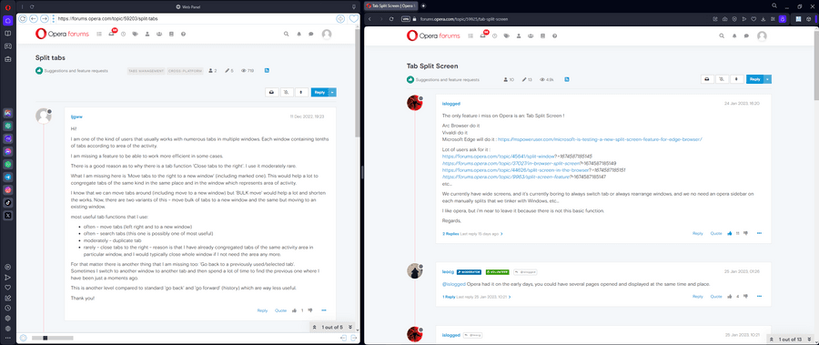
Right now if I want 2 tabs at the same time, I open them in 2 windows and organize them in Windows or use the sidebar.
-
dr1ss last edited by
I love Opera and have been using is on all my devices for years, but I find myself using Arc more and more because it lacks this feature... If most people are ok switching tabs all the time, fine, but there is people who like to use split screens to be more productive.
-
pumpkins25 last edited by
This would be a helpful feature that I would actually use. How dissappointing. Oh well, this is still the best browser imo.
-
Frederikathias last edited by Frederikathias
Hello,
This is just to say I also asked for this feature and agree that it's one of the only big and useful feature opera misses.
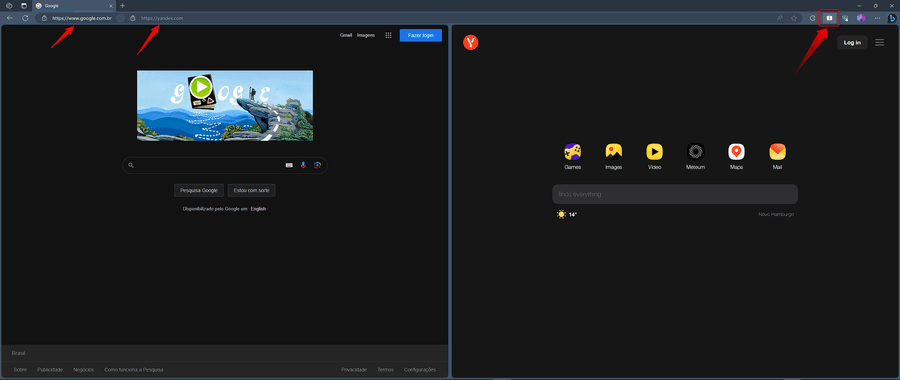
As said now it's even integrated in Edge.Would also fit nicely in the whole "liquid browser" idea behind Opera One.
Best,
-
AndreFernando last edited by
It's something that has been bothering many Opera users, to be honest. Recently, I was amazed by the convenience of tab division in Vivaldi, but I was disappointed with some other features, so I switched back to Opera hoping to find something similar here. I tried using the Tile Tabs extension, but it didn't quite please me. I would like all the tabs to be displayed at the top, just like Vivaldi does. A temporary solution was using the Web Panel in the sidebar, fixing it and dividing it with the other tabs.
I really miss a tab division feature without having to open another instance of Opera. I believe this is a fundamental feature for modern browsers, especially with the increasing screen sizes.

-
andrew84 last edited by
@andrefernando said in Tab Split Screen:
I was amazed by the convenience of tab division in Vivaldi
Edge has the feature as well.
-
AndreFernando last edited by AndreFernando
@andrew84, Yes, this feature works very well in Edge as well, so I believe it wouldn't be difficult for Opera developers to implement something similar (or maybe even better).

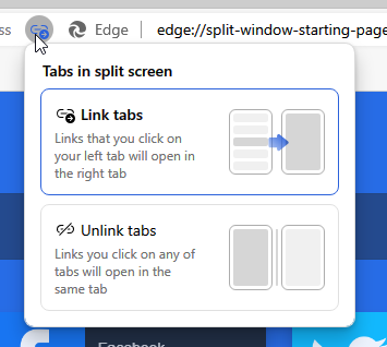
I really liked the layout and position of the links in the address bar, the feature works really well in Edge.
Now it's just a matter of hoping that they implement this in Opera.
-
andrew84 last edited by andrew84
@andrefernando Yes, there's also option how to open links.

The thing I didn't like is that there are borders (and quite thick) appearing around the opened pages.
*I also like the Edge's UI in overall (including dark theme). But, unfortunately, it seems that there will be content border also soon.
-
jas12 last edited by leocg
"Split Screen View" feature is there as "Experimental feature". To Enable it, open a new tab and go to - opera://flags. Then search for "split screen" and enable it. Restart the browser.
Then, press Ctrl and select the 2 tabs. Right-Click on the tabs and select "Create split screen".
-
TheSelfMade last edited by
Well, you can work with it, but it's far from perfect yet. For some reason, it gives you three address bars.
-
jas12 last edited by
@theselfmade - Yes even i noticed it and it confused me. Also there are some usability issues. Its time now that this feature be added to "Main Setting" so that all people can use it and suggest improvements.
Even Edge has this feature as Primary feature.