Dear Opera Team, 2 points we want to inform -
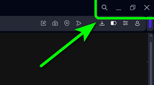
(1) we are power users and we have habbit of moving the mouse to the right-extreme corner to close Opera, but due to new design, now we have to move the mouse pointer exactly on the "Close X" button, which is very irritating
(2) Same is the issue while "Mouse Scrolling" by keeping the mouse pointer in entire "Left side" panel (entire top to bottom part). In many websites we cant scroll by keeping mouse on center of the web page bcoz the design of web-page, so we have to move the mouse to left panel and scroll, but again due to the new design, now we are not able to scroll.
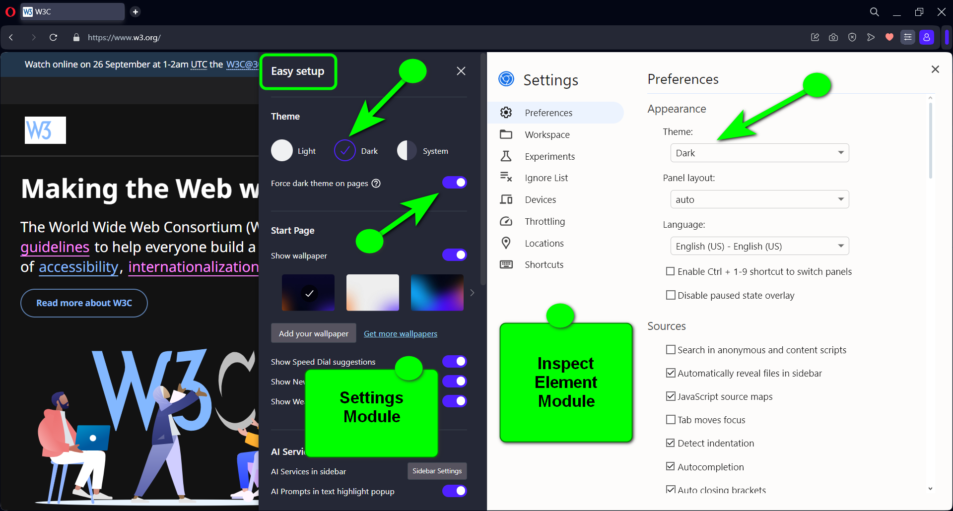
Please remove the unnecessary space on all corners; it does not make much sense to use buzz words like "Modular Design" if users are not happy with such basic features missing


