Opera 89 Stable
-
andrew84 last edited by andrew84
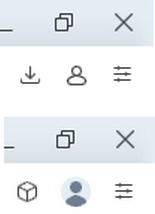
I support the suggestion to hide the account icon if the sync. is not used.
Simply there should be a toggle (Always show account icon on toolbar) similarly to the one for 'battery saver'.

-
A Former User last edited by A Former User
@avmon said in Opera 89 Stable:
Can the Account button be removed if sync is not used?
Why should the button be there if Sync is used?
Totally unneeded. Sync is available from Menu.
Sync is not a function that people access on a regular basis, necessitating such a prominent and visible placement.
Users either have Sync permanently on or they do not use it.
-
andrew84 last edited by andrew84
By the way, in my opinion, the old icon (outlined style) looks better.
The new one is out of style a bit.
-
prochmi99 last edited by
Hello,
why the QR code login is not supported anymore? It was my favourite feature, it made login process into Opera so much comfortable and smooth. Do you plan to bring it black? -
andrew84 last edited by andrew84
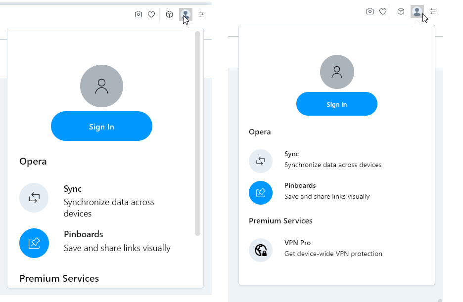
@ohmanger For accessibility is good to have the UI zoom settings as Vivaldi does. It has two separate zooming options: default web page zoom and UI zoom

Opera has option only for web page zoom, so this is incorrect if the UI's elements (popups, panels and so on) react on this zoom setting.
*The same story is with the sidebar's History/Bookmark panels. In my opinion those panels are also parts of the UI and shouldn't react on web page zoom.


