Opera 75.0.3960.0 developer update
-
Opera Comments Bot last edited by
Hello, This is weekly Opera developer update. This one is based on chromium version 89.0.4389.23. There’re small Search Tabs improvements, crash fixes and Feedback dialog UI polishing. These, and all the other changes and improvements in this update, are listed here. Installation links: Opera developer for Windows (Using the Opera developer for Windows installer means…
Read full blog post: Opera 75.0.3960.0 developer update
-
andrew84 last edited by andrew84
There’re small Search Tabs improvements,
No improvements regarding the details if comparing the old TabMenu vs SearchTabs
https://forums.opera.com/post/240672 -
andrew84 last edited by
visually there are still different spaces between the 'recently closed/open' text and highlighted first item in the list. Also, recently close/open text is still hardly readable in dark mode (in contrast to 'show more' button).
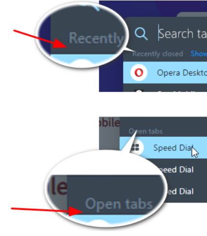
-
ralf-brinkmann last edited by
Opera again does not recognize and complete URLs of my own speed dials or bookmarks when I start typing in the address bar.
W10x64, Operax64 -
A Former User last edited by A Former User
@andrew84 Well, I understand aesthetic issues, but this time the small hick-up doesn't bother me so much. The following screenshots were made using Opera Stable. You'll understand why it's not visible in quickly changing conditions (search is a very dynamic process).
View the pictures in original size (click them).
[Fig. 1] "Recently closed" has correct visibility (system, Opera, monitor data attached)
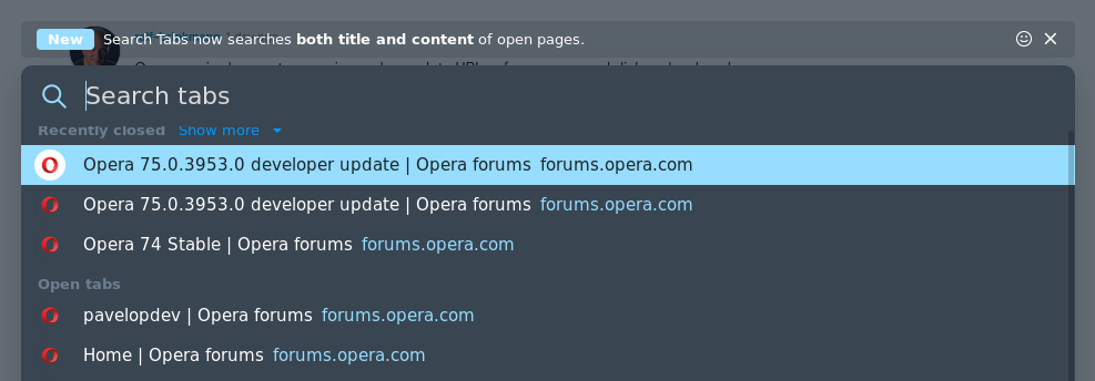
[Fig. 2] "Open tabs" is clear and well distinctive.
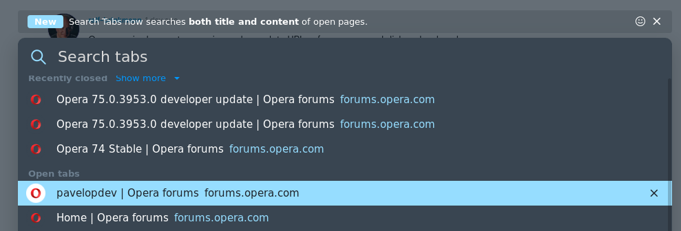
[Fig. 3] Everything's OK, isn't it?
 (when highlighting is far from the two titles)
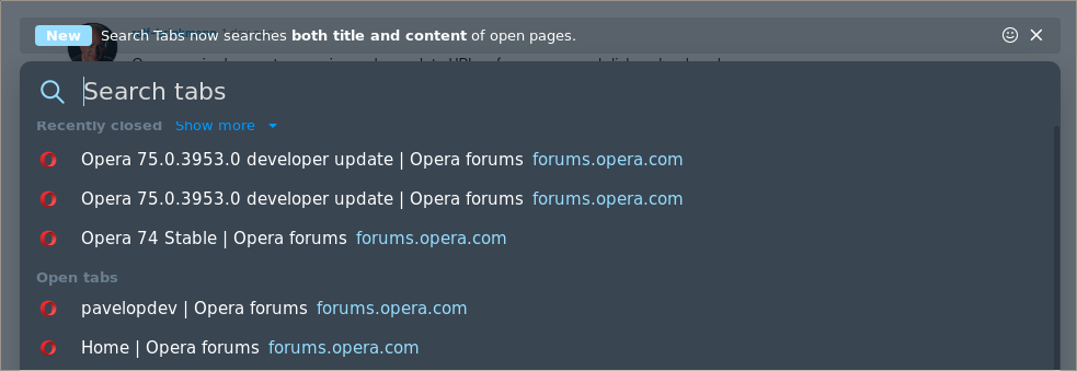
-
andrew84 last edited by
@pavelopdev Yes, but if comparing it with the 'enhanced address bar' pane, then 'recently closed' and 'visit again' titles are more clear (the both SearchTabs and enhanced address bar popups have the same background color). So I don't see a problem of unifying the titles which are used on the same background.

The same story is with vertical spaces below the 'recently closed' and 'open tabs' titles. Not a big problem at all, but the spaces are really different and I also don't see a problem of moving the first recently closed item a bit lower on few pixels. -
A Former User last edited by
@andrew84 Yes, I agree with you generally as we have the same, well, similar, vision on Opera details. I have forgotten about BABE probably (Am I right?)
Such unifying modules/functions/libraries would be godsend from programmers point of view. If you have to program such things as you pointed out are a daunting task, the more so Opera has small resources. No wonder they eschew those "bugs".
BTW. You have touched an interesting issue of monitor settings, indirectly and unintentionally perhaps, but that's another subject to ponder how to set the damn monitors to get the best possible image from them.

-
andrew84 last edited by
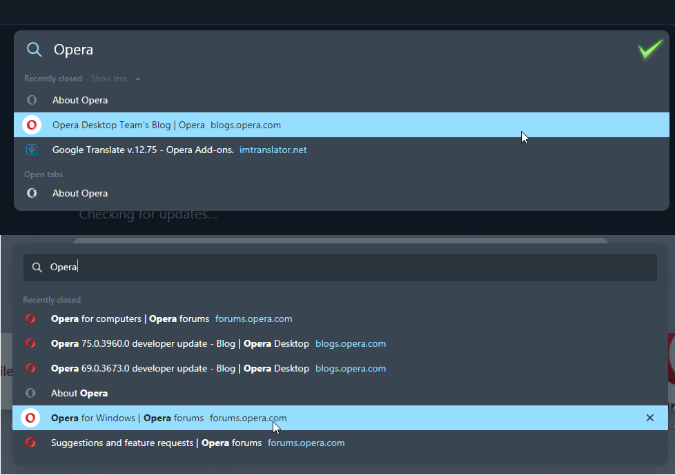
Return the previous look of the search field on SearchTabs popup. It was much more clear and modern without visible text field and with the bigger text.
-
A Former User last edited by
@andrew84 Well, it's not perfect. It might be polished, but do you recall the famous word mañana heard many times in this Opera forums in form of never fading echo:

From Wiktionary
Noun
mañana m (plural mañanas)the near future; tomorrow
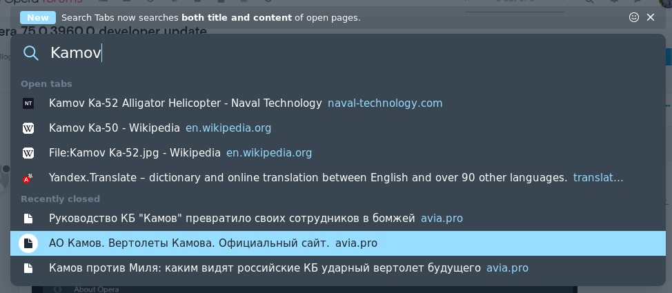
En un día del mañana. ― Some day in the near future.[Fig. 1] Open tabs and Recently closed are too washy and decidedly too small.
-
andrew84 last edited by andrew84
@pavelopdev said in Opera 75.0.3960.0 developer update:
issue of monitor settings, indirectly and unintentionally perhaps
Just now I noticed that the items text is bigger on your screenshots.
I also noticed that on your screenshots 'Recently closed' and 'Show more' text is cut.

-
A Former User last edited by
@andrew84 The damn f****g Opera!
I've spent a lot of time making dozens of screenshots to find out the cause of the cuts you noticed.
Thank you very much!The following screenshots explain the source of the phenomenon.
No matter what font size or Page zoom is selected. It is bad programming habit example. A code control is also crappy, I presume.
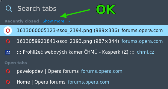
[Fig. 1] Upper part of Search tabs
[Fig. 2] Bottom of Search tabs window

[Fig. 3] Bottom of Search tabs window with selection

-
sallyface last edited by
need to make with address settings to more sites folder and temporary sites where the user came because we must have the same great translation of the buttons is large, then it will be necessary, sidebar buttons bigger and wider as there still have something new Wallpaper need to make the folders need the news feed to make it easier. Another auto-translator and, so that the opera can stretch the image,the image can be updated. You also need several modes of the copy text panel when selecting text and, paste quickly into the search field and, forms, more, you need to, picture-pictures when you click on them unfolds to the full screen in all sites. Very much missed. It's still time, head typing in, browsers do.
-
ralf-brinkmann last edited by
@leocg Only the Autoupdate file. Can I download and use this as a normal installation file for my standalone installation? I have never tried that out.
-
leocg Moderator Volunteer last edited by
@ralf-brinkmann Not sure. I remember have tried once and that it didn't work.