Opera 74.0.3876.0 developer update
-
A Former User last edited by A Former User
-
I'm logged in, I see both my posts.
-
That's what I'm concerned of. I always try to document and illustrate my bugs and requests, but all the efforts may be washed down with all other requests from and on that prolific arena of "Suggestions and feature requests" page.
-
-
andrew84 last edited by
@pavelopdev said in Opera 74.0.3876.0 developer update:
I see both my posts
In the blog (here https://blogs.opera.com/desktop/2020/11/opera-74-0-3876-0-developer-update/#feedback-container)? I don't see.
-
A Former User last edited by A Former User
@andrew84 Ok, Ok. I got it. There're no next posts. I am/was publishing from forum:
https://forums.opera.com/topic/45110/opera-74-0-3876-0-developer-update/24Definitively I need to delete one of my posts.
Tough! Too late!

-
andrew84 last edited by
@pavelopdev comparing to the previous commenting system (disqus) it's very inconvenient now because they publish changelogs and announcement in the blog, but it's impossible to post pictures/gifs from the blog comments form. Also, in the blog there is a tree view in contrast to this forum. And posts editing time limit is very short (30min).
-
A Former User last edited by
@leocg Firstly, thank you for helping in deleting my post's copy.
Secondly, how to switch to the tree view? -
andrew84 last edited by andrew84
- Improve the video pop-out. Make it like in the yandex browser currently and like it worked previously in Opera (before Chromium's popup implementation) https://forums.opera.com/post/225402
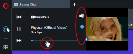
- New Player popup should be improved too, add volume control (click icon to mute/unmute) and allow fast forwarding by clicking the progress line.

*also, the big problem for me on youtube music is the ads are not blocked in the player panel. In the main window the block is working fine.
-
andrew84 last edited by andrew84
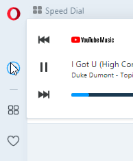
@andrew84 and in light mode the control buttons and progress line don't look great being the simply black. I guess some gray or light blue should be used (maybe the color of sidebar icons can be used)

*also, in dark mode youtube icon is white for some reason, in light mode the icon is correct red.
-
A Former User last edited by
@andrew84 That's exactly why I christened Vivaldi as "80% Browser". A lot of options/functions finished in 80% and with no slightest chance to change the status quo. With all my requests/asks/begs I was able to wallpaper my rooms, at best. Other reasonable users could do the same.
I got still the deep hope new Opera will not follow Vivaldi's path.
-
A Former User last edited by A Former User
@pavelopdev Next two examples what to polish in Opera Dev, voice similar to @andrew84's one above.
1]
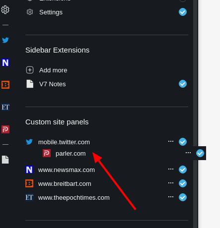
I've tried to move the last fifth item in Site panels to second place. The free area for it was created (see Fig. 1) - the first item and the second one have spread up and down a little. When I released mouse button after moving parler.com website where I wanted it to be, the movable part got back to the original position (fifth from top). No change.[Fig. 1] Changing website's order via drag'n'drop, failed.

2]
I vote to increase websites limit in Site panels, 5 items is too restrictive. -
andrew84 last edited by
@pavelopdev Yes, drag and drop rearrange doesn't work for custom sites. Custom sites is relatively old feature already. I don't remember exactly when it was first implemented but I have flag (disabled by default) in 69 Stable version. Developer version is 74v. already and the flag is still disabled by default. Player was introduced in 73 Developer version and it's in Stable already (pretty fast promoting). And another one feature was presented during this time - EasyFiles. It seems that 'custom sites' feature doesn't look important for them and thus doesn't receive any improvements (according to the recent changelogs).
-
A Former User last edited by
@andrew84 As you read my posts you know well I hate "80% Browsers". If one enters an option let it be finished! Custom site panels (CSP) are not so important to me, I can skirted it over recreating fully functional ersatz thanks to workspaces. Anyway, if CSP exists, it needs to be fully implemented.
-
andrew84 last edited by andrew84
@pavelopdev custom sites has more additional potentials than the simply bookmarked pages on the sidebar. There were pretty much complaints when they (Opera) removed the 'InstantSearch' feature and as I suggested here https://forums.opera.com/post/228116 there cold be some predefined panel that will allow perform an instant search and see the results side by side. Edge (on chromium) has the similar feture already, in Opera it could be in more advanced view.
-
A Former User last edited by
@andrew84 I've read the thread, thanks. I know now that Player is more ready (to be published) than CSP (Custom Site panels).
 The sad thing is that your's and others' knocking on Opera Sezame Gate seems to be rather fruitless.
BTW Paying attention to Edge might bring a thought about slowness of Opera Desktop development, alas. How many times one can write posts on the same topics, or bugs, or lack of finishing/polishing doings? I admire your stamina in your efforts to push Opera Dev development and "debugging" on faster track and to be more focused on details.
-
andrew84 last edited by
@pavelopdev Player is already published in latest Stable update so the feature is fully ready to use (at least in their view). https://blogs.opera.com/desktop/2020/11/opera-player-spotify-apple-music-youtube-music/#feedback-container
-
A Former User last edited by A Former User
@andrew84 said in Opera 74.0.3876.0 developer update:
@pavelopdev Player is already published in latest Stable update so the feature is fully ready to use (at least in their view).
Yep, when it plays than it's fully ready. New control functions/icons? What for? Do not be a nasty guy!
 (From this page: https://forums.opera.com/post/233994)