Opera 69.0.3686.7 beta update
-
Opera Comments Bot last edited by
Hi there, Here is the new Opera beta update, based on Chromium version 83.0.4103.44. For active Twitter users, this update also includes the Twitter in the sidebar. For the complete list of fixes and improvements, see the full changelog. Installation links: Opera beta for Windows (Using Opera beta for Windows installer means Opera for Computers EULA is accepted) Opera…
Read full blog post: Opera 69.0.3686.7 beta update
-
andrew84 last edited by
- fix the ugly dropdowns (black bold border for selected items ) and how do dropdowns open (flickering white) https://forums.opera.com/post/210304
- fix scrollable menus https://blogs.opera.com/desktop/2020/05/opera-69-0-3679-0-developer-update/#comment-209470
-
andrew84 last edited by andrew84
-
It seems that you call the 'enhanced address bar' as 'BABE' for some reason.
Please, add quick action button on this 'BABE', like it was in previous Quick Access feature (excepting 'Snapshot', I guess).

+'Paste and Go' button probablyAlso, add option to show/hide the 'TOP' sites section (buttons also can have show/hide option). Maybe 'SD tiles' section could be also there (like it worked previously).
-
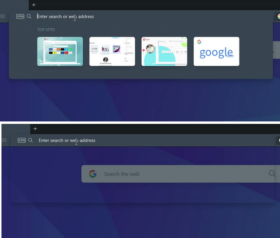
When I begin to type the panel flickers a bit and the bottom part becomes transparent (shadowed), I can see SD page for a moment.
I recorded frames.

-
-
A Former User last edited by
@treego: You have to click twice on twitter. So the icon will appear.
Some users has to disable this flag (#sidebar-site-panel) before. You can reenable it again when the twitter icon appear. I had twitter like a sidepanel, so I had to disable that, so twitter icon apeear to me. -
andrew84 last edited by andrew84
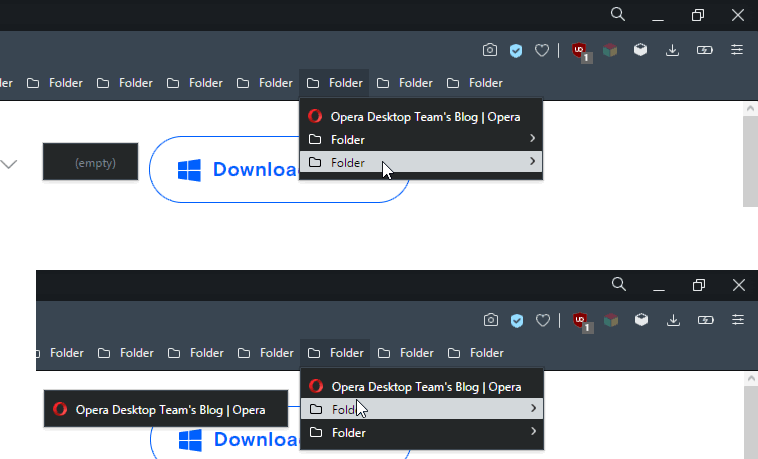
Bug (in Dev too)
Look how far and in wrong direction the 'empty' item is shown for the last folders, bookmark is also shown with a gap.

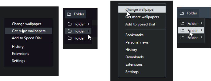
- And make the selected items in dropdown/menus/context menus to look like in GX (with adjusted color scheme). The high contrasting items still look horrible in dark theme (my opinion)

- And make the selected items in dropdown/menus/context menus to look like in GX (with adjusted color scheme). The high contrasting items still look horrible in dark theme (my opinion)
-
A Former User last edited by
@kened: Perhaps an interface transparency control? Some blur should be good.
-
chas4 last edited by
No auto update from 69.0.3686.2?
Why Open the Web?
Despite the connecting purpose of the Web, it is not entirely open to all of its users.
When used correctly, HTML documents can be displayed across platforms and devices.
However, many devices are excluded access to Web content. -
A Former User last edited by
@leocg: Are colors the only differentiator of Opera GX? I don't think so.
-
A Former User last edited by
@leocg: I think that with the GX' colors it would be easier to identify the active tab.

