Opera 69.0.3638.0 developer update
-
leocg Moderator Volunteer last edited by
@takesh-kovacs As said before, it was removed. Last closed tabs can be found in Menu > History.
-
takesh-kovacs last edited by leocg
@leocg said:
@takesh-kovacs As said before, it was removed. Last closed tabs can be found in Menu > History.
no sense for me.
why do I need a card search engine when I use max 5 cards? -
andrew84 last edited by andrew84
@leocg He means that there's no need to use a search among 5 opened tabs, I guess.
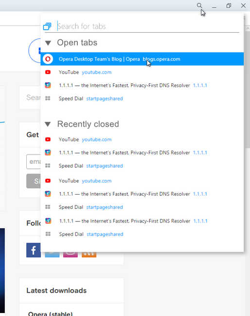
And I agree, I think that most of the user have usually not more than 10 tabs opened at the same time.@takesh-kovacs you can disable the #search-in-open-tabs flag and TabMenu button will be back
-
andrew84 last edited by andrew84
@leocg said in Opera 69.0.3638.0 developer update:
the same could be told about closed tabs.
Why? The search is only for currently opened tabs.
I can have important 3 tabs opened at the same time, but I can have 30 tabs closed tabs that I'd like to revisit quickly some of them without visiting the full History page.
Opera is forcing to the the opposite: keep all tabs opened and use search (to search you must also remember what pages were opened, in contrast to the TabMenu dropdown where you can see the tab header).
Using OMenu > History is not the best solution because there is limited number of items. And what for was created the TabMenu if there was also such opportunity to use the OMenu? It's similar like removing the search popup because it's possible to use right click's context menu > search/copy.- InstantSearch is removed, so put 'Search in tabs' button on the sidebar and leave 'recently closed tab' button in place.
-
andrew84 last edited by andrew84
@leocg You can notice pretty much complaints here since that time when the feature was removed.
It was a kind of universal feature: someone uses it to see opened tab (if there are many tabs opened), someone for 'recently closed', someone uses both options, someone just not using the feature at all.
Instead of one universal feature we have 3 now: Search in tab, Ctrl+Tab cycling popup and workspaces. Search in tabs and Ctrl+Tab are useless, in my opinion, and won't be popular. Workspaces a bit more popular.
I wish to browse quickly without extra typing/browsing inside browser UI, I don't want to collect opened tabs in different views, filter them, search and look at them. I want to do 1 or 2 clicks to get the result. -
andrew84 last edited by andrew84
@ralf-brinkmann Checked it in latest Edge (which is 83.0.461.1) and still no fix.
-
andrew84 last edited by andrew84
@leocg said in Opera 69.0.3638.0 developer update:
can't please everyone all the time.
It's more than possible in this particular case.
Just add switches on the new popup as I suggested above https://forums.opera.com/post/203796Or restyle the TabMenu to look more modern but with the kept functionality and layout.
Both developers (because there will be another one new feature implemented that can be hyped) and users (because it will be the same feature, loved by most users, but even more improved) will be happy in this case. And the complaints will stop instantly.
