Opera 66.0.3480.0 developer update
-
Opera Comments Bot last edited by
Hi, this is our weekly Opera developer update with some UI fixes and other improvements. All the changes and fixes, you can find by clicking link to a detailed list. Installation links: Opera developer for Windows (Using the Opera developer for Windows installer means you have accepted the Opera for Computers EULA) Opera developer for…
Read full blog post: Opera 66.0.3480.0 developer update
-
andrew84 last edited by andrew84
@eugene-b but that green text 'Opera Software....' still looks too thin/big to me. Also that green text is not centered with vpn, badge icons and address bar text.

-
andrew84 last edited by
Move the vpn icon (or other if vpn is disabled) closer to the left address bar's border, make the same space like between the heart icon and the right border

-
ralf-brinkmann last edited by
For me that green "Opera Software AS ..." is too wide, big and showy. And the other font? I don't see any difference. But it is not so important for me.
-
andrew84 last edited by andrew84
Address bar dropdown is not fixed in darkmode https://forums.opera.com/post/185386
And in private windows dark mode is completely broken https://forums.opera.com/post/185374 -
andrew84 last edited by
@ralf-brinkmann: probably you don't see any difference because you have 'reborn3' dropdown disabled in flags. Now with the enabled flag it looks in the same way as with disabled (but that green text is still not great).
-
ralf-brinkmann last edited by
"DNA-80584 Closing active tab – the last active tab should be shown" still does not work if the active tab was opened by clicking a link in an external program (e-mail client, usenet client, external pdf-reader ...). Instead the focus goes to the last tab on the far right.
W10x64, Operax64 -
andrew84 last edited by andrew84
suggestion: add search engines choice on new r3 dropdown at the bottom like in old dropdown (here it could be round icons), don't cut its functionality.

-
ralf-brinkmann last edited by
@andrew84 said in Opera 66.0.3480.0 developer update:
@ralf-brinkmann: probably you don't see any difference because you have 'reborn3' dropdown disabled in flags. Now with the enabled flag it looks in the same way as with disabled (but that green text is still not great).
Oh, you are right. It is disabled.
Reborn disabled:

Reborn enabled:

I miss the lower line under the url when enabled. The font is nearly the same.
-
andrew84 last edited by
@ralf-brinkmann I can see the difference on your pictures, but here (Win8x64) that underline is visible in both cases.
-
ralf-brinkmann last edited by
@andrew84 said in Opera 66.0.3480.0 developer update:
@ralf-brinkmann I can see the difference on your pictures, but here (Win8x64) that underline is visible in both cases.
And I don't like this darkening when I type a new url or search term into the address bar.
-
andrew84 last edited by andrew84
@ralf-brinkmann said:
And I don't like this darkening when I type a new url or search term into the address bar.
me too, looks like InstantSearch.
-
A Former User last edited by A Former User
Did you know, that you can use Chromium's
opera:flags#enable-force-darkflag (several options) in Opera Dev/beta, and it will work also on internal pages (including this SD page - you can see it, when you disable wallpapers);-) -
andrew84 last edited by andrew84
@l33t4opera: yes, but how to expand it to Opera UI? I mean toolbar, menus , popups.
-
A Former User last edited by A Former User
@andrew84 When you enable the Opera's dark mode you will have a full dark mode browser (also for websites, without any extension), though it will look different then, for the UI and internal pages of course
;-) -
andrew84 last edited by andrew84
@l33t4opera: sorry, I misread it that the flag is for Web Content. I remember there was an similar option to 'force' the dark theme (for the UI) but that was a switch for the shortcut (it worked for Chrome, but didn't work in Opera)

-
andrew84 last edited by andrew84
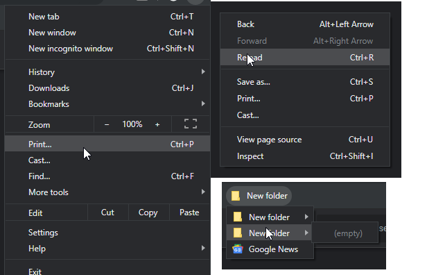
By the way, that 'forced' dark theme looks better than in Opera (in Edge it's even more better). Items have light gray selection instead of white, borders are shadowed and also not so noticeable when in gray color (in Opera borders are strange blue) and it looks better (almost all companies understand this, not only browsers: YouTube in dark mode, Adobe, graphic editors and many others use the light gray selection instead of that 'stroboscopic' white)

And if understand it right, it's default chromium's dark mode. -
A Former User last edited by A Former User
Hi @andrew84, yes the flag you mentioned is not working from the command line.
'forced' dark theme looks better than in Opera
Yes, that's why I wrote, it will be different, when you enable both - the flag and the dark mode in the Opera. Also, without telling what is better or worse, because both implementation seems to be still work in progress.
-
leocg Moderator Volunteer last edited by
@l33t4opera I'm using it. One of the best recent features in my opinion, although it has space for improvement.