color: grey
-
blackbird71 last edited by
@leocg said in color: grey:
@ryszard What is the problem with it?
See the comments in this thread: https://forums.opera.com/topic/22911/readability-issue
-
leocg Moderator Volunteer last edited by
@blackbird71 I don't see such problems here, at least on a way that bothers me.
-
blackbird71 last edited by blackbird71
@leocg said in color: grey:
@blackbird71 I don't see such problems here, at least on a way that bothers me.
I believe the impact of the font varies greatly with the person viewing it. When font gets smaller, it is harder for the eye to distinguish details in each character. The same thing is true if the contrast against the background is reduced, either by reduction of the color difference between character and background or by slimming down the lines comprising the font characters. If color, font size, and line slimness are all reduced, the impact on viewability is made all the greater... but the impression on a reader depends greatly on his individual vision nature.
What I especially notice right on this very web page is the distinct contrast difference between the button text in the lower right of the forum page (the Mark unread, Watching, and Sort by buttons) and the text in these posts. The difference is most noticeable by moving back from the screen and noting at what point the two different kinds of text become hard to discern... in my case, I can move back over three times as far before the button text becomes roughly comparable to what the posting text appears to be at normal viewing distance.
I think to many users' vision, the post text becomes hard to clearly read beyond distances that are uncomfortably near to the screen, and that would be remedied by making the posts' font thicker and darker.
-
leocg Moderator Volunteer last edited by
@blackbird71 said in color: grey:
What I especially notice right on this very web page is the distinct contrast difference between the button text in the lower right of the forum page (the Mark unread, Watching, and Sort by buttons) and the text in these posts.
True, the text of the buttons looks darker and bolder here. And for me it may look strange to have it on a post text.
-
ryszard last edited by ryszard
ROZWIĄZANIE
- Zainstalować https://addons.opera.com/pl/extensions/details/stylish/?display=en
- Dodać:
body {
color: #000000 !important;
}
div[widget-area] {
display: none !important;
}
.content p {
font-size: 12pt !important;
}
I już.
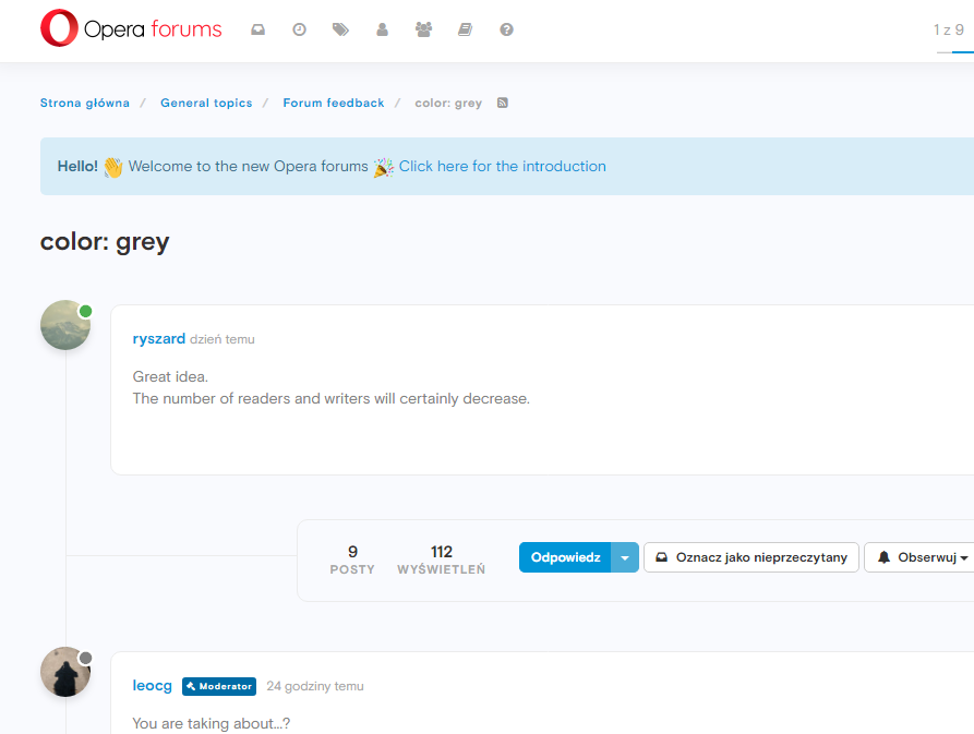
przed - ŹLE

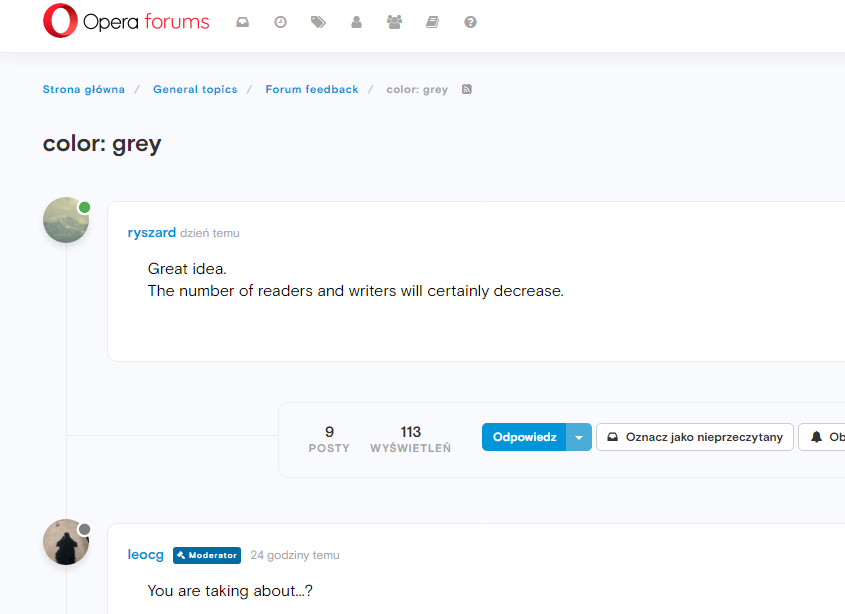
po - DOBRZE

-
A Former User last edited by
@sgunhouse It's a bit difficult to read here, and I'm certainly not going to offset my monitor settings to make it better!
I'm not suggesting the text should necessarily be black, but the grey should certainly be a bit darker IMO.

-
donq last edited by
@leocg said in color: grey:
@blackbird71 said in color: grey:
What I especially notice right on this very web page is the distinct contrast difference between the button text in the lower right of the forum page (the Mark unread, Watching, and Sort by buttons) and the text in these posts.
True, the text of the buttons looks darker and bolder here. And for me it may look strange to have it on a post text.
It can look strange for you - for me black text would look much better. That is why it would be best to have few themes (both gray and contrasty ones), selectable in forum settings.
-
A Former User last edited by
Forums have been updated today. There is implemented darker palette of all gray levels we use.
All posts text maybe is not black, but much darker than previously. We hope it's enough readable.
-
blackbird71 last edited by
@lmormol-op For my eyes, it's a major improvement. Now I don't have to rock closer to the screen when I visit the forums here... Thanks!