Close button is not default size - cannot close movig cursor to right upper corner
-
suszi last edited by leocg
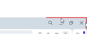
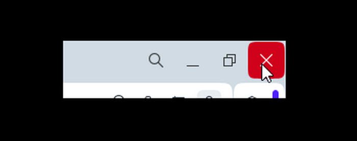
Image is not perfect, but, the Close Opera button is not stretched to the end of screen whem windows is maximized, so you have to move cursor to the corner, then move back a little and then click to close the browser

please remove all unnecessary spaces from the UI
anyway - switching tabs and search icon works when clicking at the edge of the screen.....
-
andrew84 last edited by
@suszi said in Close button is not default size - cannot close movig cursor to right upper corner:
please remove all unnecessary spaces from the UI
the unnecessary spaces is one of the main ideas of the 'modular design'.
@suszi said in Close button is not default size - cannot close movig cursor to right upper corner:
switching tabs and search icon works when clicking at the edge of the screen...
I don't use Stable version. But in Developer version all the 4 buttons are non responsive on the edge (marked red on the picture) because buttons are surrounded by the border.


-
zainalabideen last edited by
@andrew84 How can we cancel the "modular design" ?
Because the close button is annoying in this version -
andrew84 last edited by
@zainalabideen You can only continue hoping they pay attention and fix the issue by extending the active area of the buttons block.
-
luciflash last edited by
It feels like people who develop Opera don't use Opera in their daily lives.
-
siddhartha last edited by
Also clicking dragging the scroll bar whe it is maximized, most of the time causes all sorts of weird visual issues and detaches and resized the window losing sync of it's state, then I have to click few times on the maximize button. Extremely annoying

-
jas12 last edited by
Dear Opera Team, 2 points we want to inform -
(1) we are power users and we have habbit of moving the mouse to the right-extreme corner to close Opera, but due to new design, now we have to move the mouse pointer exactly on the "Close X" button, which is very irritating(2) Same is the issue while "Mouse Scrolling" by keeping the mouse pointer in entire "Left side" panel (entire top to bottom part). In many websites we cant scroll by keeping mouse on center of the web page bcoz the design of web-page, so we have to move the mouse to left panel and scroll, but again due to the new design, now we are not able to scroll.
Please remove the unnecessary space on all corners; it does not make much sense to use buzz words like "Modular Design" if users are not happy with such basic features missing
-
Moved from Opera for Windows by
 leocg
leocg
-
CloseButtonTed last edited by
I don't know why you did it, but a quick flick up to the corner of the screen to close an app no longer applied in Opera, you changed the style... now it's highly annoying to close, I think every other app I've ever used since the 90's I've closed in a similar way on Windows, it's making me want to go back to Firefox, well I actually use Edge as my main browser, but I was simply using Opera to avoid using Youtube on Firefox, anyway... If it's at all possible to let me know how to remove the rounded off X close button in the top right hand corner this would be a boon... otherwise it's got to go.
-
jas12 last edited by
Now i think that this is a useful feature bcoz sometimes Power Users like me can end up closing Opera Browser in quick mouse movements. But i feel that users should be given an option of whether they want a New Modular Layout or want to continue with Old Layout
-
Referenced by
 leocg
leocg
-
jas12 last edited by jas12
@kevin-cherry Absolutely correct reply. "Modular Design" seems a fancy new word, but is very irritating even for basic tasks
-
Kevin-Cherry last edited by leocg
@leocg Also, I want you to look at Every Other Browser and tell me if this behavior is present in any of them. I just double checked Chrome, Edge, and Firefox (the ones most people use) and none of them have this behavior. Hell, look at any other software and tell me if any of them do this. If your software is the only one with this behavior, then by definition this is not going to be expected by the end user which will lead to confusion and frustration, which leads to user Unfriendly design. A user shouldn't have to retrain their muscle memory for this One application that wants to be different from everyone else.
-
devilsummoner last edited by
@kevin-cherry You know what makes this even funnier? This problem does not exist in Opera GX... You know that one problem we had about moving the whole window when using the scroll bar... That was not there either.