General Opera One Appearance Feedback Topic
-
A Former User last edited by
@tiborzsitva It seems to me there is no point asking for any change. The design is set in stone and the developers wont listen to us.
The sooner you switch back to version 99 or part ways and fine another browser the better. -
tiborzsitva last edited by leocg
ok, thx
Maybe I should have put this somewhere else, but I noticed a bug... I have a 3 buttons touchpad and I use the middle button to close tabs. I move my mouse cursor completely to the top, I position it horizontally and click. But sometimes it doesn't close the tab. Sometimes yes.
Edit: I already know the reason. It doesn't work, when I open a link in the tab in new window. Then a vertical bar will appear before the title of the tab and in that case the middle button of the touchpad will only work if I move the cursor inside of the tab's rectangle. I think I should be able to close the tab when my cursor is just above that rectangle.
-
cheerd last edited by
@jessbaltrusch I just returned to version 99. But history got broken after it (maybe should to clear all history to get it work again).
-
A Former User last edited by
I've been using Opera since around 1998...I was a Netscape user prior but at that time I had an older PC (in college so I could only get the basics), I found a suggestion to use Opera as Netscape was getting a little 'thirsty' on the resources and Opera was fast and efficient.
The other day I was updated (I closed the browser but didn't notice the update looming)...the next day when I went online for work, I got this new splash screen animation, and a horrible new look and layout. I had had it all tweaked the way that I liked it for my needs...all sorts of settings that had tailored it to my personal use (another reason that I had originally switched). I had noticed many updates ago Opera was getting 'thirsty' with more features (that I've never needed anyway) and it had slowed some, but my PC has always had enough grunt to deal with it so it didn't bother me.
.....however, the new look is.....well I don't know what they are going for as the colours are all over the place as is all the stuff that I had customized (muscle memory)...some of these new features make the browser more of a pig (the stupid splash screen really serves no purpose and slows the whole lot down).
The new One looks a little childish in style, colours and as I said before stuff just seems to be all over the place. Such a drastic change should have an option (maybe it's there and I missed it, but I was looking)-like other porgrams that make a big leap-the option for a 'classic' mode. This would maintain the familiar look and feel and mix in new features/function, but not at the expense of the experience.
It feels like the group over at Opera thought it all looked cool, but (as most companies do anymore) didn't check with the user say by offering a limited time preview, or something along those lines. I would have given it a shot, but I would have had the option to click a button to revert it all back.
I welcome change to most things, but this just seems like a 'shoot first and ask questions later' sort of thing.
I still have it installed in the event they re-work it (I mean it's a browser, not an OS...it doesn't need as much as it has), however I have mograted everything over to Edge (feels more like Opera used to.
I will keep checking back, as I have been with it a long time...so I'll give them a chance.
-
canadagoose4everreturns last edited by
@habsfan In spite of my being a Leafs fan, I'll still give you an upvote since I share your view of Opera One. You've been with Opera two years longer than I (I began in 2000) and came from Netscape as well (I could no longer stand Netscape 6, if memory serves). Unlike you, however, I've removed Opera One since I received the information that there would be no reverting to the older UI and that updates to the older version would only continue temporarily. Not sure what else to tell you since I'm in the same quandary although unlike you, I've reverted to Firefox rather than Edge.
-
Vasevase last edited by
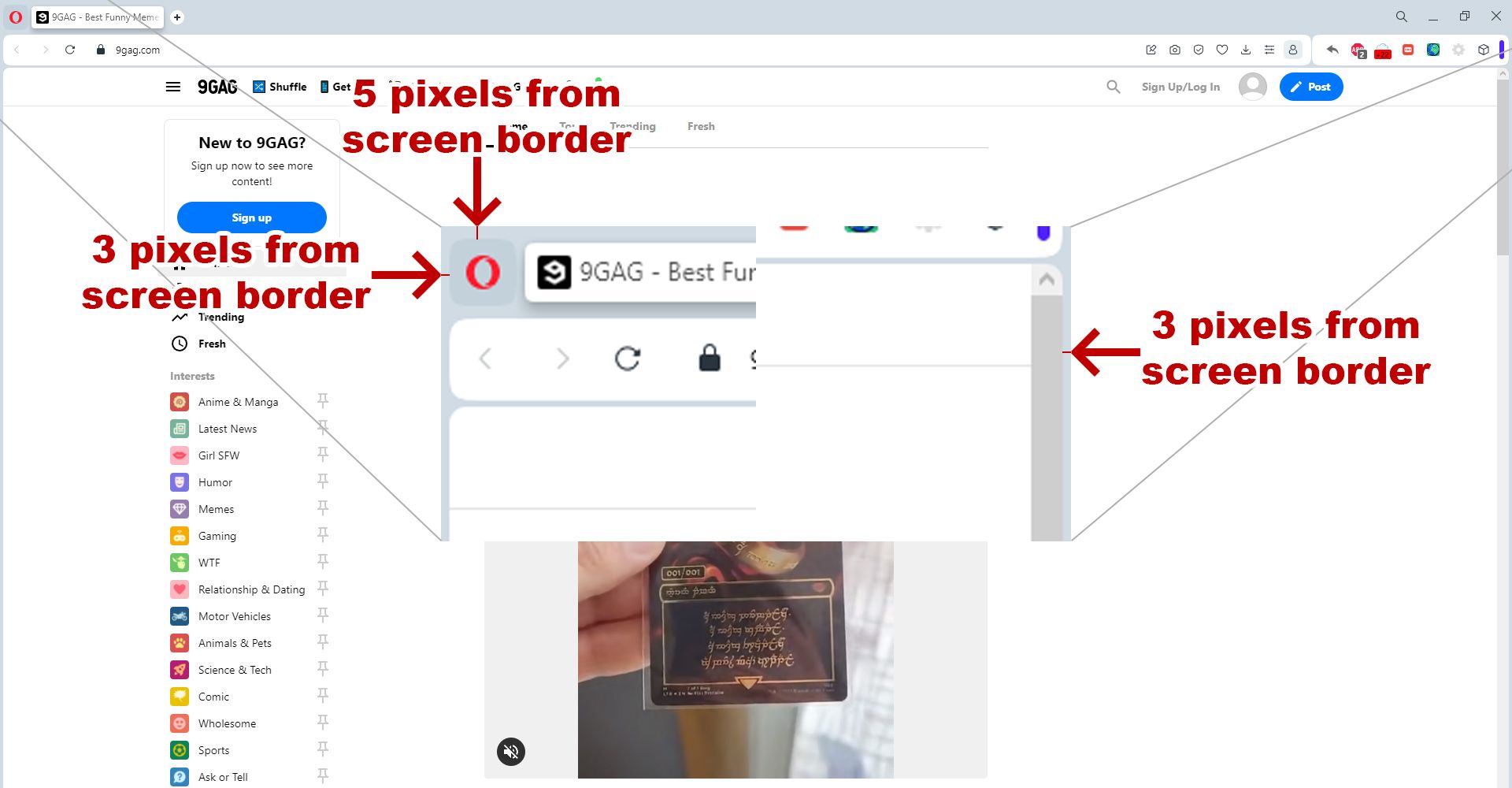
Hello. Tell me why you added a border between the scrollbar and the edge of the screen. It became impossible to sharply move the mouse cursor to the right edge of the screen to click on the scroll bar. Also, by quickly moving the mouse cursor to the upper left corner, it is impossible to click on the Menu. Is there any rational explanation for this innovation?

-
A Former User last edited by A Former User
For me, Opera has always felt like a small startup from my hometown Oslo.
Since the times with Jon Tetzchner, I’ve given them some slack compared to the large operators such as Google and Microsoft.
But for the company to make such user-unfriendly design choices in 2023 is inexcusable.
Are they a fashion- and marketing company or a producer of software?
Opera has 600 employees. What do they all do?
-
andrew84 last edited by
@habsfan said in General Opera One Appearance Feedback Topic:
The new One looks a little childish in style, colours and as I said before stuff just seems to be all over the place
Maybe now the GX and regular Opera version will be supported by the same team (because of staff reducing or smth. similar), that's why the two browsers look similar (including splash screen and the forced dark theme on their promotional videos and screenshot). Just an assumption.
I'll stay on pre-One version.
Similar situation was after the Reborn3 presentation. There were also a lot visual bugs and weird effects implementations. But that time I didn't give up because most of the visual issues were just bugs. I also was staying on old version but quite actively checking developer version and posting suggestions and bugs.
The reborn3 was polished finally and well looking in recent years and I was happy with it (my only complain was that the OMenu/context menus/dropdowns were still old looking with their white high contrast items in dark mode).
But now I have to give up because the visual changes are not for me and these are not simply bugs but intentional(and hyped) changes.
I have no wish to check bugs or making suggestion if I'm not going to use the One version. At the same time it's pretty pointless if they already made a choice towards the bubble design and the purple accents.I won't count the multiple ridiculous design changes, there's enough feedback already regarding this. It'll take some time to understand if Opera team will take into account the feedback or not.
I have a little hope that they'll will remove the content border at least. -
dwk102 last edited by
I left Opera installed but moved to Firefox as my main browser... I dislike almost everything about this update and until we have an option to go back to use the previous appearance/skin/layout, I don't see myself coming back. Not only that, the islands feature is especially annoying since you can't customize the name or color.
It's sad too because I've loved Opera for decades

-
A Former User last edited by
It's maybe crazy, but am I the only one that outright likes the new design?
I used Edge for a whole day yesterday, but I'm so glad that I'm back with Opera. In contrast to Edge everything's feels at the right place. No clutter, no bloat. Even when Edge can claim some functionality that Opera has, it seems to simply added without any plan.
The sidebar is simply on the wrong side. The startpage is so full with stuff nobody needs, and it really lacks a speed dial.
In contrast to Opera the design looks so old-fashioned and boring. The setting page is so ugly and cluttered. Especially there, nothing feels right. Quite contrary to Opera.
If you want sync you have to register and log in to a Microsoft account. How easy is it so set up an Opera account in contrast.
Bing AI didn't give me an answer nearly as convincing as Aria to my questions.The only alternatives to Opera that I find appealing at the moment are Vivaldi and Firefox. But they have issues of their own.
I wouldn't say that Opera's design isn't without flaws, actually. But for me it's especially after having a look at Edge the best blend of features, simpleness and performance. I liked the old design though but the new one really stands out IMHO.
-
andrew84 last edited by
@himmelsheriff said in General Opera One Appearance Feedback Topic:
In contrast to Edge everything's feels at the right place. No clutter
According to feedback on this forum there is significant negative regarding the new design.
And for me the 'One' version now looks cluttered to me comparing to other browsers.
When I look at these 3 levels of 'bubbles' (tab strip + address bar + bookmarks bar) in light theme I can't simply understand why it should look like more modern design. What advantages I get from these separate bordered modules? And the content border below just knocks me out.
Another one irritating factor for me is the purple highlighting items in menu. I mostly use the light theme. Previously the 'stroboscopic' effect was only in dark theme with the bright white items, now the bright purple is in both light and dark theme. You really think the most of the companies are just retarded, use light gray accents instead of the bright ones and Opera did revolution in design? The bright one is looking good for gaming interface, but browser is not an gaming interface. And additionally there's GX version with such interface. -
A Former User last edited by
@andrew84 I think it's like always: Those who are content with the new design don't see the need to comment here, obviously. So I wanted to give them a voice (and was already downvoted for that - people don't stand other people's convictions nowadays).
I rather see myself using the dark theme, actually. And it's quite nice in my eyes - not so much different from the "old" one. I've never used GX so I only know screenshots. But that looks quite weird but it's rather like the old one, doesn't it? Only the colors are different.
I get your point with the light theme in some way. Why do they color the sidebar and the adressbar white instead with a nuanced but lighter grey, in order not to have such a great contrast to the blueish grey tabs and other elements. They have done it more smoothly with the dark design where the contrast isn't nearly as stark as in the light one.
I don't see purple anyways. For me the accents and highlights are blue really. And I don't matter with that, because I like blue and it contrasts perfectly to the black and the white of both themes respectively. (But it may be a matter of eyesight, as I got new lenses lately).To sum it up. among all the browsers I'm feeling most at home when using Opera - that hasn't changed with the new design. I've used Firefox, Vivaldi, Brave and Edge lately. But they all haven't given me the kind of familiarity that I have with Opera at now. But of course that may change.
-
andrew84 last edited by
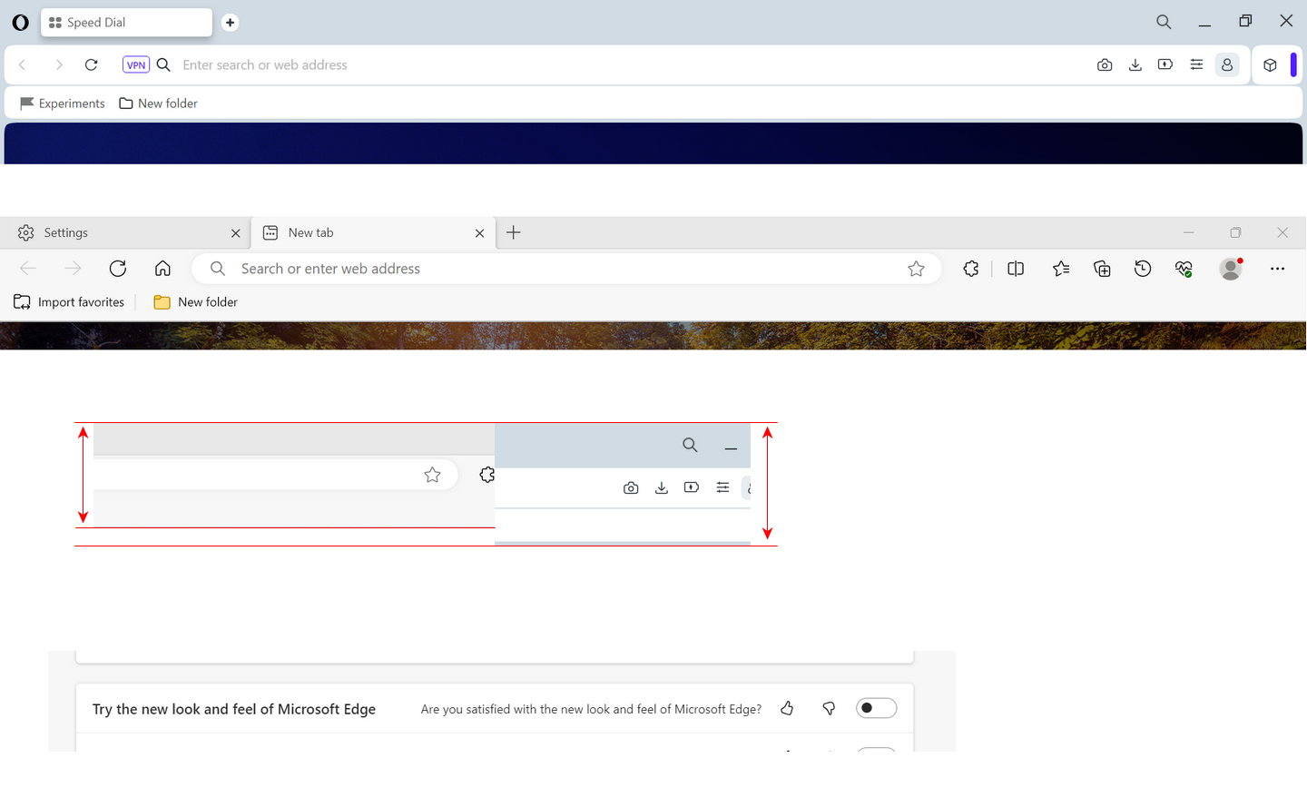
Edge has more compact top now comparing to 'One' version.
At the same time buttons and tabs are bigger/clear in Edge, in 'One' version it's the wasted space.
I also noticed that Edge Canary offers option to try new style (I assume its chromium 2023 refresh). When I enable the toggle, the ugly content border appears also in Edge.
-
A Former User last edited by
@andrew84 I don‘t think the new design is revolutionary.. But if a new design is only a copy of other vendor‘s, it might not stand out.
I think, they’re purposely done that to differentiate themselves. And that’s ok, I think. -
andrew84 last edited by
As for the items highlighting.. I'll write the same I wrote many times when the dark theme was yet implemented.
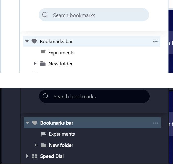
In sidebar panels for History and Bookmarks I see the nice and pleasant to eyes looking highlighted items. In light mode Opera's inherent light blue and in dark theme dark navy colors. Why the purple in other places and the same color in both dark/light theme?

-
andrew84 last edited by
@himmelsheriff said in General Opera One Appearance Feedback Topic:
GX so I only know screenshots. But that looks quite weird but it's rather like the old one, doesn't it?
I don't know how the GX looks now.
I installed it once when it was presented and launched few times later, disliked and then deleted completely. I remember it's all dark with the bright controls and buttons (similarly to gaming interfaces and gaming peripherals).
Now the One version looks similar to GX.I'm fan of calm tones.
I see for example them on youtube page dark mode, I see that developers took care of users to make it pleasant to eyes in dark environment.I'm also fan of unified colors and color themes/styles. If they implement significant UI changes, then all needs to be reworked. Now we have the bright purple( or blue, violet) here, calm and different tones for dark/light mode there in the sidebar panels, and still the old light blue color in settings. So 3 different color schemes in similar places.
-
stolis last edited by
@himmelsheriff It's very simple. They were just enjoying opera as it was and now, with this messed up "upgrade" everybody got crazy.
-
A Former User last edited by
@stolis I don't actually, at least not the way you think, I'm afraid. Maybe it's a matter of mentality. I appreciate new design and look generally, others may like old and trusted one better. None is better than the other. But the new design definitely keeps me with Opera.