Opera 92 Stable
-
ralf-brinkmann last edited by
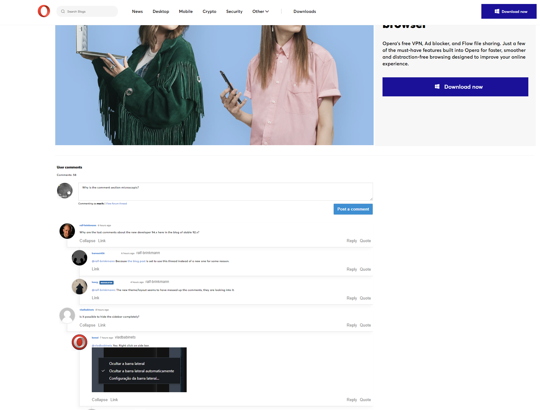
Sorry, I find the new blog page impossible. At the top everything is plastered with these oversized pictures like Picadilly Circus and at the bottom you have to search for the comments of the users first and can hardly read them because the font is so small. What the heck!!! It was a thousand times better before.
-
ralf-brinkmann last edited by
Why are the last comments about the new developer 94.x here in the blog of stable 92.x?
-
burnout426 Volunteer last edited by
@ralf-brinkmann Because the blog post is set to use this thread instead of a new one for some reason.
-
vladbabinets last edited by
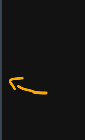
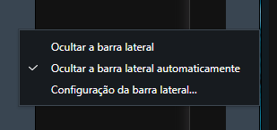
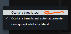
@kened You understood me wrong. I have this option, but the panel is not completely hidden
-
rick2 last edited by
@ralf-brinkmann: Agreed, at least make the contnt and comment fonts biggern and the same size so we can zoom in/out as necessary
-
leocg Moderator Volunteer last edited by
@ralf-brinkmann: The new theme/layout seems to have messed up the comments, they are looking into it.
-
burnout426 Volunteer last edited by
@max1c Because of (at least partially):
#nodebb-comments { font-size: .94em } -
vladbabinets last edited by vladbabinets
@leocg Popup menu does not work on all sites in Opera Dev 94
-
vladbabinets last edited by vladbabinets
@leocg Popup menu when text is selected. For example, it works on the blog here https://blogs.opera.com/desktop/, but not on other sites
-
A Former User last edited by
@vladbabinets If you refer to this vertical line, it is needed to activate the sidebar.

-
vladbabinets last edited by
@kened Yes, on her. It would just be prettier if she was completely hidden.
-
andrew84 last edited by andrew84
Still no fix for the blog page. And on forum there's no 94 version's post at all.
here > https://forums.opera.com/category/51/blogs


