Opera 72.0.3814.0 developer update
-
A Former User last edited by
@andrew84: I also think that Opera has stopped developing pip. Many things could be added such as multiple simultaneous pips, built-in captions and full screen button.
-
balcis last edited by
I had a problem that I was reporting here for a while. I couldn't copy more than 2-3, or sometimes 8 bookmarks from speed dial of a device to anothers. I made a clean install several times but it didn't work.
this time when I signed to sync I didn't choose "sync settings" and it worked.
if anyone is having the same specific problem with me.
-
ralf-brinkmann last edited by
The Opera taskbar icon (in Windows) still jumps around to the last position on the far right when I click a link in an external program (like in a newsletter) to open it in Opera.
W10x64, Operax64 (standalone installation) -
ralf-brinkmann last edited by
The focus in the "Clear browser data" popup window (CTRL-SHIFT-DEL) is still somewhere in the nirvana instead of the blue button.
W10x64, Operax64 -
andrew84 last edited by andrew84
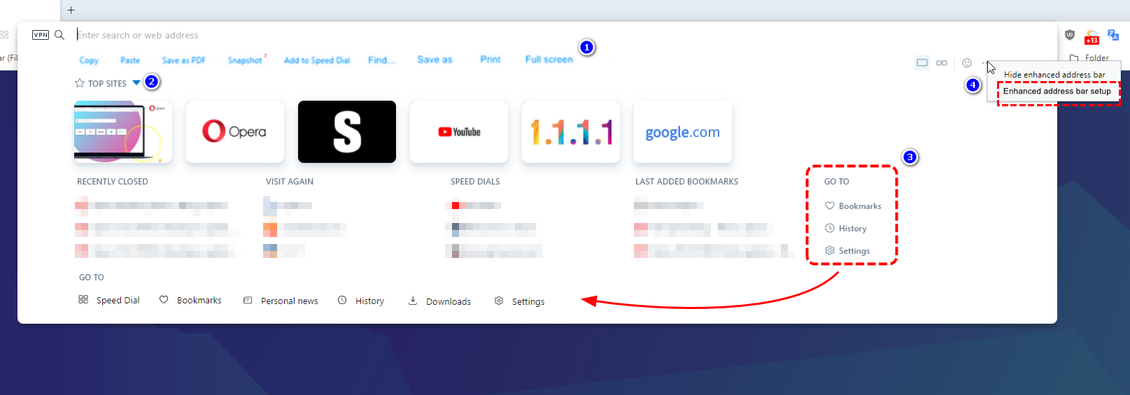
Enhanced Address Bar suggestions.
Fix the layout/scale first of all (related to default page zoom in Settings)
-
Add quick actions buttons
-
Make the Top Sites section optional in Settings and collapsable (when the section is enabled)
-
Move 'Go To' links to the bottom (and add more links which be useful for those who don't like to see the sidebar).
-
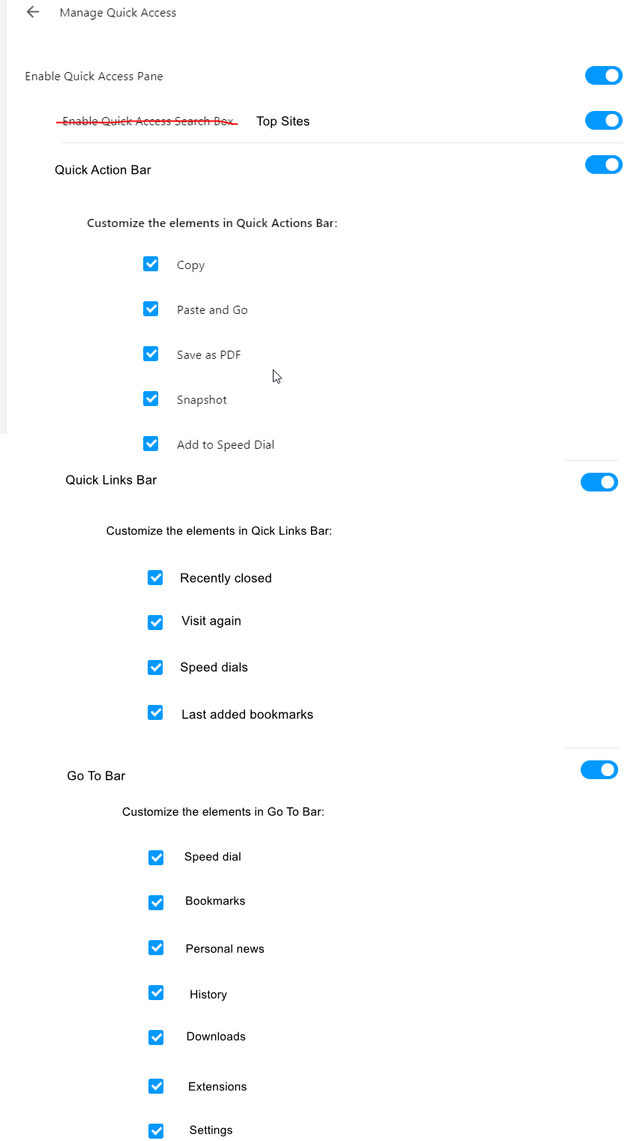
make a separate sections in Settings where all the sections will be customizable (show/hide elements in each section) like it worked for the Quick Access feature in the past.
Something like this (and the 3 dots setup menu in the BABE's top right corner will lead directly to this section)
-
-
andrew84 last edited by
Top site's tile reacts on the bottom's cursor too early, still not fixed. Sometimes when moving cursor over the pane the tiles flicker because tile's active (invisible) area is oversized and I hover it even if I don't want to.

-
andrew84 last edited by andrew84
- Years dropdown's scrollbar in history advanced search looks white in dark mode (on the cookies popup too)
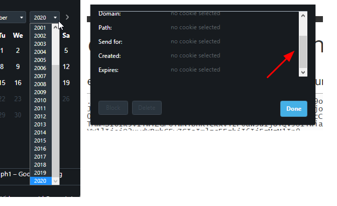
- Inactive buttons in the blocked section of the cookies popup look weird, and active buttons don't have a highlighting effect on hover in dark mode
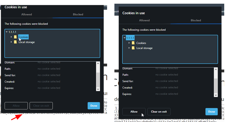
- Years dropdown's scrollbar in history advanced search looks white in dark mode (on the cookies popup too)
-
andrew84 last edited by
Improve the video pop-out, comparing to the yandex browser's one it looks poor.
https://forums.opera.com/post/225402 -
pclaudel1 last edited by
The upgrade to 73.0.3820.0 caused Amazon videos to stop functioning as they previously had. The mouse cursor no longer disappears from the screen when the mouse isn't in use, and tapping the space bar no longer pauses and restarts the video.
-
andrew84 last edited by andrew84
When opening Search tabs popup an active tab should be selected. not simply the first item in the list. I think it's obvious.
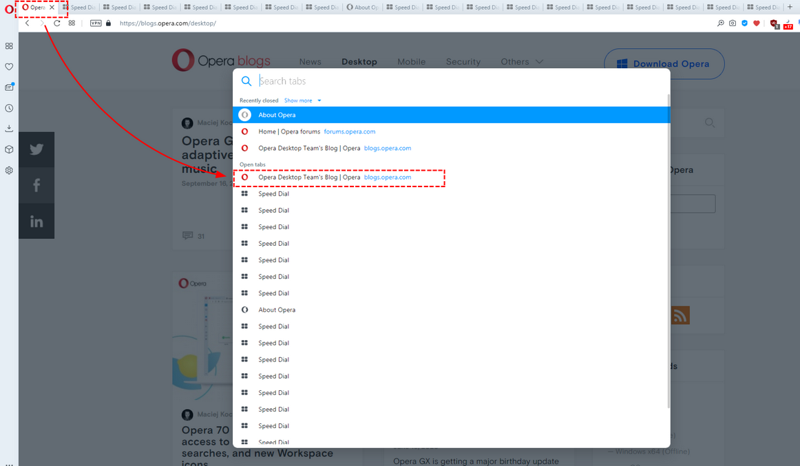
And currently active tab should stay highlighted, for the hovered items another color should be used (like it worked in previous TabMenu)
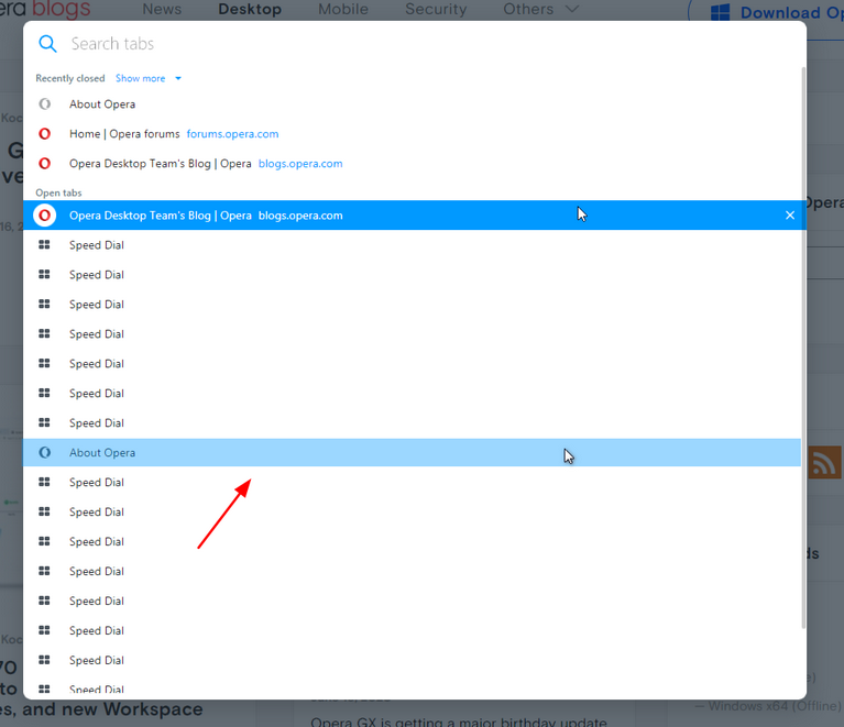
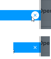
*Also, the highlighting still overlaps the scrollbar (closing cross in the circle too)
